
What is the mobile-first design skill?
Mobile-first design is a short skill in the secondsky skills collection. It tells an AI coding agent to start at mobile width, add min-width media queries for tablet and desktop, keep touch targets at 48px, hold to simple performance targets and layer HTML, CSS and JavaScript as progressive enhancement.
It is a one-page SKILL.md that frames responsive work as designing for mobile screens first, then enhancing for larger ones. The description says it applies to responsive websites, mobile optimization and adaptive layouts.
The file is deliberately brief. It gives a breakpoint table, a CSS pattern, touch rules, performance targets and a short best-practice list, so an agent gets the same starting point every time.
What changes in your agent's output
- Base styles target mobile, and media queries use min-width at 768px and 1024px.
- Navigation is hidden on mobile behind a toggle, then shown as a flex row on tablet and up.
- Buttons get a 48px minimum height and width, with 16px list padding and 8px gaps.
- Markup starts as semantic HTML that works without CSS or JavaScript.
- Units lean on rem, percentages and viewport width, not fixed pixel layouts.
Who the mobile-first design skill is for
Best for
- Teams whose traffic is mostly phones and who need a consistent default.
- Agents that tend to build desktop layouts and shrink them afterwards.
- Quick responsive reviews, where a short checklist beats a long guide.
- Landing pages and content sites with simple navigation.
Not for
- Deep layout systems with grids, container queries or fluid type. Look at CSS Expert or Layout Grid for that.
- Native mobile app design.
- Visual style, brand or color decisions, which it does not cover.
Use it with UiChemy
The skill shapes your front-end CSS. For WordPress, UiChemy Figma to WordPress converts a Figma design, including a mobile frame, into editable pages. Click Get Started on uichemy.com.
How to install Mobile-First Design Skill: Breakpoints and Touch Targets
git clone https://github.com/secondsky/claude-skillsClone the collection
Run the clone command. The repo holds many plugins, one folder each.
Copy the skill
Copy plugins/mobile-first-design/skills/mobile-first-design into the skills folder your agent reads. It is a single SKILL.md.
Reload the agent
Restart or reload your agent so it indexes the skill.
Prompt for responsive work
Ask for a responsive page or an adaptive layout, and mention mobile users so the skill is chosen.
Check that it loaded
Ask for a header with navigation. Base CSS should show a toggle on mobile and a flex nav inside a min-width media query.
Key features
- Four breakpoint bandsMobile at 320 to 480px, tablet 481 to 768px, desktop 769 to 1024px and large at 1025px and above, each tied to example devices.
- Min-width CSS patternA worked example where base rules serve mobile and two min-width queries at 768px and 1024px change padding, max width and the nav.
- Nav toggle patternA hidden desktop nav and a visible hamburger toggle on mobile, reversed at tablet width.
- 48px touch targetsButtons use min-height and min-width of 48px with 12px by 24px padding, and list items get 16px padding and an 8px gap.
- Performance targetsFirst Contentful Paint under 3 seconds on 3G, a JavaScript bundle under 100KB gzipped and total page weight under 500KB.
- Progressive enhancementThree layers: semantic HTML that works alone, CSS for appearance and JavaScript for interactivity.
- Start at 320pxThe first best practice is to begin the design at 320px wide, then widen.
- Relative unitsPrefers rem, percentages and viewport units over fixed pixel sizing.
- Real device testingAdvises testing on real devices and making text readable without zooming.
- Mobile asset careCalls for optimized images and minimal JavaScript on first load.
Frequently asked questions
What is the mobile-first design skill?
It is a short SKILL.md in the secondsky skills collection that tells an AI coding agent to design for mobile screens first and enhance for larger ones, with breakpoints, a min-width CSS pattern, touch target sizes and page weight targets.
How do I install mobile-first design?
Clone the secondsky skills repo and copy the plugins/mobile-first-design/skills/mobile-first-design folder into the skills folder your agent reads. Reload the agent afterwards. The repo gives no dedicated installer for this skill.
What breakpoints does it use?
Mobile covers 320 to 480px, tablet 481 to 768px, desktop 769 to 1024px and large 1025px and above. The CSS example uses min-width queries at 768px and 1024px, so styles layer upward from the mobile base.
How big should touch targets be?
The skill sets a minimum of 48 by 48px for buttons, with 12px by 24px padding. It also recommends 16px padding on list items and 8px spacing between them so taps do not land on neighbors.
Does it include performance targets?
Yes, three: First Contentful Paint under 3 seconds on 3G, a gzipped JavaScript bundle under 100KB and total page weight under 500KB. They are guidance numbers in the file, not measurements of your site.
Does mobile-first design work with Cursor or Codex?
The repo describes itself as skills for Claude Code, and this SKILL.md has no setup notes for other agents. It is plain markdown with CSS, so check how your own agent loads skills before relying on it.
What are mobile-first design alternatives?
For a fuller mobile-first stylesheet approach, see Frontend Responsive UI. For layout columns and breakpoints, Layout Grid goes deeper, and Modern CSS is a snippet reference for current stylesheets, if you need newer features than media queries.
Can it make my WordPress site responsive?
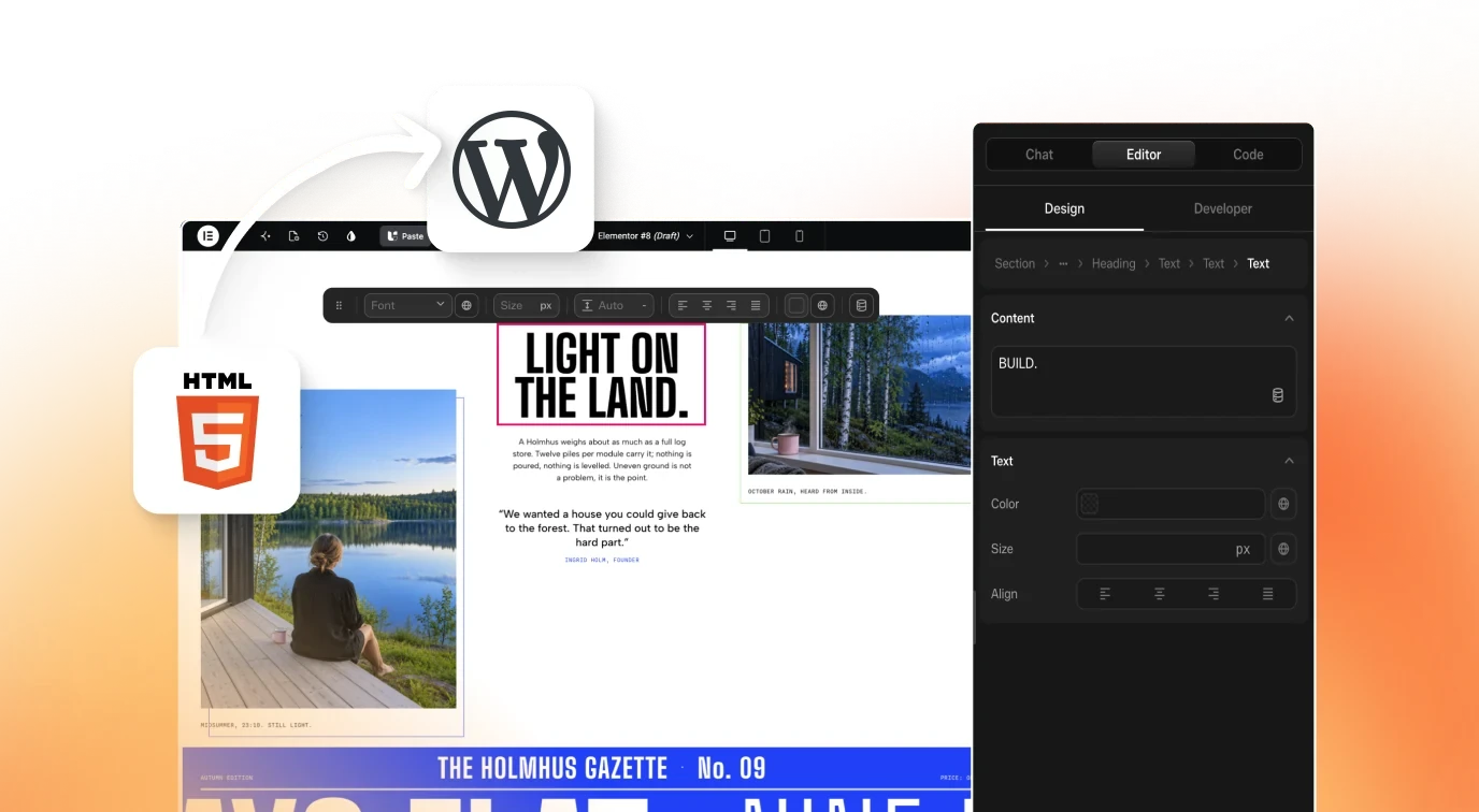
It writes front-end CSS guidance, not WordPress content. UiChemy Figma to WordPress converts Figma designs, and Composer writes HTML, CSS and JS in Elementor or Gutenberg. Click Get Started on uichemy.com.