
What is the layout system skill?
Layout system is a skill in the vibe-building-skills library. It makes an AI coding agent scan your CSS for fixed widths and breakpoint sprawl, choose Grid or Flexbox by content shape, build mobile-first from 320px, and verify at five viewport widths before delivering.
It is one of 13 frontend design skills in the vibe-building-skills repo. The agent produces working layout code for your real screens, not a CSS tutorial. The governing principle is that content determines structure.
In practice that means Grid or Flexbox is chosen by the shape of the content, breakpoints go where the content breaks, and flexible tracks absorb the rest. It starts from a 320px single column.
What changes in your agent's output
- Page shells use Grid with template areas, and
minmax(0, 1fr)stops wide children from blowing out a track. - Card lists with an unknown item count use auto-fit and minmax, which needs no media queries.
- Fixed pixel widths, absolute positioning and negative-margin hacks are replaced and listed in a smells table.
- Breakpoints are derived from where the content breaks, capped at two or three per component.
- The reply ends with results at 320, 375, 768, 1024 and 1440px.
Who the layout system skill is for
Best for
- Pages that break on mobile, overflow horizontally or do not line up.
- Dashboards, grids, sidebars and card layouts that need a clean responsive structure.
- Codebases with media-query sprawl, where the skill counts distinct breakpoints.
- Projects using Tailwind, CSS Modules or styled-components, since it delivers in the same system.
Not for
- Defining a spacing scale from nothing. It sends that to design-foundation first.
- Fixing text readability, which goes to typography-system.
- Reducing clutter through emphasis, which goes to visual-hierarchy-refactoring.
Related layout skills
For container queries and fluid sizing, see Responsive Design. A grid-first view is in Layout Grid, and Better Layout covers grouping and alignment checks.
Use it with UiChemy
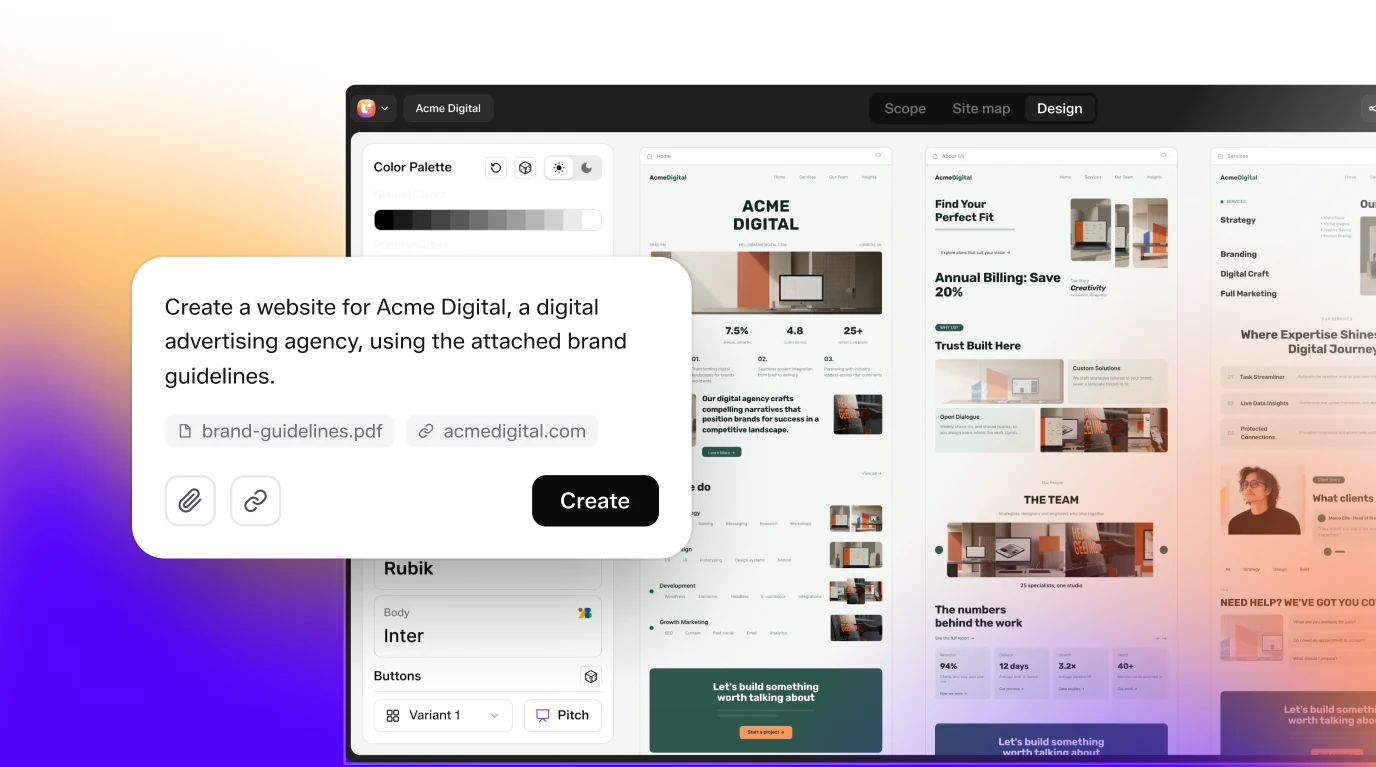
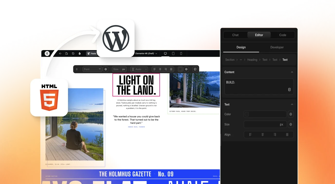
Layout system fixes structure in front-end code. When the finished build has to become an editable WordPress page, UiChemy AI to WordPress imports an AI build. Click Get Started on uichemy.com.
How to install Layout System Skill: Responsive Grid and Page Shells
git clone https://github.com/sanky369/vibe-building-skills.gitClone the repository
Run the clone command above. The README gives no package installer, so the skill lives as a folder in the repo at
skills/frontend-design/layout-system/.Add the skill to your agent
The README describes uploading the SKILL.md in Claude under Settings, Capabilities, Skills, then Add Skill. For a folder-based agent, copy the whole
layout-systemfolder, including its references folder, into your skills directory.Start from the orchestrator if unsure
The README suggests beginning with frontend-orchestrator, which assesses design maturity and sequences the 13 frontend skills. You can also call this one directly.
Describe the job
Name the screen that matters most and the smallest and largest viewports. The skill defaults to 320px to 1440px with content capped near 1200 to 1280px, then states assumptions and builds.
Check that it loaded
Ask the agent to list its skills, or name the skill in your prompt. The description should match the trigger text in SKILL.md.
Key features
- Codebase smell scanThe agent greps for fixed widths, absolute positioning, floats and negative margins, media queries, and overflow-x or 100vw. It counts them and treats more than four distinct min-widths as breakpoint sprawl.
- Same styling systemIt detects Tailwind, CSS Modules or styled-components and delivers in that system, reusing existing breakpoints and spacing tokens unless they are the problem.
- Mobile-first startBegin at 320px in one column and add columns only where the content earns them. The skill says never to shrink a desktop design downward.
- Grid or Flexbox rulesGrid when rows and columns must align, Flexbox for one-direction content-driven rows. Flexbox with percentage-width children faking columns should become Grid.
- Page shell patternA Grid with grid-template-areas that collapses at smaller widths, with a sticky sidebar from 768px up and minmax(0, 1fr) for the main track.
- Content-driven breakpointsResize until something breaks, such as a long line or a squeezed column, and put the breakpoint there. Keep to two or three per component.
- Container queriesUse them when one component renders in different container widths. Viewport media queries stay for page-level structure.
- Media and unitsaspect-ratio with object-fit cover, no fixed-height responsive images, rem for space and type, ch for text measure, px only for borders.
- Verification checklistChecks for horizontal scroll, columns under about 250px, text measure outside 45 to 75ch, touch targets under 44px, and content trapped under sticky elements.
Frequently asked questions
What is the layout system skill?
It is a SKILL.md in sanky369/vibe-building-skills for responsive layout: page shells, grids, card layouts, sidebars, breakpoint strategy and container queries. It inspects existing CSS for layout smells and returns refactored code, a decisions table and a responsive verification result.
How do I install the layout system skill?
Clone the repository and add skills/frontend-design/layout-system to your agent. The README describes uploading SKILL.md through Claude Settings, Capabilities, Skills. It lists no package installer, so for folder-based agents copy the whole folder, including references, into your skills directory.
When does it choose Grid and when Flexbox?
Grid when rows and columns must align, such as a page shell, dashboard, gallery or form with aligned labels. Flexbox for one-direction layouts like a navbar, button row or tag list. A card grid with unknown item count uses auto-fit and minmax.
Which viewport widths does it check?
The verification step covers 320, 375, 768, 1024 and 1440px. It looks for horizontal scroll, squeezed columns, text measure outside 45 to 75 characters, small touch targets and content hidden under sticky elements. If it cannot render the page, it flags the result as reasoned, not rendered.
Will it rewrite my Tailwind or CSS setup?
It delivers in the system your project already uses, whether Tailwind classes, CSS Modules or styled-components. New gaps and padding must use your existing spacing scale, and it reuses your breakpoints unless they are the cause of the problem.
What are the limits of the layout system skill?
It does not define spacing tokens, tune text readability or fix clutter. The SKILL.md hands those to design-foundation, typography-system and visual-hierarchy-refactoring. It also expects a named target screen, or code it can read, to work from.
Does it work with Claude, Cursor or Codex?
The repo README covers installing skills in Claude and using Claude Code for implementation. It states nothing about Cursor or Codex, so check your agent's skill support. The skill itself is a plain SKILL.md folder with a layout patterns reference file.
Can it build the page in WordPress?
No. It produces front-end CSS and markup in your project. To bring an AI-built page into WordPress as editable content, UiChemy AI to WordPress imports an existing AI build. Click Get Started on uichemy.com to begin.