
What is the building-components skill?
The building-components skill packages the components.build specification for an AI coding agent. Its SKILL.md is a short when-to-use list that points to 15 reference files on composition, accessibility, as-child polymorphism, state, design tokens, styling, registries, npm publishing and documentation. The spec was co-authored by Hayden Bleasel and shadcn.
Components.build is an open-source specification for modern, composable and accessible UI components, co-authored by Hayden Bleasel and shadcn. The building-components skill is how that specification reaches your agent: a short SKILL.md that points to reference files.
When the skill applies
- Building primitives, components, blocks or templates.
- Accessibility work: ARIA, keyboard navigation and focus management.
- Composable APIs with slots, render props and controlled or uncontrolled state.
- Design tokens and theming, polymorphism and as-child patterns, and data attributes for styling and state.
- Publishing to a registry or npm, and writing component documentation.
How the references are organised
SKILL.md holds no rules itself. It lists 15 .mdx files, from definitions and principles through accessibility, composition, types, state and styling to registry, npm, marketplaces and docs, so the agent reads only what the task needs.
Who the building-components skill is for
Best for
- Open-source maintainers and senior front-end engineers shaping a component library.
- Agents asked to build a reusable component and not a one-off screen.
- React and TypeScript projects, since the examples use them, though the README says the principles are framework-agnostic.
Not for
- Choosing a visual style or palette. The spec is about structure and API design, not looks.
- Reviewing finished UI code against a rule list. See web-design-guidelines.
- A ready-made component set. For installable components, see shadcn.
Use it with UiChemy
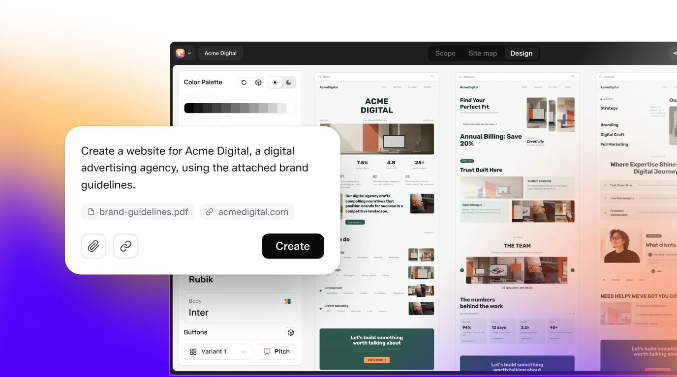
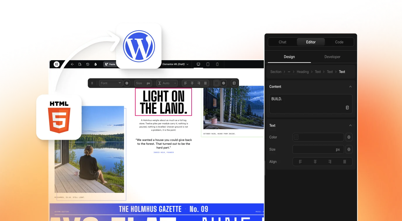
This spec covers component code, while UiChemy covers the WordPress side: Figma to WordPress converts a Figma design into a site, and Composer edits HTML, CSS and JS in Elementor or Gutenberg. Click Get Started on uichemy.com. For related patterns, see web-component-design.
How to install Building Components Skill: Composable, Accessible UI
git clone https://github.com/vercel/components.build.gitClone the repository
Run
git clone https://github.com/vercel/components.build.git. The skill sits in the skills/building-components folder.Copy the skill folder
Copy skills/building-components, with its references folder, into the folder your agent loads skills from. The README gives no agent specific path.
Keep the references together
SKILL.md links to 15 .mdx files in references/. Copy the whole folder so those links resolve.
Ask for a component
Ask your agent to build or review a component, for example one with accessible keyboard behaviour or an as-child API.
Check that it loaded
Ask the agent to design a reusable button or dialog. It should consult the accessibility, composition and state references before writing code.
Key features
- Artifact taxonomyA definitions reference separates primitives, components, blocks and templates, so the agent knows what level it is building.
- Core principlesThe spec's qualities are composable, accessible, customizable, performant, transparent and well-documented.
- Accessibility referenceCovers ARIA, keyboard navigation and WCAG compliance for components, including focus management.
- Composition patternsDescribes composable component APIs built with slots and render props, in preference to inheritance.
- As-child and polymorphismTwo references explain the as-child pattern and polymorphic components for changing the rendered element.
- State and typesReferences cover controlled versus uncontrolled state and TypeScript typing patterns for component props.
- Data attributes and stylingExplains using data attributes for styling and state, plus the styling approaches the spec recommends.
- Design tokensA design-tokens reference covers token systems and theming for components.
- DistributionRegistry, npm and marketplaces references cover shadcn-style registry distribution, publishing and marketplace distribution.
- Documentation guidanceA docs reference explains how to write component documentation that developers can use.
Frequently asked questions
What is the building-components skill?
It is the skill version of components.build, an open-source standard for composable and accessible UI components. SKILL.md lists when to use it and links to 15 reference files, so an AI coding agent follows the spec when it builds or reviews a component.
How do I install the building-components skill?
Clone vercel/components.build and copy the skills/building-components folder, including references, into the place your agent loads skills from. The README does not give an install command or an agent folder, so treat it as a manual copy and test it.
Does it only work for React?
The examples use React and TypeScript. The README says the core principles are framework-agnostic and apply to Vue, Svelte, Angular and other modern frameworks, so the guidance on composition, accessibility and tokens still carries over to other stacks.
What topics do the reference files cover?
There are 15: definitions, principles, accessibility, composition, as-child, polymorphism, types, state, data attributes, design tokens, styling, registry, npm, marketplaces and docs. Each one is an .mdx file the agent opens when the task touches that topic.
Who wrote the components.build specification?
The README says it was co-authored by Hayden Bleasel and shadcn. It is described as a formal specification of best practices for open-source UI components, informed by the open-source community and real-world component libraries.
Does the skill help with publishing a component library?
Yes. Besides building guidance, it has references on shadcn-style registry distribution, publishing to npm, marketplace distribution and writing documentation. Those cover the steps after a component is built and ready to share with other developers.
Which AI agents support the building-components skill?
The skill is a SKILL.md folder with linked references, so an agent that loads that format may work, but the repository does not list supported agents. Test it with one component task before relying on it in a team.
What license does components.build use?
GitHub's license field does not report a recognised license for this repository, while the README says the project is available under the MIT License. Read the LICENSE file in the repository before you redistribute the skill or the references.