
What is the design-system-starter skill?
The design-system-starter skill is a SKILL.md in Softaworks' agent-toolkit repository. Describe your app, and it guides an AI coding agent to produce token JSON, an atomic component hierarchy, CSS variable theming with dark mode, WCAG 2.1 AA patterns and component documentation templates.
Its quick start is a single sentence: ask for a design system for your React app with dark mode support. Version 1.0.0 of this skill then supplies the tokens, components and accessibility guidance from one SKILL.md plus a few bundled files.
It ships inside Softaworks' agent-toolkit, a curated collection of skills for AI coding agents, where it appears under the Design and Frontend group. In the plugin marketplace each skill installs as its own plugin.
What it produces
- Design tokens as JSON for color, typography, spacing and shadows, with a template in the W3C design token format.
- A component structure organized as atoms, molecules, organisms, templates and pages.
- Theming through CSS variables or a ThemeProvider setup.
- Accessibility patterns that target WCAG 2.1 AA.
- Component documentation covering props, variants, accessibility notes and examples.
How the skill guides the work
- Primitive color tokens, such as a blue scale from 50 to 950, sit under semantic tokens that name a color by purpose.
- Spacing uses a consistent 4px or 8px base scale, with radius and shadow tokens beside it.
- Contrast targets are 4.5:1 for normal text and 3:1 for large text and UI components.
- Component APIs favor predictable props, sensible defaults, composition over configuration and a polymorphic
asprop.
Who the design-system-starter skill is for
Best for
- Starting a token and component foundation for a React project and wanting a standard shape from day one.
- Teams that need dark mode, accessibility and documentation planned together rather than patched in later.
- Following with design-token work or color-system decisions once the first draft exists.
Not for
- Generating a visual style. The skill sets structure and rules and does not pick a brand look. See visual-design-foundations and design-system-patterns for that side.
- Producing a Figma file. Its outputs are token JSON, component code and docs.
- Pure Tailwind projects that only need utility guidance. tailwind-design-system fits that case better.
Use it with UiChemy
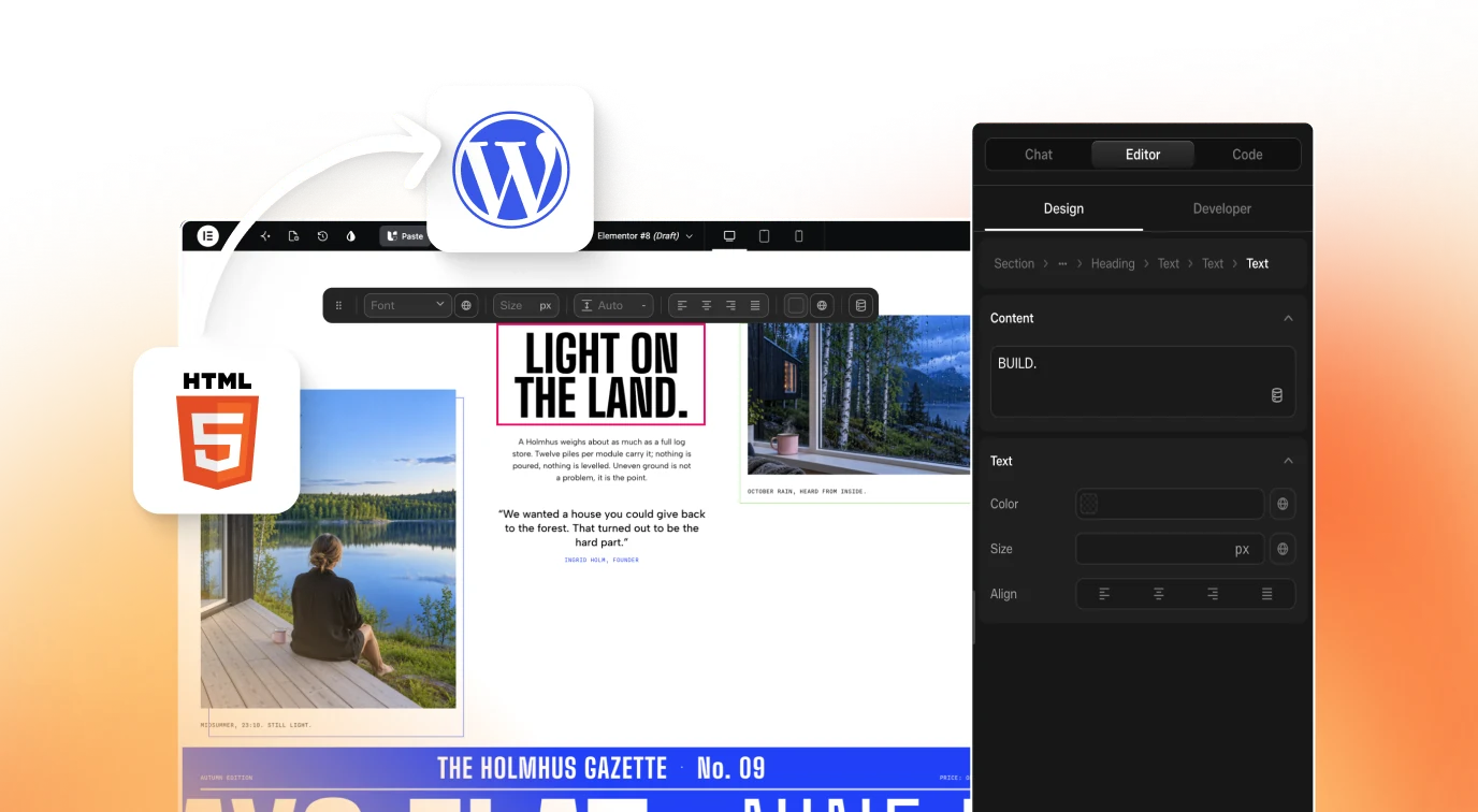
Your tokens and components live in code. UiChemy works on the WordPress side: Figma to WordPress converts designs into editable pages, and Composer edits them visually with real HTML, CSS and JS. Share the token set with whoever designs in Figma, then click Get Started.
How to install Design System Starter Skill: Tokens and Components
/plugin marketplace add softaworks/agent-toolkitAdd the marketplace
In Claude Code, run
/plugin marketplace add softaworks/agent-toolkit. The README says each skill in the toolkit is an individual plugin.Install the plugin
Run
/plugin install design-system-starter@agent-toolkit, following the README's<skill>@agent-toolkitpattern. Or use/plugin, open the Marketplaces tab, pick agent-toolkit and choose Install now.Or copy the folder manually
From a clone of the repository, the README gives
cp -r skills/<skill-name> ~/.claude/skills/, so here the folder is skills/design-system-starter. For claude.ai, add the skill to project knowledge or paste SKILL.md into the conversation.Keep it updated
Run
/plugin, open the Marketplaces tab, select agent-toolkit and choose Update marketplace. You can also enable auto-update.
Check that it loaded
Ask your agent to create a design system for a React app with dark mode support. With the skill loaded you should get token JSON, an atomic component structure and theming guidance in one reply.
Key features
- One-sentence quick startYou describe the system in plain words, such as a design system for a React app with dark mode support, and the skill supplies tokens, components and accessibility guidelines.
- Token categoriesColor tokens split into primitive and semantic layers. Typography, a 4px or 8px spacing scale, radius and shadows complete the set.
- Contrast targetsNormal text needs 4.5:1, large text needs 3:1, and UI components and graphics need 3:1, measured against WCAG 2.1 Level AA.
- Atomic design hierarchyComponents are organized as atoms, molecules, organisms, templates and pages. The workflow says to build atoms first and compose upward.
- Component API rulesProps stay predictable with defaults, composition beats configuration, and a polymorphic
asprop lets one Button render as a link or a button. - Three theming approachesDark mode can be done with CSS variables under a data-theme attribute, with the Tailwind dark: variant, or with a styled-components ThemeProvider.
- Accessibility patternsKeyboard navigation, focus traps for dialogs, ARIA attributes such as aria-label, aria-expanded, aria-controls and aria-live, and semantic HTML first.
- Documentation templateEach component page covers purpose, usage, variants, a props table, accessibility notes and examples, using Storybook, Docusaurus or similar tools.
- Four phase workflowDesign, development, adoption and maintenance. Adoption adds a migration guide and codemods, and maintenance versions releases semantically.
- Bundled resourcesA component examples reference, a design tokens template, a React component template and a design system audit checklist ship in the folder.
Frequently asked questions
What is the design-system-starter skill?
It is a SKILL.md at version 1.0.0 in Softaworks' agent-toolkit repository. It helps an AI coding agent create and evolve design systems, covering design tokens, component architecture, accessibility guidelines and documentation templates under an MIT license.
How do I install the design-system-starter skill?
In Claude Code, add the marketplace with /plugin marketplace add softaworks/agent-toolkit, then install design-system-starter@agent-toolkit. For a manual copy, put the skill folder in ~/.claude/skills/. The README also describes adding it to claude.ai project knowledge.
What files come with the skill?
Besides SKILL.md, the folder holds a README, a component examples reference, a design tokens template in W3C format, a React component template and a design system checklist. These give the agent concrete shapes to copy instead of inventing structure.
Does it support dark mode?
Yes. It describes three theming routes: CSS variables with a data-theme dark selector, the Tailwind dark: variant, and a styled-components ThemeProvider. The quick start prompt itself asks for a React app with dark mode support.
Does it work with Claude Code, Cursor or Codex?
The repository README says the skills CLI add command pointed at softaworks/agent-toolkit works with several AI coding agents, naming Claude Code, Codex, Cursor and AdaL. It gives a plugin route specifically for Claude Code. For claude.ai it says to add skills to project knowledge or paste SKILL.md into the conversation.
What accessibility standard does it target?
WCAG 2.1 Level AA. The skill sets contrast at 4.5:1 for normal text and 3:1 for large text and UI components, and covers keyboard navigation, focus traps, ARIA attributes and semantic HTML for components.
Does it generate Figma files?
No. Its listed outputs are token JSON, an atomic component structure, theming setup, accessible patterns and documentation. Its workflow does include designing the component library in Figma as a human step before development.