
What is the design-to-component-translator skill?
The design-to-component-translator skill converts Figma or other design specifications into React components styled with Tailwind and shadcn patterns. It maps spacing, type and colour to tokens, adds hover, focus, active and disabled states, applies breakpoint rules and finishes with an output checklist.
The skill sits in the frontend folder of the patricio0312rev/skills repository, a collection whose README counts 155 skills. Its job is narrow: take measurements, colours and states from a design spec and write the React component that matches.
It follows an eight step workflow: analyse specs, map values to tokens, build semantic HTML, apply Tailwind or CSS, add states, handle breakpoints, add accessibility attributes and document variants.
From spec values to class names
- A button with 40px height, 12px 24px padding, a 6px radius, Inter Medium 14px text and a #3B82F6 background becomes h-10, px-6, rounded-md, text-sm and a primary 500 colour, with hover on 600 and active on 700.
- A card with 24px padding, a 12px radius and a 1px #E5E7EB border becomes p-6, rounded-xl and border-gray-200, with an optional stronger shadow prop.
- A 44px form input with a 1px #D1D5DB border and an 8px radius becomes h-11, border-gray-300 and rounded-lg.
- A 40 by 40px icon button holding a 20px icon becomes h-10, w-10 and an inner h-5, w-5 icon.
Tokens, breakpoints and states
- A tokens.ts sample covers colours, spacing, font sizes, radii and shadows, plus a Tailwind config extension for off-scale values such as spacing 18 and a 2xs font size.
- Artboards map to breakpoints: 375px is the default, 768px becomes md, 1024px becomes lg and 1280px becomes xl.
- Hover is a colour step, focus uses a focus-visible ring, active darkens the fill and disabled drops opacity and pointer events.
- Hex colours become HSL CSS variables in the shadcn style, such as primary from #3B82F6, alongside background, foreground, border, input, ring and radius.
- Disabled designs get aria-disabled, and error designs get aria-invalid with aria-describedby.
Who the design-to-component-translator skill is for
Best for
- React and TypeScript projects that style with Tailwind and use the cn helper and cva variants familiar from shadcn.
- Developers handed raw Figma measurements who want repeatable token mapping. A Tailwind specific companion is gentleman-tailwind-4.
- Design system work that needs every state and prop variant written down, alongside theming-components.
Not for
- Stacks other than React. The examples and output are React with TypeScript.
- Pulling data from Figma. The skill text describes no Figma connection, so pair it with a server such as gethopp-figma-mcp-bridge or paste the spec values yourself.
- Strict fidelity. The card example adds a hover shadow that the Figma spec does not contain, and it tells you to note deviations.
Use it with UiChemy
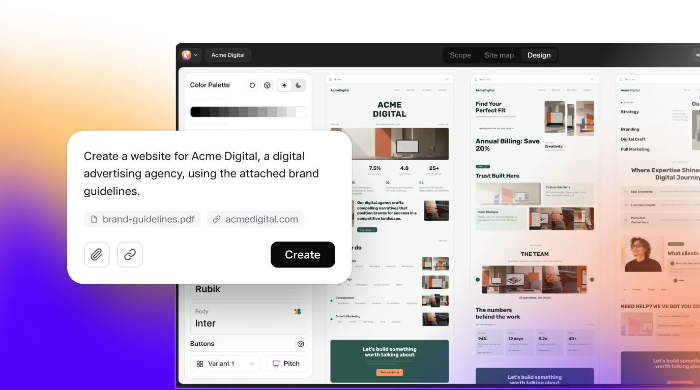
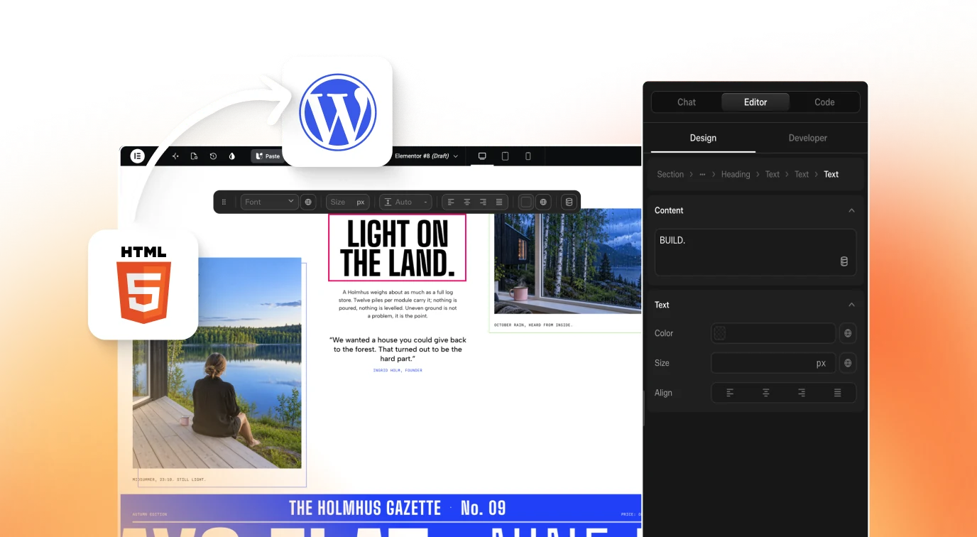
This skill outputs React and Tailwind for an app. When the destination is WordPress, UiChemy Figma to WordPress converts the design into an editable build, and Composer lets you refine it visually inside Elementor or Gutenberg. Click Get Started on uichemy.com.
How to install Design to Component Translator Skill: Figma to React
git clone https://github.com/patricio0312rev/skills.gitClone the repository
The README gives no single install command for this skill. Run
git clone https://github.com/patricio0312rev/skills.gitto get the whole collection.Find the skill folder
The skill is at frontend/design-to-component-translator inside the clone. Copy that folder, not the full repository, to avoid loading skills you do not need.
Place it in your skills folder
For Claude Desktop or Claude Code, the README uses a project-level .claude/skills folder, created with
mkdir -p .claude/skills. Put the copied skill there.Check your project stack
The examples assume React, TypeScript, Tailwind and a cn helper imported from your own utils file, so confirm those exist or adapt the output.
Ask for a translation
Phrases such as Figma to code, design specs to components or implement design system match the trigger text in the skill description.
Check that it loaded
Paste a button spec with height, padding, radius and colours. The agent should map the values to tokens, include hover, focus, active and disabled states, then run through the checklist.
Key features
- Eight step workflowAnalyse specs, map tokens, generate structure, apply styles, add states, handle responsive rules, ensure accessibility and document variants, in that order.
- Spec extraction in Tailwind termsSpacing, typography, colour, borders and shadows are listed as Tailwind classes with their pixel values, such as px-6 for 24px and text-sm for 14px.
- Design token mappingValues go into a tokens file and a Tailwind config extension, so components use named tokens instead of hardcoded numbers.
- Pixel to class tableA conversion table runs from 2px to 48px, and off-scale sizes such as 18px use arbitrary values like w-[18px] or a config entry.
- Interaction statesHover, focus-visible, active and disabled styling are written for components, with an accessible focus ring and a subtle press scale in the examples.
- Responsive translationFigma artboards at 375, 768, 1024 and 1280px map to default, md, lg and xl rules, covering layout direction, type size and padding.
- shadcn style variantsA cva example defines default, destructive, outline, secondary, ghost and link variants with default, sm, lg and icon sizes.
- Colour to CSS variablesFigma colours convert to HSL variables for primary, secondary, background, foreground, border, input and ring, with a shared radius value.
- Accessibility mappingVisual states from the design turn into ARIA attributes, including aria-disabled for disabled controls and aria-invalid with aria-describedby for errors.
- Output checklistA twelve item list covers spacing, type, colour, radius and shadow, four states, breakpoints, token documentation, accessibility attributes and variants.
Frequently asked questions
What is the design-to-component-translator skill?
It is a skill in the patricio0312rev/skills repository that converts design specifications into React components. It extracts spacing, typography, colour, borders and shadows, maps them to design tokens, writes Tailwind and shadcn style code, and adds interaction states, breakpoints and accessibility attributes.
How do I install the design-to-component-translator skill?
The README has no dedicated command, so clone the repository with git and copy the frontend/design-to-component-translator folder into the skills folder your agent reads. Then ask for Figma to code or design specs to components, which are the phrases named in the skill description.
Which AI coding agents can use it?
The README describes Claude Desktop, uploading a skill file in Claude.ai and a project level .claude/skills folder. The repository topics also list Cursor and a Copilot coding agent, but the README gives no setup steps for either, so test it in your own tool first.
Does it read Figma files directly?
The skill text does not describe a Figma connection. It starts from design specifications, so you supply measurements, colours and states as text. A separate Figma server can fetch those values for the agent first, then this skill turns them into components.
What code does it produce?
Examples are React components in TypeScript, styled with Tailwind classes combined through a cn helper. They include prop interfaces, size and variant props, forwarded button or div attributes, and shadcn style variant definitions built with cva.
How does it handle responsive design and dark mode?
Artboards at 375, 768, 1024 and 1280px map to the default, md, lg and xl prefixes, with examples for stacking, side by side layouts, type size and padding. Its best practices say to implement dark mode with class variants when designs for it exist.
What license does it use and how active is the repository?
The repository is MIT licensed, has 61 stars and was last pushed on January 12, 2026. It is a large collection of general skills, so check this folder against your own components before adopting it. For related reading see web-component-design and design-md.