


What is the framed-grid-layout skill?
framed-grid-layout is a skill in boraoztunc/skills that gives an agent a 12-column parent grid, consistent frame padding, and background-layered L-shaped corner brackets for a precise, technical page structure. It adds low-opacity diagonal texture and fixed section spans, so editorial or system-like layouts stay aligned without floating cards or uneven margins.
framed-grid-layout is one skill in boraoztunc/skills. It specifies a 12-column parent grid, consistent frame padding and L-shaped corner brackets for pages that need a precise, editorial or system-like structure instead of floating cards.
Every section snaps to the same grid rhythm. One border color, one bracket color and one spacing scale apply across the whole page, with a low-opacity diagonal texture adding surface tension without becoming a visible pattern.
What changes in the agent's output
- Sections align to a 12-column parent grid instead of floating cards with ad hoc widths and uneven margins.
- Each frame gets the same 1px border, padding and L-shaped corner brackets built from layered backgrounds, not extra markup.
- A diagonal texture sits below 0.05 opacity so the surface reads as tension rather than a visible pattern.
- Section spans use explicit grid-column classes that collapse to a single column under a 760px breakpoint.
Taste rules it enforces
The skill keeps border weight consistent across adjacent frames, skips heavy shadows so the visible frame carries the structure, and repeats the same corner bracket size on every major section.
Who the framed-grid-layout skill is for
Best for
- Editorial, technical or system-like pages that need visible section boundaries.
- Dashboards and documentation layouts where precise alignment matters more than organic shapes.
- Teams that want one repeatable frame pattern instead of custom spacing per section.
Not for
- If your job is mostly choosing column counts, gutters and breakpoints rather than brackets, the layout-grid skill is the better fit for that.
- When the page needs a magazine-style editorial reading column instead of a bracketed grid frame, the ui-craft-editorial skill is the better fit for that.
- If your job is mostly checking alignment, grouping and reading order across a layout, the better-layout skill is the better fit for that.
Use it with UiChemy
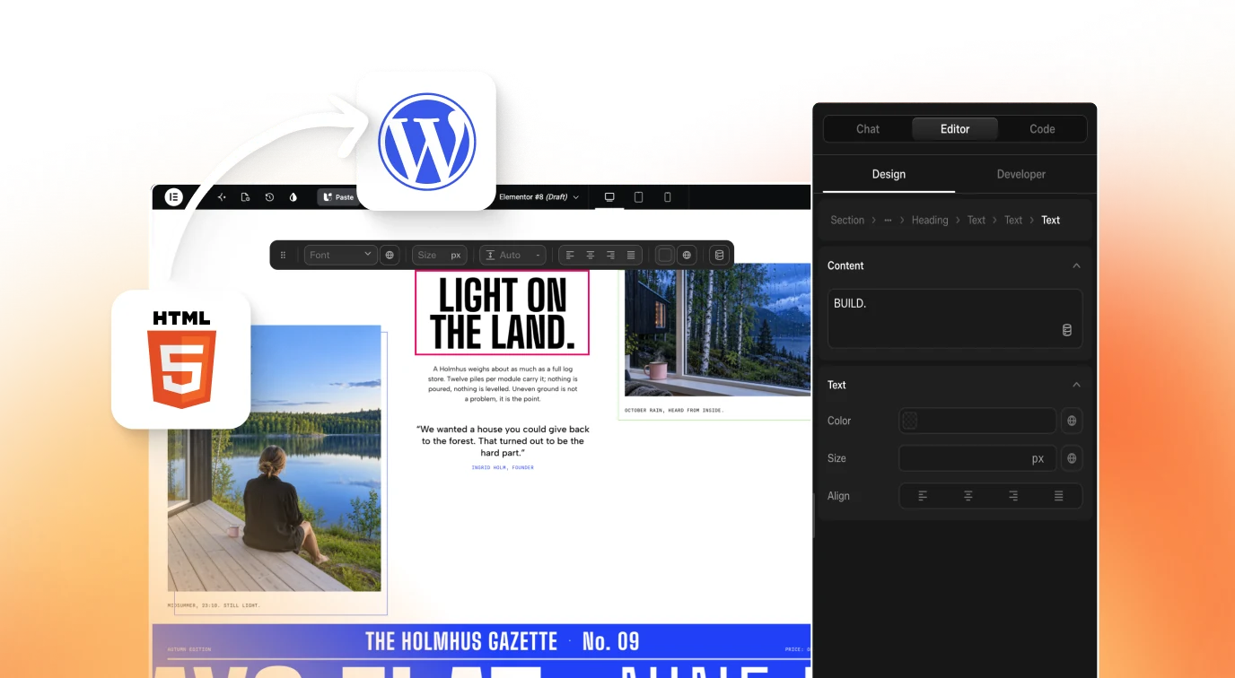
The grid and bracket pattern is a layout decision, not a page host. Once the structure is built, UiChemy AI to WordPress carries the resulting markup into an editable WordPress page.
How to install Framed Grid Layout Skill for AI Coding Agents
mkdir -p ~/.claude/skills/framed-grid-layout && curl -o ~/.claude/skills/framed-grid-layout/SKILL.md https://raw.githubusercontent.com/boraoztunc/skills/main/framed-grid-layout/SKILL.mdCreate the skill path
Run
mkdir -p ~/.claude/skills/framed-grid-layoutto make a place for SKILL.md.Download the SKILL.md
Run the curl command above to copy framed-grid-layout's SKILL.md from boraoztunc/skills into that path.
Or clone the whole set
Run
git clone https://github.com/boraoztunc/skills.gitand symlink framed-grid-layout into ~/.claude/skills for the full collection.
Check that it loaded
Ask the agent for an editorial page layout and check the output uses a 12-column grid, consistent frame borders and background-built corner brackets, not floating cards.
Key features
- 12-column parent gridA CSS grid with repeat(12, minmax(0,1fr)) columns and a shared gap value forces every section to snap to the same rhythm.
- Consistent frame box modelEvery frame uses the same 1px border, background and padding, so sections read as one system instead of mismatched boxes.
- Background-built corner bracketsEight linear-gradient layers draw L-shaped brackets at each corner without extra markup, keeping the markup clean.
- Low-opacity diagonal textureA repeating-linear-gradient at 135 degrees under 0.05 opacity adds surface tension that is only visible on close inspection.
- Explicit grid-column spansspan-12, span-8, span-6 and span-4 classes replace ad hoc widths with fixed, repeatable section sizes.
- Single breakpoint collapseA 760px media query collapses every span class to one column, keeping the frame pattern intact on narrow screens.
- One-token color systemA shared set of custom properties for background, line, strong line and texture colors keeps every frame visually consistent.
- Quick alignment checksA short checklist confirms section edges line up, border and padding match, and the texture layer stays optional rather than load-bearing.
Frequently asked questions
What is the framed-grid-layout skill?
It is a skill in boraoztunc/skills that specifies a 12-column parent grid, consistent frame padding and L-shaped corner brackets for pages that need a precise, editorial or system-like structure instead of floating cards and organic shapes.
How do I install the framed-grid-layout skill?
Download its SKILL.md into a local skills path with curl, or clone the full boraoztunc/skills repository and symlink framed-grid-layout into your agent's skills setup. Both routes work without a package manager or build step.
What are the L-shaped corner brackets in this skill?
They are small bracket marks drawn at each corner of a frame using eight layered linear-gradient backgrounds rather than extra markup. The pattern keeps the bracket size and color consistent across every major section on a page.
How does the 12-column grid work in framed-grid-layout?
The parent container uses a CSS grid with twelve equal columns and a shared gap value. Every section then takes an explicit span, such as span-8 or span-4, instead of a width set by hand for each box.
What is the diagonal texture used for in framed-grid-layout?
A repeating diagonal gradient kept under 0.05 opacity adds a faint surface tension to the page background. It should only be noticeable on close inspection and the layout still has to read clearly if that texture layer is removed.
Does framed-grid-layout work on narrow screens?
Yes. A single media query at 760px collapses every grid-column span class down to one column, so the same frame, border and bracket pattern carries over to narrow screens without a separate mobile layout.
When is framed-grid-layout the wrong pattern to reach for?
It fits structured, editorial or dashboard-style pages. A page built around soft, organic shapes, floating cards or heavy shadows is working against the skill's rectangular, thin-line approach rather than with it.