






Figma Wireframe to Finished Website, Start to End
 Sagar Patel
A client approves a grey box wireframe on a Tuesday and expects a live WordPress page by Friday.
Between those two moments sit four decisions that most designers make by accident: how the frame is structured, where the breakpoints fall, whether the type and colour live in a system or on individual layers, and what actually survives the handoff.
Get those wrong at the wireframe stage and you pay for it twice, once in Figma and once in the page builder.
This is the full journey for a website, not an app, ending with the part nobody writes about: what happens when the file becomes a WordPress page. Every claim traces to Figma’s own documentation or the UiChemy docs, both checked on 8 September 2026.
The opinion running through it is simple. A wireframe is not a drawing, it is the first version of your page structure, and if you build it as a structure rather than as a picture, the rest of the build gets shorter.
Start With Fidelity, Not With Boxes
Figma’s own guidance splits wireframes into two levels and is blunt that you can skip the second one. Low fidelity is grayscale, basic shapes, and layout only.
High fidelity adds colour, real type, images and copy, at which point you are close to a mockup already.
Figma’s conventions are worth following because they keep the conversation on structure. Grayscale only.
Two fonts maximum, with size and weight doing the hierarchy work. Images as rectangles with a cross through them.
A client who cannot argue about the blue will argue about the order of the sections instead, which is the argument you want at this stage.
| Low fidelity | High fidelity | |
|---|---|---|
| Colour | Grayscale only | Brand colours, graphics, shadows |
| Type | Two fonts maximum, hierarchy by size and weight | Real type styles, real copy |
| Images | A rectangle with a cross through it | Placed images, sometimes final ones |
| What you are deciding | Section order, content priority, space constraints | Visual treatment, spacing rhythm, motion |
| Who should be in the room | Client and stakeholders | You, and the person who will build it |
| Can you skip it | No | Yes, Figma says you can go straight to a prototype |
Two starting points save real time. Figma’s wireframing page points at community kits, and its wireframe kits are component based, as is the Relume wireframe output, so the boxes you draw are already instances rather than loose rectangles.
Build the Structure Once, at the Wireframe Stage
This is where a website wireframe differs from an app wireframe, and where most conversion problems are born. A web page is a vertical stack of full width sections inside one container.
If your Figma file says that, everything downstream is easy. If it says “a pile of rectangles arranged to look like a page”, nothing downstream is easy.
The UiChemy documentation is unusually specific about the shape it wants, and those rules are cheaper to apply at the wireframe stage than to retrofit. Everything lives inside one top level frame, auto layout on, direction vertical, aligned top centre, with both paddings and the vertical gap at zero and a fixed width.
The rule that catches people is the next one. Anything placed outside that container is ignored during export.
Not warned about, not flagged, ignored. A stray annotation, a spare logo, a section you moved out of the frame while you thought about it, all of them simply do not arrive.
| Setting | Top level frame | Section inside it |
|---|---|---|
| Auto layout | On, required | On, recommended |
| Direction | Vertical | Whatever the section needs |
| Alignment | Align top centre | As the section needs |
| Horizontal padding | 0 | As designed |
| Vertical padding | 0 | As designed |
| Vertical gap between items | 0 | As designed, never negative |
| Width | Fixed | Fill container, recommended |
| Height | Hug contents or fixed | Hug contents, ideally |
Negative gapping deserves its own sentence, because designers reach for it constantly to overlap a card onto a hero. HTML has no negative flex gap.
Overlap belongs in a nested frame, not in a gap value.
One more habit from the same documentation: use fewer nested frames. Every extra level of nesting becomes another container in the builder, and a page you cannot navigate in the layers panel is a page nobody wants to edit six months later.
Decide Breakpoints Before You Decide Colours
Figma’s wireframing guidance asks three questions early: which devices are supported, which orientations matter, and what the context of use is. That last one is the money question.
If a feature is realistically desktop only, cut it from the mobile version at the wireframe stage instead of designing it twice and deleting it later.
On the WordPress side, a conversion arrives responsive but not finished. The Responsive Manager documentation puts a design exported in Optimize mode at about 90% responsive on most devices by default.
The remaining slice is tuned by hand, and it is quicker if you already know which values change.
The Responsive Manager expresses tablet and mobile values as a percentage of the desktop value rather than as absolute pixels, and ships a calculator for it.
Enter 100 in the Desktop field and 45 in the Responsive field and it returns the percentage to paste into the tablet column. It works in reverse too: 80px desktop at 35 percent returns the mobile pixel value.
| Property | Desktop, as drawn | Tablet target | Percentage to enter |
|---|---|---|---|
| Hero heading size | 100px | 45px | 45 |
| Section vertical padding | 120px | 60px | 50 |
| Card grid flex gap | 40px | 24px | 60 |
| Body line height | 28px | 25px | 89 |
The Design System Is What Makes the Second Page Cheap
A wireframe for one page is a drawing. A wireframe for a site is the first draft of a system, and the difference shows up on page four.
Name your text styles, put your colours in variables, and pick your spacing steps before the file gets pretty.
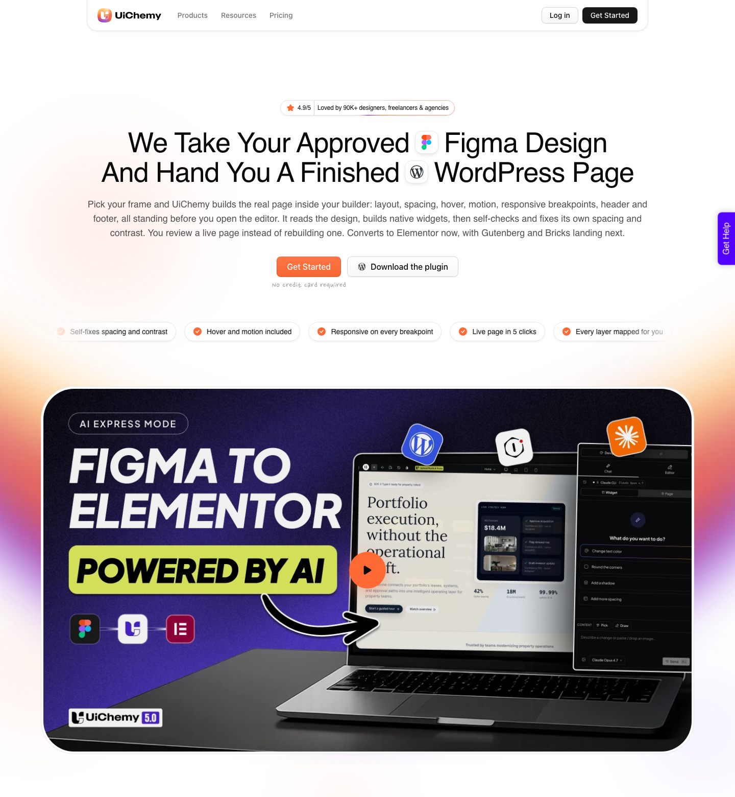
The reason this matters for WordPress specifically is that the styles travel. Figma colours and typography sync into Elementor as reusable globals, and in the Elementor v4 Atomic route they become variables and reusable classes rather than settings buried on each element.
Not everything crosses over, and the documented list is worth reading before you invent a token nobody can use. Colour comes across from variables and styles.
Typography carries font family, size, line height, weight, case, decoration and letter spacing. Padding, border, gap, radius and shadow each carry their own named subset.
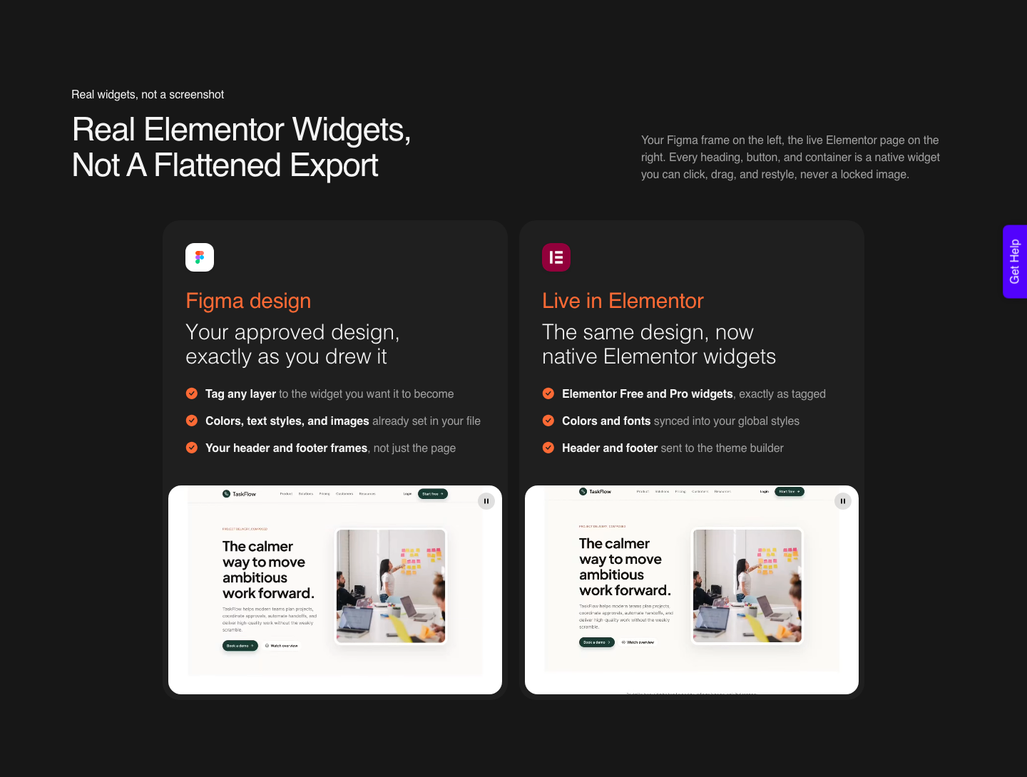
- Set text to auto height, always. Fixed height text overlaps its neighbours the moment the copy changes, and Elementor’s Heading widget has no height control to rescue it.
- Make space with gaps and padding, never with a stretched text box. This is the same rule stated the other way round, and it is the single most common cause of a converted page needing manual repositioning.
- Do not let layers overlap unless you mean it. Two overlapping layers arrive absolutely positioned, and every one of them has to be set back to relative by hand.
- Give vector paths a fill, not a stroke. Flatten works on fills, so run Outline Stroke first if the icon was drawn with a stroke colour.
- Draw dividers as a frame border. A line drawn as its own shape becomes its own element on the page. A border does not.
- Replace anything using a blend mode. Blend modes do not carry across, so export that layer as an image and place the image instead.
What Actually Happens at Handoff
Handoff used to mean a developer opening your file and rebuilding it. That manual rebuild is the real competitor to any tool here, and it is why wireframe discipline pays.
A structured file converts. An unstructured one gets rebuilt by hand whatever tool you point at it.
UiChemy runs two modes from the same plugin on the Figma route. AI Express Mode reads every layer without tagging, builds the page, and fixes spacing and contrast, and it outputs to Elementor today with Gutenberg and Bricks marked as coming.
Classic Mode has you tag layers yourself and covers Elementor, Elementor v4 Atomic, Gutenberg, Bricks, Nexter Blocks, GenerateBlocks, Spectra and Kadence right now.
If you last looked at this before September 2026, the Figma frame is now one of four starting points. AI Website Creator turns a prompt or a client brief into a sitemap and a whole site.
UiChemy Composer is one widget you drop into Elementor once, after which AI writes real editable HTML, CSS and JavaScript by prompt. AI to WordPress moves an existing Lovable, Claude, Bolt or v0 build across, through Composer.
That matters here for one reason. If a section is easier to describe in a sentence than to draw, you no longer have to draw it.
Wireframe the structure, convert the frame, then let Composer write the awkward interactive block. Both routes land in the same Elementor page.
Expectations should be set from a customer’s words rather than a marketing page. A verified reviewer describes it as handling “about 70% of the design work and leaves the remaining 30% for us to fine-tune using Elementor”.
The UiChemy checklist doc puts the same idea in a range: it states plainly that it cannot guarantee 100% conversion accuracy, and that with proper design practices you can expect between 85% and 99%. Anyone quoting 100% has not converted many real client files.
Three limits are worth knowing before you draw a tall page. Keep the design under 12,000 pixels tall, because past that the upload will not go through and the fix is to split the page or send a section with Copy to Clipboard.
Compress images to the size they will display. Run a live import on a connection you trust, because it holds open to your site until it finishes.
A Worked Sequence for One Marketing Page
Here is the order that keeps rework low, using a services page with a hero, three feature cards, a testimonial row and a contact block. The numbers are the ones the docs specify, not invented ones.
- Sketch the section order in FigJam, in grayscale. Argue about order here, where changing it costs a drag.
- Create the top level frame in Figma Design at a fixed width. Auto layout on, vertical, align top centre, all three padding and gap values at 0.
- Add one frame per section inside it, each set to fill container width and hug contents height. Five sections, five frames, no loose layers.
- Add micro auto layout inside each card, nav row and list item, not only on the page frame. Spacing drifts without it.
- Name your text styles and define your colours as variables now, while there are four of each rather than forty.
- Write the four responsive percentages for heading size, section padding, flex gap and line height. Four numbers, one row in your notes.
- Replace the grey boxes with real content. Set every text layer to auto height as you go.
- Lock image groups and masked groups so they arrive as one flat image, and leave vector icons as they are so they stay vectors.
- Delete hidden layers, empty frames and old drafts. Everything inside the frame converts, including what you cannot see.
- Convert, then tune the breakpoints in the Responsive Manager rather than in Figma.
Step nine is the one designers resist and the one that pays fastest. A file with three abandoned hero variants hidden behind the live one produces three heroes in the builder.
If you want the longer version of steps two through five, our design optimisation checklist lists all fifteen items with the reason behind each, and the auto layout documentation covers the frame settings in full.
Where This Approach Falls Down
No conversion route is free of edges, and the ones below are the ones that cost a real afternoon.
- Absolute positioning is contagious. Figma lets you place anything anywhere. The moment two layers overlap, both arrive absolutely positioned, and a page full of absolute elements is a page that breaks at the first breakpoint.
- Rotated vectors misbehave. The fix is Flatten, either in Figma or after import, and it is a manual step every time.
- Fonts have to be installed. A font that is not on the system will not render as you drew it.
- Icons can land off centre. The documented fix is a theme typography line height change, which is a site level setting rather than a per icon one.
- AI Express is Elementor only today. Gutenberg and Bricks are on the roadmap for that mode. Classic Mode covers them now.
- Very tall pages do not upload. The 12,000 pixel ceiling is a hard one, and a long homepage crosses it more often than you would expect.
What It Costs to Run This Pipeline
Conversions are counted in Credits, and both modes draw on the same monthly pool. There is a Free plan at $0 a month with 1,000 Credits and 1 Figma seat, which is enough to convert a real frame and see the output on your own site.
Designer is $9 a month for 4,000 Credits across 2 seats, Studio is $29 for 12,000 across 10 seats, and Agency is $49 for 20,000 across 50. Annual billing is advertised as two months free on every paid tier.
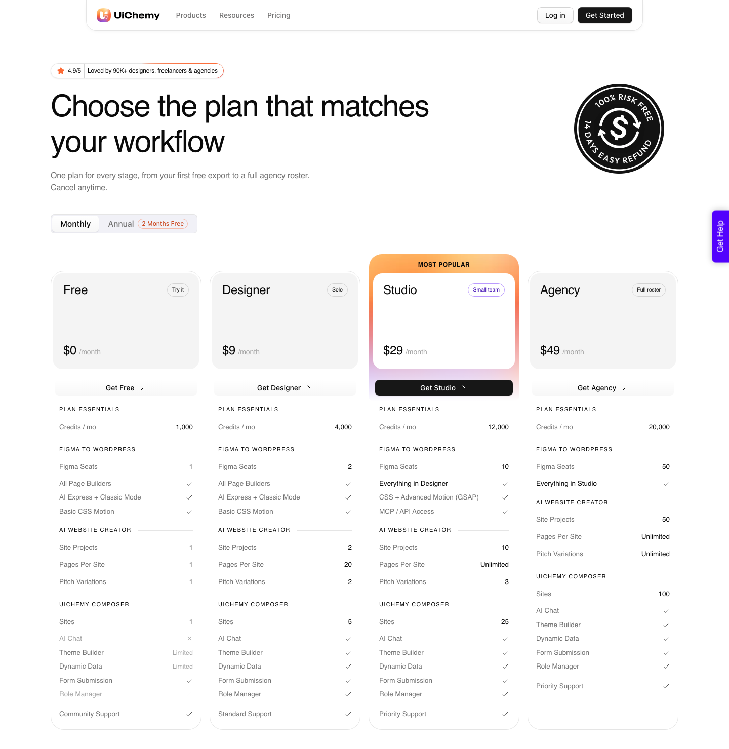
An AI Express conversion draws more Credits than a Classic one, which is worth knowing when you are converting the same page repeatedly during a revision cycle. Your balance refreshes every month, and if you run out before the refresh you can top up between refreshes.
The pricing page does not publish pack sizes or top-up prices, so do not budget against a number you read somewhere else. Every plan carries a 14-day money-back guarantee, and full detail sits on the pricing page.
Frequently Asked Questions
Should I wireframe in FigJam or in Figma Design?
Both, in that order. FigJam is where Figma points you for sketching flows, and it is deliberately loose.
Figma Design is the only place the top level frame, auto layout and fixed width exist, so that is where the structure has to live.
Do I need auto layout on a wireframe, or only on the final design?
On the wireframe. The top level frame needs it regardless, and adding it to the small pieces later means rebuilding the spacing you already decided.
The UiChemy checklist puts it plainly: auto layout should be used for every frame, with the main frame at a fixed width and inner sections set to fill.
Why did part of my design not arrive in WordPress?
The most likely reason is that it was sitting outside the top level frame or outside a section inside it. The documentation states that elements outside the container are ignored during export.
The second most likely reason is that the page was over 12,000 pixels tall, at which point the upload does not complete at all.
How responsive is the page when it lands?
The Responsive Manager documentation puts an Optimize mode export at roughly 90% responsive on most devices by default. The gap is closed in the breakpoint manager using percentage values, with a calculator for the arithmetic.
A verified reviewer puts the whole job at 70% done by the tool and 30% fine-tuned by hand in Elementor, which is the number I would plan against. Nobody in this category should be telling you 100%.
Can I wireframe a whole site rather than one page?
Yes, and the structural rules are the same per page. Build each page in its own top level frame with the same settings, share text styles and colour variables across all of them, and convert them one at a time.
Header and footer detection sends those to the theme builder, so you are not separating them by hand on every page.
The Short Version
Wireframe in grayscale, but wireframe in the real structure: one top level frame, auto layout vertical, align top centre, zeros on the outer padding and gap, fixed width, one frame per section.
Decide your four responsive percentages and your type and colour tokens before the file gets pretty. Then the handoff is a conversion rather than a rebuild.
More on the surrounding workflow in our pieces on designing websites in Figma and the Figma tutorial for website work.
Primary sources for this article: Figma’s wireframing page, Figma’s how to wireframe guide, Figma’s wireframe kits, the UiChemy auto layout and design checklist documentation, the Responsive Manager calculator doc, and the UiChemy pricing page, all fetched on 8 September 2026.