Custom Sections a Page Builder Cannot Do: Eight Ideas to Build With Composer
 Sagar Patel
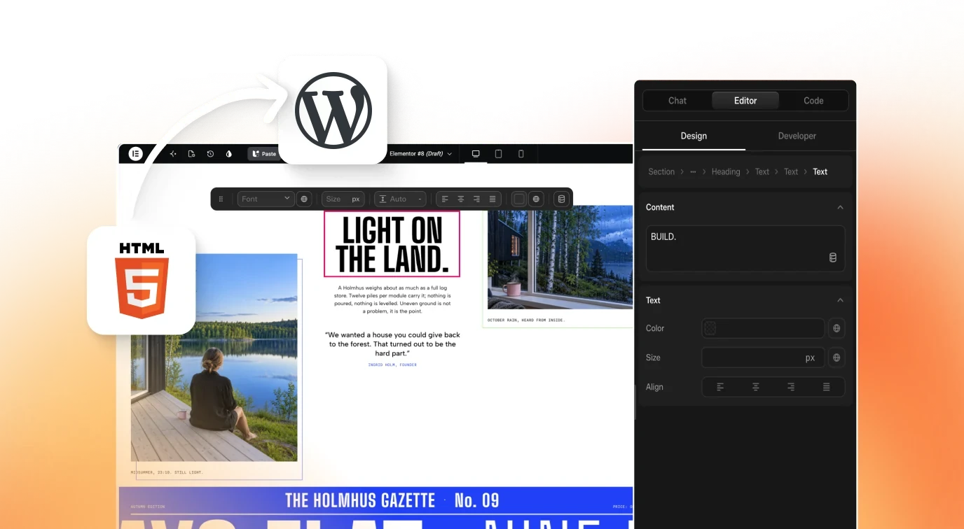
A custom Elementor section is a block of your own HTML, CSS and JavaScript placed inside a page, for layouts and behaviour that no ready-made widget offers. Good candidates are scroll timelines, comparison sliders, calculators and filterable grids. UiChemy Composer writes that code from a prompt and lets you edit it visually afterwards.
This post is a list of ideas, not a showcase of finished results. I have not tested all eight, and I say so on each one. If you want the background first, read how to write real HTML, CSS and JavaScript inside Elementor with AI, then come back for the ideas.
Why Widget Libraries Stop Short
A widget is a fixed shape with settings. You get the options its author thought of, and nothing beyond. That is fine for headings, buttons and image boxes. It stops working when the design asks for behaviour: something that reacts to scroll, to a slider value, or to a click on a filter chip.
The usual workaround is a stack of add-ons, each carrying its own CSS and scripts. You end up loading a library for one effect on one page. The other route is hiring someone to write a custom widget, which is slow for a single section.
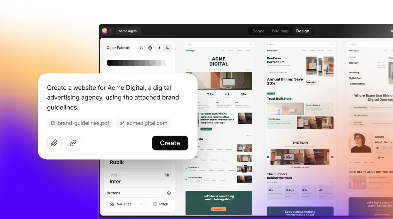
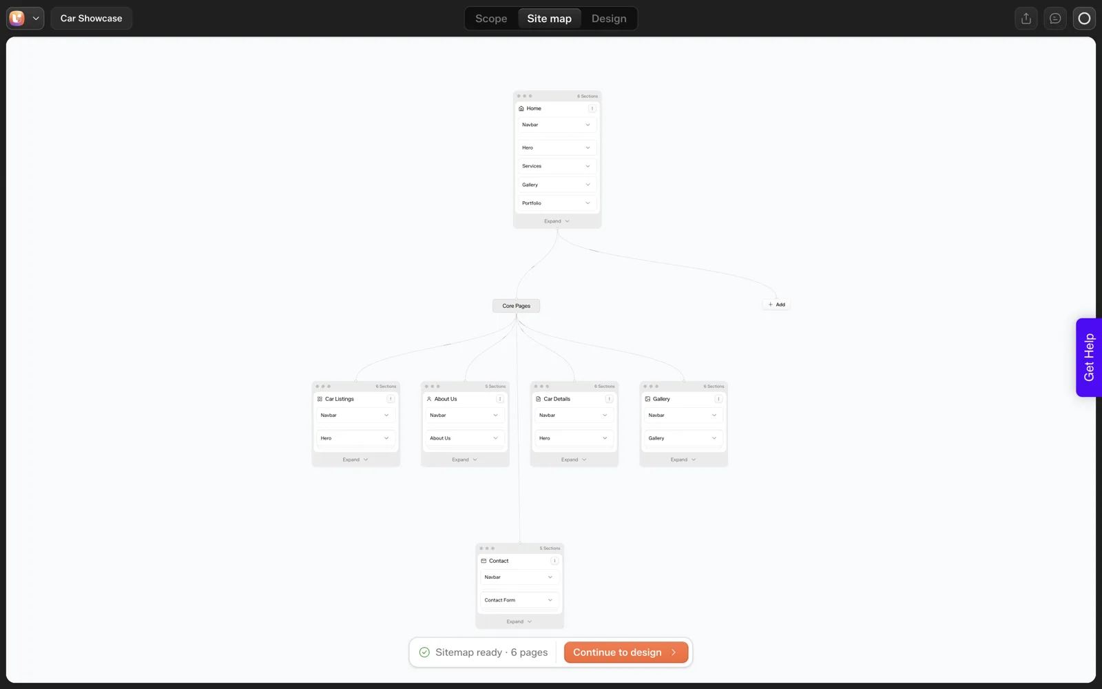
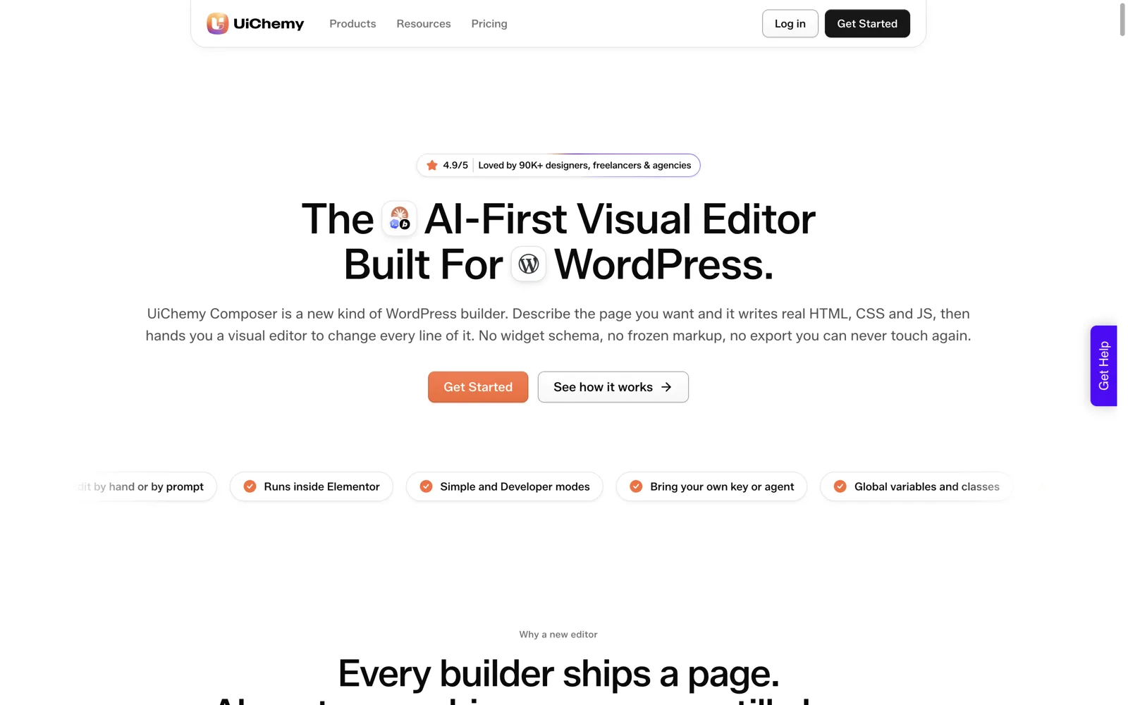
Composer takes a third route. You describe the section, it writes real HTML, CSS and JS, and you refine it in a visual editor. The Composer documentation explains the widget model, including the Editor and Code tabs.
Eight Section Ideas Worth Building
Each idea below needs behaviour that most widget packs do not cover well. I mark every one as an idea. None of these is a claim about a captured Composer output.
1. A scroll-driven timeline
A vertical line that fills as the visitor scrolls, with milestones that fade in. Useful for company history, process pages and roadmaps. It needs scroll position logic, which is exactly what static widgets lack. If you want the animation side in depth, see GSAP scroll animations in WordPress.
2. A before and after comparison slider
Two images stacked, with a draggable handle that reveals one over the other. Good for renovation, photography and design agencies. It needs pointer events and clipping.
3. A live cost calculator
Sliders or number fields that update a total in real time. Quote estimators, savings calculators, subscription size pickers. The maths is a few lines of JavaScript, but no widget will know your formula.
4. A sticky split-scroll feature showcase
Text on the left scrolls, while an image or demo on the right stays pinned and swaps as each point passes. Popular on SaaS pages.
5. A filterable portfolio grid
Filter chips above a grid, with items that hide and show without a page reload. Good for case studies and product ranges.
6. A logo marquee that pauses on hover
A continuous horizontal ticker for client logos. The detail that matters is respecting reduced motion preferences, which a prompt can ask for explicitly.
7. An SVG line-draw section
A path that draws itself as you scroll, connecting steps in a process. Needs stroke-dash animation tied to scroll progress.
8. An interactive pricing toggle
Monthly and annual switch that changes the displayed numbers across several cards. For the specific prompts, see a pricing table, tabs and a slider from one prompt each.
A Prompt Template for Any of Them
The quality of the output tracks the quality of the brief. This template forces the details that custom code needs: states, inputs, limits and accessibility. Copy it and fill the brackets.
Build a [section type] for a [kind of business] page.

Content:
- [exact headings, labels and button text]
- [number of items, and what each contains]

Behaviour:
- [what happens on scroll / click / hover / input]
- [what the default state looks like before any interaction]
- [what happens on touch devices]

Constraints:
- Use my site colours and fonts from the global variables.
- Respect prefers-reduced-motion: no movement if it is set.
- Every interactive element reachable and usable by keyboard.
- No external libraries unless I name one.
- Mobile layout: [stack / scroll / hide X].

Do not add sections or copy I did not list.
The last line matters. Models like to pad. Telling them not to saves a cleanup round.
How to Pick the First One
Do not start with the most impressive idea. Start with the one that fixes a real page. Ask three questions:
- Is there a page right now where a widget workaround looks awkward?
- Does the section carry a business goal, such as a quote request or a signup?
- Can you describe its behaviour in five sentences?
If the answers are yes, build it. A calculator or comparison slider usually wins, because it also gives visitors a reason to stay.
If your site uses Elementor v4, a designer’s introduction to atomic elements shows how the newer structure sits alongside custom code.
If you work with agencies or clients, pair it with the workflow for shipping a custom interaction as a designer, which covers sign-off.
What to Review Before It Goes Live
Generated code is code. Review it the way you would review a freelancer’s work. A short pass:
| Check | How |
|---|---|
| Keyboard | Tab through every control; focus must be visible |
| Reduced motion | Turn on the OS setting and reload |
| Mobile | Test at a narrow width and on a real phone |
| Empty and extreme states | Zero items, very long labels, maximum slider values |
| Page speed | Run PageSpeed Insights before and after adding it |
The full method is in keeping AI-written code clean. Composer scopes CSS so styles do not leak outside the widget, per the docs, which helps, but it does not replace testing.
When a Normal Widget Is the Better Choice
Custom code has a maintenance cost. If a standard accordion, tabs or icon box already does the job, use it. Your client can edit it without thinking, and it keeps working after updates.
Reach for a custom section when the behaviour itself is the point, or when the add-on route would load heavy scripts for a small effect. The comparison in Composer vs custom HTML widgets and code snippets spells out where each approach wins.
For what Elementor’s own AI generates and where it stops, see Elementor AI: what it generates and what it cannot.
What Does a Filled-In Prompt Look Like?
The template above is easier to trust when it is filled in. This is a brief for idea 3, the cost calculator, for a photography studio. The prices are placeholders for you to replace with real ones, and I have not run this prompt, so treat it as a draft to test.
Build a cost calculator for a photography studio page.
Content:
- Heading: "Estimate your shoot"
- Three inputs: shoot type (portrait, family, event), hours
  (1 to 8), and number of edited photos (10 to 100)
- Result line: "Estimated total: [amount]"
Behaviour:
- Total updates as any input changes.
- Default state: portrait, 2 hours, 20 photos, total shown.
- Prices: portrait [price] per hour, family [price] per hour,
  event [price] per hour, [price] per edited photo.
- On touch devices, use large tap targets.
Constraints:
- Use my site colours and fonts from the global variables.
- Respect prefers-reduced-motion.
- Every input reachable by keyboard, with visible labels.
- No external libraries.
- Mobile layout: stack inputs, result below.
Do not add sections or copy I did not list.
Notice the default state and the limits on every input. Those two lines stop the most common failure, a calculator that shows nothing or a nonsense total until someone types.
Which Idea Fits Which Kind of Business?
Eight ideas are too many to try at once, so match them to a business. This table is my own judgement and none of it is measured.
| Business | First idea to try | Why |
|---|---|---|
| Home renovation or interiors | Before and after slider | Visitors want to see the change |
| Consultant or service firm | Live cost calculator | It turns browsing into a quote request |
| SaaS product | Sticky split-scroll showcase | It walks through features in order |
| Agency or studio | Filterable portfolio grid | Case studies need sorting |
| Company with a long story | Scroll timeline | History reads as a sequence |
| Subscription business | Pricing toggle | Monthly and annual numbers change in one place |
Pick one row, build it on a staging site, and review it with the checklist above. For the pricing idea, this post has one prompt each for a pricing table, tabs and a slider.
Which Prompt Mistakes Waste the Most Time?
Custom section prompts fail in predictable ways. Each fix below adds one line to the brief.
| Mistake | What you get | Add this line |
|---|---|---|
| No default state | An empty or broken first view | “Before any interaction, show [state]” |
| No input limits | Odd totals, broken layout at extremes | “Hours from 1 to 8, photos from 10 to 100” |
| No mobile behaviour | A layout that overflows | “On a narrow screen, stack and scroll” |
| No reduced motion rule | Animation that ignores a user setting | “Respect prefers-reduced-motion” |
| Vague copy | Generic labels and filler text | Paste the exact headings and labels |
| Open-ended “make it nice” | Extra features you did not want | “Do not add anything I did not list” |
When the first result is close, edit it rather than starting again. Our guide to writing HTML, CSS and JavaScript inside Elementor shows the editing options.
FAQ
Can I add custom HTML, CSS and JavaScript to Elementor without a plugin?
Elementor has an HTML widget and a custom code area, so yes for simple cases. They give you a box to paste into, not a visual editor or scoped styles. Composer adds generation from a prompt and a visual editor on top of the code, which suits sections you will keep changing.
Do these eight ideas work in Gutenberg too?
Composer runs inside Elementor or Gutenberg, so the approach applies to both. The ideas are about behaviour, not builder. Test each in your own setup before promising it to a client, because I have not verified all eight on both.
Will custom sections slow my page down?
Not by default, but any script adds weight. A small calculator is light. A heavy animation library loaded for one effect is not. Measure with PageSpeed Insights before and after, and ask the prompt to avoid external libraries unless needed.
How specific should my prompt be?
More specific than feels natural. Give exact copy, item counts, default state and mobile behaviour. Vague prompts return generic sections. The template above exists to force those details, and the five-minute edit afterwards is much smaller when the brief was tight.
Are these ideas tested outputs?
No. They are ideas that need real code, and I have labelled them that way. Treat each as a brief to try, then review the result with the checklist before it goes near a client site.
When you are ready to try one, you can Get Started and run the first prompt on a staging site.
Every feature named in this post is listed by product: all UiChemy features, UiChemy Composer features.