





Figma Make Design Systems: Why Output Ignores Yours
 Sagar Patel
| What you supply | What the model can then do | What is still missing |
|---|---|---|
| Nothing | Guess an appearance | Everything structural |
| A screenshot of the design | Approximate the look | Exact colour and spacing values |
| Library style context | Use your colours and type | Components and usage rules |
| A guidelines file | Follow your standing rules | Real component code |
| A full Make kit | Build from your actual components | Figma Design frame structure |
Note the last row’s remaining gap. Even a perfect kit produces a code-backed build, and the frame structure a WordPress converter needs is a property of the Figma Design file you paste into afterwards.
How Figma Says to Write Token Guidelines
When library styles go into a kit, Figma adds an empty guidelines file alongside them and publishes six best practices for filling it in. They are worth reading closely, because every one of them is a description of a way generated output goes wrong.
The first is to explain the quirks of your tokens before anything else. Figma’s example is a spacing token that equals 16 rather than 16px, so a rule that writes it straight into CSS produces an invalid declaration and every line after it is quietly broken.
Format-level details go at the top of the file, ahead of any advice about which token to use where.
The second is to organise tokens around decisions rather than around your CSS file’s structure. Someone building a card wants a background colour for a card, not 200 variables in alphabetical order, and Figma says the model reads the same way.
- Give typography its own section, because family, size, weight, line height and letter spacing are enough properties that improvisation starts as soon as the picture is incomplete. Figma recommends a table listing every class with its properties and a note on when to use it.
- Create a clear priority between semantic tokens and raw palette values, so that names carrying meaning are the first choice and raw colours are the fallback for cases nothing semantic covers.
- Tell Figma Make what not to do. The documented examples are blunt: do not use the brand colour as a page background, do not hardcode pixel values when a spacing token exists, do not pair dark text with dark backgrounds.
- Include a code snippet for any token that has to be composed. Shadows are the example Figma gives, where offset, blur, spread and colour live in separate variables and have to be stitched into one declaration.
The third bullet is the one I would write first. Listing what exists is necessary and insufficient, because a model given the blocks but no rule about how not to combine them still reaches for a literal when nothing on the list obviously answers its question.
Writing Guidelines That Actually Bind
Guidelines are the cheapest of the three parts and the one people write worst. Figma describes them as instructions for how Make should behave in coding and personality and how to use things like style context, so anything you would otherwise retype belongs there.
The failure is rarely absence. It is vagueness.
Figma’s template models the level of detail that works, documenting a Button component by purpose, visual style and usage for each of primary, secondary and tertiary variants, with rules such as one primary button per section.
A rule the model can check itself against is worth ten rules about brand feeling, and the same test applies to the prompt you type on top of it.
There is a ceiling, and Figma writes it into the first line of the template: more context is not always better and can confuse the model.
You can upload several markdown files into the guidelines folder, and Figma’s own advice is to audit them for conflicting information and to state inside the guidelines how Make should use each file.
You can also ask Make to analyse your packages and library styles and draft the guidelines for you, which spends AI credits and can take a few minutes.
# Design system guidelines

Layout
- Use flexbox and grid. Absolute positioning only where genuinely required.
- Page structure is one vertical stack of full-width sections.
- Spacing uses the 8px scale only. Never introduce an intermediate value.

Colour
- Use variables from the library. Never write a literal hex value.
- Semantic tokens first. Raw palette values only where nothing semantic fits.

Buttons
- Primary: one per section, filled with the primary brand colour.
- Secondary: outlined, transparent background, for supporting actions.
- Tertiary: text only, no border, for the least important actions.
The two lines that matter most for anything reused downstream are the spacing scale and the never-write-a-literal-hex rule. Both are checkable, both are violated by default, and both are invisible in a screenshot of the result.
What Survives the Trip to Figma Design
If the layout is going to WordPress, it usually passes through Figma Design first via the Copy design feature, which Figma says is available on all paid plans.
The same article states plainly that the pasted layers are not automatically tied to your design system, which is the sentence that surprises people who did the kit work properly.
There is one exception and it has a precondition. Figma says any available variables in the file will be matched and bound to layers, and the documented step order puts adding a library containing those variables before pasting.
Do it in that order and variables bind. Do it afterwards and they do not.
Two more limits sit in the same article. The pasted layers keep no link back to the Make file, so edits in Figma Design never reach the prototype, and they are not interactive, being a snapshot of one preview state rather than the running app.
Components do not come across as instances at all. Whatever the kit contained, the pasted result is layers, so swapping in real components is manual work in the destination file.
That is worth budgeting for rather than discovering.
The full sequence for that handover, including the order the variable library has to be added in, is covered in our post on getting editable layers back from Figma Make.
Why This Decides the WordPress Result
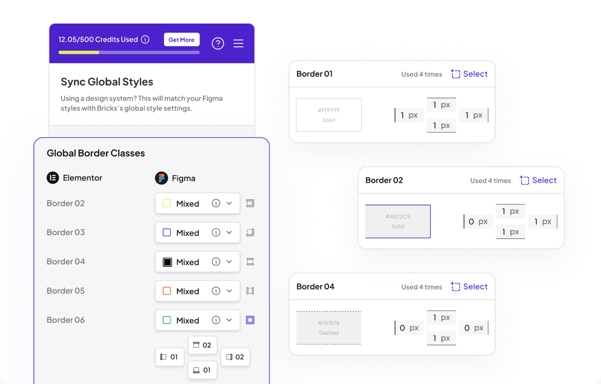
A converter reads the file, not the render. That is the point where a generated build stops being Figma’s problem and becomes yours, and it is where UiChemy picks the work up.
The Figma route is one of four ways into the same engine: an approved Figma design, a prompt or client brief through AI Website Creator, a section written by prompt through Composer, or an existing AI build moved across through AI to WordPress.
All four land in the same place, which is native, editable WordPress in the builder the site already runs.
For a Figma file that came out of Make, the relevant route is the first one, and what it consumes is references. Classic Mode reads the design and outputs to Elementor, Elementor v4 Atomic, Gutenberg, Bricks, Nexter Blocks, GenerateBlocks, Spectra and Kadence.
AI Express Mode does the same work without layer tagging and outputs to Elementor today, with Gutenberg and Bricks still on the roadmap.
Hand either mode literals and there is nothing to map. The page still arrives and still looks correct, and the client’s brand colour is now written into forty widgets individually instead of sitting in one global setting.
The cost appears the first time that colour changes.
Layout is the same story with different vocabulary.
The auto layout documentation asks for one top level frame with auto layout enabled, vertical layout, align top centre, horizontal padding, vertical padding and vertical gap all at zero, and a fixed width, with sections stacked inside it.
It notes that enabling auto layout is what carries CSS flexbox behaviour into the exported template, and that anything placed outside the container is ignored during export.
| In the Figma file | What conversion produces | If it is a literal instead |
|---|---|---|
| Bound colour variable | An Elementor global colour | The hex repeated per widget |
| Text style from a library | Global typography | Per-widget font settings |
| Auto layout on a section | Flexbox behaviour in the template | Fixed positions that resist breakpoints |
| Section inside the top level frame | A converted section | Ignored during export |
| Few nested frames | A page that is pleasant to edit | Deep nesting to unpick in Elementor |
The right-hand column is not a list of errors. It is a list of pages that work and cost more to maintain, which is the most common and least visible outcome of skipping the system work upstream.
The output is real editable widgets rather than a flat export: the marquee slides, the accordion opens, and every block stays a WordPress element you can change visually, in code, or by prompt. That is what makes a global colour swap one edit instead of a sweep.
The Honest Limits
Make kits are gated. Figma states they are available to Full seats on paid plans, so a solo designer on the free Starter plan cannot build one, and a Full seat on Professional is $16 a month.
Figma also warns that npm packages or libraries containing a high volume of assets may take a few minutes to import into a kit, which matters when you are testing rather than shipping.
Guidelines are not a guarantee either. They are context, and context influences a model rather than constraining it.
Reviewing the output against your own rules remains part of the job, and Figma’s suggestion to audit multiple markdown files for conflicting information exists because conflicts happen.
The conversion side has limits worth naming in the same breath, and the plan comparison is where the tier-specific ones live. AI Express outputs to Elementor today and not yet to Gutenberg or Bricks.
AI Website Creator exports to Elementor, with Gutenberg export marked Soon on every plan including Agency. Composer runs inside Elementor.
Responsiveness is handled automatically and then tuned in the responsive manager, and a verified reviewer’s estimate of roughly 70% of the design work handled with 30% left to fine-tune is the realistic expectation to hold.
On cost, the Free plan is $0 a month with 1,000 credits, one Figma seat and one Composer site, which is enough to find out whether your file converts before spending anything. Paid plans start at $9.
The refund window is 14 days.
Questions People Ask About Figma Make Design Systems
Why does Make ignore my design system?
Usually because it was given a palette rather than a system. Library style context supplies colours and type.
Components, tokens and usage rules arrive through a Make kit and a guidelines file, which are separate mechanisms with separate rows on Figma’s pricing table.
Will a Make kit stop hard-coded spacing?
It helps, and a guidelines rule helps more. State the spacing scale explicitly and forbid intermediate values.
Figma’s own best practice list includes telling Make not to hardcode pixel values when a spacing token exists, which tells you what the default behaviour is.
Do my variables survive into Figma Design?
Only if a library containing them is already in the destination file when you paste. Figma matches and binds available variables at paste time.
Components do not come across as instances at all, and the pasted layers keep no link back to the Make file.
Does any of this matter if the page looks correct?
It matters the first time something changes. A literal value looks identical to a token until the token moves, and on a WordPress page that difference is one global setting versus dozens of individual widget overrides.
Is it faster to rebuild the file by hand?
Rarely, but restructuring is usually faster than correcting the converted page. Fixing the frame hierarchy and binding colours once in Figma is cheaper than repairing the same values across widgets in the editor afterwards.
What to Take From This
Generated output converges on your appearance and skips your references, and Figma’s own starter guidelines admit which way the default leans.
The fix has three named parts, all documented: a Make kit for components and library variables, a guidelines file for standing rules, and library style context for colour and type.
Do that work and the page that reaches WordPress carries global colours and typography instead of forty copies of the same hex code. Skip it and you still get a page that looks right, which is exactly why the problem goes unnoticed until the first change request.
Open the generated page and it is your brand. The blue is your blue, the heading sizes look like the ones in your kit, the buttons have the right corner radius.
Then you select a card, and the padding is 26 pixels because that is what the model chose, and the colour is a literal hex value that happens to match your token rather than a reference to it.
That is the failure mode worth naming precisely. Figma Make output routinely looks right and is built wrong, and the difference only becomes expensive when something downstream needs to read the structure.
This post covers why that happens, what Figma provides to fix it, and what it costs you at the WordPress end if you skip the fix. Checked against Figma’s help centre and pricing page on 8 September 2026.
Looks Right, Built Wrong
A design system is a set of references. A colour is a variable, a spacing step is a token, a button is an instance of a component.
Visual fidelity is what those references produce, but it is not the same thing as having them, and a model optimising for appearance will reach the appearance by the shortest route available.
The shortest route is a literal. A hard-coded 26 pixel gap renders identically to a token that resolves to 24, right up until someone changes the token.
One-off colour values render identically to bound variables, right up until a rebrand, a dark mode, or a converter that was going to map those variables to global styles.
None of this is a defect report. It is the predictable output of asking for a result rather than a construction, and Figma clearly knows it.
What Figma Tells Its Own Model
Every Figma Make file ships with an empty guidelines file and, helpfully, the template contents are published in Figma’s guidelines documentation.
The first general rule in that template reads: only use absolute positioning when necessary, and opt for responsive and well structured layouts that use flexbox and grid by default.
Read that as a confession rather than a tip. You do not write a standing instruction against absolute positioning unless absolute positioning is what happens by default.
Figma is telling you, in its own starter file, which way the output leans when nobody says otherwise.
The same template’s design system section is equally concrete about the kind of rule that works, offering examples such as using a base font size of 14 pixels, capping a bottom toolbar at four items, requiring chips in sets of three or more, and avoiding a dropdown where there are two or fewer options.
These are constraints on construction, not descriptions of a look.
Style Context Is Not a Design System
Figma offers several things that sound like the same feature and are not. Library styling context is one, and it has its own row under Figma Make on the pricing page.
Packaging your design system into reusable AI context is a separate row on that same table, called Make kits.
Style context gives the model your colours and type to work from. It does not give it your components, your usage rules, or the code your engineers actually ship.
A build made from style context alone will be on-brand and still constructed from scratch every time.
That distinction is the whole reason people feel their system was ignored. It was not ignored, it was never fully supplied, because the thing they attached was a palette rather than a system.
Make Kits Are the Actual Answer
A Make kit is Figma’s mechanism for supplying a whole system rather than a palette. According to Figma’s Make kits documentation, a kit can include npm packages for code context, variables and styles from published Figma Design libraries, and guidelines that teach Make how to use those assets.
Those three parts map onto the three things that go missing. The npm package supplies real components, the library supplies real variables, and the guidelines supply the rules about when each one is correct.
Figma’s stated goal for the feature is that a team can build things realistic to how the product looks and functions without adding code and style context from scratch each time.
Setup is six documented steps rather than a switch: start a kit from Settings, assemble it from existing packages and library styles or build from scratch, add custom configurations, write guidelines, test it by prompting it to build something, then publish.
A kit cannot be published from a drafts folder, and organisation admins can approve published kits and enable them by default.
| What you supply | What the model can then do | What is still missing |
|---|---|---|
| Nothing | Guess an appearance | Everything structural |
| A screenshot of the design | Approximate the look | Exact colour and spacing values |
| Library style context | Use your colours and type | Components and usage rules |
| A guidelines file | Follow your standing rules | Real component code |
| A full Make kit | Build from your actual components | Figma Design frame structure |
Note the last row’s remaining gap. Even a perfect kit produces a code-backed build, and the frame structure a WordPress converter needs is a property of the Figma Design file you paste into afterwards.
How Figma Says to Write Token Guidelines
When library styles go into a kit, Figma adds an empty guidelines file alongside them and publishes six best practices for filling it in. They are worth reading closely, because every one of them is a description of a way generated output goes wrong.
The first is to explain the quirks of your tokens before anything else. Figma’s example is a spacing token that equals 16 rather than 16px, so a rule that writes it straight into CSS produces an invalid declaration and every line after it is quietly broken.
Format-level details go at the top of the file, ahead of any advice about which token to use where.
The second is to organise tokens around decisions rather than around your CSS file’s structure. Someone building a card wants a background colour for a card, not 200 variables in alphabetical order, and Figma says the model reads the same way.
- Give typography its own section, because family, size, weight, line height and letter spacing are enough properties that improvisation starts as soon as the picture is incomplete. Figma recommends a table listing every class with its properties and a note on when to use it.
- Create a clear priority between semantic tokens and raw palette values, so that names carrying meaning are the first choice and raw colours are the fallback for cases nothing semantic covers.
- Tell Figma Make what not to do. The documented examples are blunt: do not use the brand colour as a page background, do not hardcode pixel values when a spacing token exists, do not pair dark text with dark backgrounds.
- Include a code snippet for any token that has to be composed. Shadows are the example Figma gives, where offset, blur, spread and colour live in separate variables and have to be stitched into one declaration.
The third bullet is the one I would write first. Listing what exists is necessary and insufficient, because a model given the blocks but no rule about how not to combine them still reaches for a literal when nothing on the list obviously answers its question.
Writing Guidelines That Actually Bind
Guidelines are the cheapest of the three parts and the one people write worst. Figma describes them as instructions for how Make should behave in coding and personality and how to use things like style context, so anything you would otherwise retype belongs there.
The failure is rarely absence. It is vagueness.
Figma’s template models the level of detail that works, documenting a Button component by purpose, visual style and usage for each of primary, secondary and tertiary variants, with rules such as one primary button per section.
A rule the model can check itself against is worth ten rules about brand feeling, and the same test applies to the prompt you type on top of it.
There is a ceiling, and Figma writes it into the first line of the template: more context is not always better and can confuse the model.
You can upload several markdown files into the guidelines folder, and Figma’s own advice is to audit them for conflicting information and to state inside the guidelines how Make should use each file.
You can also ask Make to analyse your packages and library styles and draft the guidelines for you, which spends AI credits and can take a few minutes.
# Design system guidelines

Layout
- Use flexbox and grid. Absolute positioning only where genuinely required.
- Page structure is one vertical stack of full-width sections.
- Spacing uses the 8px scale only. Never introduce an intermediate value.

Colour
- Use variables from the library. Never write a literal hex value.
- Semantic tokens first. Raw palette values only where nothing semantic fits.

Buttons
- Primary: one per section, filled with the primary brand colour.
- Secondary: outlined, transparent background, for supporting actions.
- Tertiary: text only, no border, for the least important actions.
The two lines that matter most for anything reused downstream are the spacing scale and the never-write-a-literal-hex rule. Both are checkable, both are violated by default, and both are invisible in a screenshot of the result.
What Survives the Trip to Figma Design
If the layout is going to WordPress, it usually passes through Figma Design first via the Copy design feature, which Figma says is available on all paid plans.
The same article states plainly that the pasted layers are not automatically tied to your design system, which is the sentence that surprises people who did the kit work properly.
There is one exception and it has a precondition. Figma says any available variables in the file will be matched and bound to layers, and the documented step order puts adding a library containing those variables before pasting.
Do it in that order and variables bind. Do it afterwards and they do not.
Two more limits sit in the same article. The pasted layers keep no link back to the Make file, so edits in Figma Design never reach the prototype, and they are not interactive, being a snapshot of one preview state rather than the running app.
Components do not come across as instances at all. Whatever the kit contained, the pasted result is layers, so swapping in real components is manual work in the destination file.
That is worth budgeting for rather than discovering.
The full sequence for that handover, including the order the variable library has to be added in, is covered in our post on getting editable layers back from Figma Make.
Why This Decides the WordPress Result
A converter reads the file, not the render. That is the point where a generated build stops being Figma’s problem and becomes yours, and it is where UiChemy picks the work up.
The Figma route is one of four ways into the same engine: an approved Figma design, a prompt or client brief through AI Website Creator, a section written by prompt through Composer, or an existing AI build moved across through AI to WordPress.
All four land in the same place, which is native, editable WordPress in the builder the site already runs.
For a Figma file that came out of Make, the relevant route is the first one, and what it consumes is references. Classic Mode reads the design and outputs to Elementor, Elementor v4 Atomic, Gutenberg, Bricks, Nexter Blocks, GenerateBlocks, Spectra and Kadence.
AI Express Mode does the same work without layer tagging and outputs to Elementor today, with Gutenberg and Bricks still on the roadmap.
Hand either mode literals and there is nothing to map. The page still arrives and still looks correct, and the client’s brand colour is now written into forty widgets individually instead of sitting in one global setting.
The cost appears the first time that colour changes.
Layout is the same story with different vocabulary.
The auto layout documentation asks for one top level frame with auto layout enabled, vertical layout, align top centre, horizontal padding, vertical padding and vertical gap all at zero, and a fixed width, with sections stacked inside it.
It notes that enabling auto layout is what carries CSS flexbox behaviour into the exported template, and that anything placed outside the container is ignored during export.
| In the Figma file | What conversion produces | If it is a literal instead |
|---|---|---|
| Bound colour variable | An Elementor global colour | The hex repeated per widget |
| Text style from a library | Global typography | Per-widget font settings |
| Auto layout on a section | Flexbox behaviour in the template | Fixed positions that resist breakpoints |
| Section inside the top level frame | A converted section | Ignored during export |
| Few nested frames | A page that is pleasant to edit | Deep nesting to unpick in Elementor |
The right-hand column is not a list of errors. It is a list of pages that work and cost more to maintain, which is the most common and least visible outcome of skipping the system work upstream.
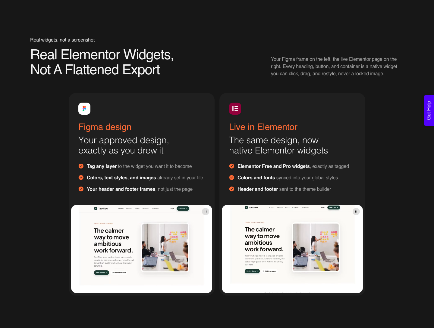
The output is real editable widgets rather than a flat export: the marquee slides, the accordion opens, and every block stays a WordPress element you can change visually, in code, or by prompt. That is what makes a global colour swap one edit instead of a sweep.
The Honest Limits
Make kits are gated. Figma states they are available to Full seats on paid plans, so a solo designer on the free Starter plan cannot build one, and a Full seat on Professional is $16 a month.
Figma also warns that npm packages or libraries containing a high volume of assets may take a few minutes to import into a kit, which matters when you are testing rather than shipping.
Guidelines are not a guarantee either. They are context, and context influences a model rather than constraining it.
Reviewing the output against your own rules remains part of the job, and Figma’s suggestion to audit multiple markdown files for conflicting information exists because conflicts happen.
The conversion side has limits worth naming in the same breath, and the plan comparison is where the tier-specific ones live. AI Express outputs to Elementor today and not yet to Gutenberg or Bricks.
AI Website Creator exports to Elementor, with Gutenberg export marked Soon on every plan including Agency. Composer runs inside Elementor.
Responsiveness is handled automatically and then tuned in the responsive manager, and a verified reviewer’s estimate of roughly 70% of the design work handled with 30% left to fine-tune is the realistic expectation to hold.
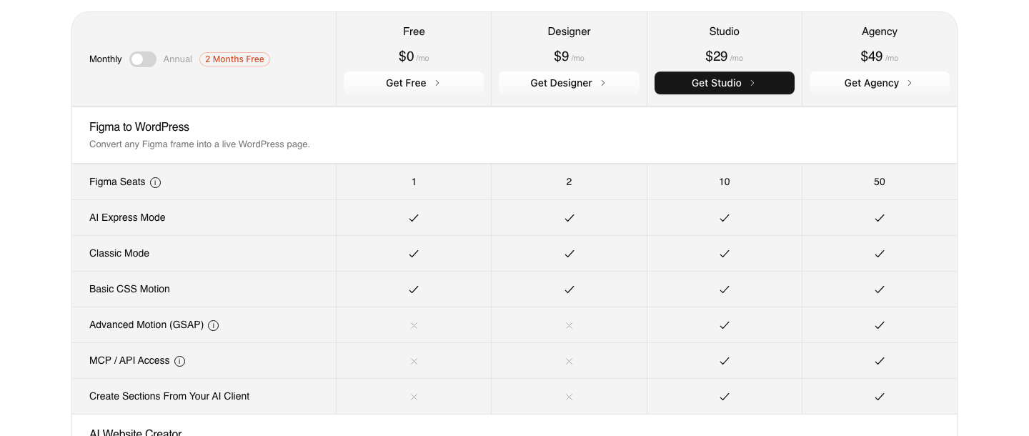
On cost, the Free plan is $0 a month with 1,000 credits, one Figma seat and one Composer site, which is enough to find out whether your file converts before spending anything. Paid plans start at $9.
The refund window is 14 days.
Questions People Ask About Figma Make Design Systems
Why does Make ignore my design system?
Usually because it was given a palette rather than a system. Library style context supplies colours and type.
Components, tokens and usage rules arrive through a Make kit and a guidelines file, which are separate mechanisms with separate rows on Figma’s pricing table.
Will a Make kit stop hard-coded spacing?
It helps, and a guidelines rule helps more. State the spacing scale explicitly and forbid intermediate values.
Figma’s own best practice list includes telling Make not to hardcode pixel values when a spacing token exists, which tells you what the default behaviour is.
Do my variables survive into Figma Design?
Only if a library containing them is already in the destination file when you paste. Figma matches and binds available variables at paste time.
Components do not come across as instances at all, and the pasted layers keep no link back to the Make file.
Does any of this matter if the page looks correct?
It matters the first time something changes. A literal value looks identical to a token until the token moves, and on a WordPress page that difference is one global setting versus dozens of individual widget overrides.
Is it faster to rebuild the file by hand?
Rarely, but restructuring is usually faster than correcting the converted page. Fixing the frame hierarchy and binding colours once in Figma is cheaper than repairing the same values across widgets in the editor afterwards.
What to Take From This
Generated output converges on your appearance and skips your references, and Figma’s own starter guidelines admit which way the default leans.
The fix has three named parts, all documented: a Make kit for components and library variables, a guidelines file for standing rules, and library style context for colour and type.
Do that work and the page that reaches WordPress carries global colours and typography instead of forty copies of the same hex code. Skip it and you still get a page that looks right, which is exactly why the problem goes unnoticed until the first change request.