The Figma Make Prompts That Produce Usable Layouts
 Sagar Patel
The first prompt produces something that looks close. The next eleven prompts are spent moving a card, fixing a colour, and asking why the spacing changed on a section you did not mention.
Each of those eleven costs AI credits, and none of them were necessary.
Figma publishes its own prompting guidance, and the useful parts are specific enough to copy.
This post works through what Figma recommends, adds the one constraint that matters if the layout is eventually going to a WordPress site, and shows where a standing rule belongs instead of a prompt. Checked against Figma’s help centre on 8 September 2026.
The Prompt Shape Figma Recommends
Figma’s guidance in Create a Figma Make file gives the structure in one line: task, context, constraints. Say what you are building and who it is for before you describe details, and put constraints such as platform requirements or accessibility needs up front rather than discovering them in a revision.
The reason is mechanical rather than stylistic. Figma’s own explanation is that being specific gives the model fewer opportunities to make assumptions, and makes it less likely to proactively add features you did not intend.
Every unintended feature is a prompt spent removing it.
Figma’s documented contrast between a weak and a strong prompt is worth reading as a pattern rather than an example. The weak version names a category of thing.
The strong version enumerates what you must be able to do with it.
Weak
Create an app I can take notes in.

Strong
Build a note-taking app. I want to be able to:
1. Name a file.
2. Add and edit text.
3. Format the text, such as bold, italics, and strikethrough.
4. Add links to text.
5. Save the file in markdown format.
The strong version is not longer for the sake of it. Five numbered requirements is five things the model does not have to guess, and five things you will not be correcting in a follow-up.
Attaching a Design Without Wasting the Prompt
The attachment documentation is the part of Figma’s guidance people skim, and it contains the instruction that matters most for reusable output: in designs, use auto layout where possible, because the model reads the flow of content from it.
A frame built with auto layout gives relationships between elements rather than coordinates, and those relationships are what survives into anything downstream.
Be careful about what an image attachment promises. Figma says the model reads an image and uses it to guide layout, colours and positioning, doing its best to replicate text, colours and element positions, and that the result may still differ from the original.
So if you want a faithful rebuild rather than a mood board, the documented fix is to say which one you mean: state in the prompt whether the attachment is an exact 1:1 build or a style reference.
Volume is the other half of it. Figma Make takes up to 10 files per prompt, and the file’s total attachment ceiling is 30 on Starter and Education plans against 500 on Professional, Organization and Enterprise.
Text and code attachments do not count toward that per-file limit.
Attaching anything can increase the credits a prompt uses, so the cheap habit is fewer, smaller, more deliberate attachments.
Figma’s stated order of work is worth copying verbatim: prompt for the layout first and add functionality afterwards, work in steps rather than one end-to-end description, and when the designs are complex attach them frame by frame rather than all at once.
With multiple screens, one or two attachments at a time gives the closest rebuild.
| Attachment | Documented size limit | What it is good for |
|---|---|---|
| Figma design file | Pasted as a link | Layout the model can read as flow, if auto layout is on |
| Image, JPEG PNG GIF SVG | 25MB on Starter, 50MB on paid plans, SVG capped at 1MB | Reference or an asset to embed, with results that may differ |
| Text or code, including .md .csv .json .tsx | 1MB | Real content and data, and it does not count to the file’s attachment cap |
| 5MB | Brand guidelines or a PRD, read as reference and never embedded | |
| Spreadsheet or presentation | 20MB | Data and slide content pulled into the build |
| Video or audio, Make only | 50MB | Embedding only. Figma says the model cannot analyse the content |
Write the Layout Constraint Nobody Writes
Most prompt advice concerns what the thing should do. Almost none concerns how it should be built, which is the property that decides whether the output can be reused anywhere else.
Figma actually supplies the wording for you, in the default guidelines file that ships with every Make file.
That template’s first general rule reads: only use absolute positioning when necessary, and opt for responsive and well structured layouts that use flexbox and grid by default. It is a build instruction rather than a design instruction, and it is the one that keeps a generated layout from being a stack of pinned boxes.
Add your own version of that rule and be equally concrete. Naming a base font size, a spacing scale and a container width costs one sentence each and removes the most common category of correction.
Build the marketing homepage for a two-person accounting firm.

Layout rules:
- Use flexbox and grid. Only use absolute positioning where it is genuinely required.
- One vertical stack of full-width sections, no overlapping elements.
- Base font size 16px. Spacing scale in multiples of 8px.
- Content container is 1200px wide, centred.

Sections, in order: hero, three services, two testimonials, contact form.
The vertical stack line is doing quiet work. A single column of full-width sections is the structure a WordPress converter expects, and asking for it at generation time is free, while restructuring for it afterwards is not.
Put Standing Rules in Guidelines, Not in Prompts
Every Make file gets a guidelines.md file, and Figma’s guidelines documentation describes it as instructions for how you want Make to behave in terms of coding and personality, and how to use things like style context. Figma states that Make reads it automatically as part of its context on every prompt.
That changes where a rule should live. Anything you would otherwise retype every session belongs in the file, not the prompt box.
Figma’s own credits guidance says the same in the other direction: do not repeat context you have already provided through a Make kit, a guidelines file or an MCP connector, because the model already has access to it.
There is a ceiling on this, and Figma writes it into the template itself: more context is not always better, and it can confuse the model.
Its credit guidance is more specific still, recommending a parent guidelines file that points to smaller task-specific files, removing anything already covered by a package or library, and asking Make to critique the file for redundancy, inconsistent naming and vague instructions.
Once the file is solid, edit it by hand rather than regenerating it, because regeneration spends credits.
Where Each Instruction Belongs
Once you accept that guidelines, kits and prompts are different slots, most prompt bloat disappears. The question stops being how to phrase something and becomes where to put it.
| Kind of instruction | Where it belongs | Why |
|---|---|---|
| Brand rules that never change | guidelines.md | Read automatically on every prompt |
| Components, tokens and package context | A Make kit | Bundles npm packages and library styles |
| What this specific build is and does | The first prompt | It sets the direction for everything after |
| A colour or padding tweak on one element | Point-and-edit or direct code edit | Bypasses the model entirely |
| A structured approach to a complex build | Plan mode | Writes a reviewable plan before any code |
| An API key or personal data | Nowhere in the chat | Figma says to add a backend instead |
The point-and-edit row deserves emphasis because it is the cheapest habit on the list.
Figma’s guidance is to select an element in the preview and adjust properties such as colours, padding, margins and text directly, or attach an annotation that anchors an instruction to one part of the preview, before writing a broad revision prompt.
Both keep the model focused on the right part of the build and reduce unnecessary regeneration.
That is the same instinct as fixing a single section in the page builder rather than reconverting a page. If you are weighing Make against other prompt-to-app tools on exactly this kind of edit loop, our comparison of Figma Make alternatives covers how the others handle it.
The last row is a security instruction rather than a quality one. Figma’s documented pattern is to ask for the mechanism instead of supplying the secret, as in requesting an input box where a key can be pasted rather than pasting the key into the chat.
The Three Moments That Waste Credits
Figma’s credit optimisation guidance names three high-impact moments, and all three are prompting decisions.
An unscoped first prompt, because it sets the direction for everything that follows. The wrong model for the job, because a heavier model than the task requires costs more than necessary.
The third is the one nobody expects. As prompt history accumulates in a file, Make has more context to process on every prompt, even when the prompt itself is simple.
Figma’s advice is to start fresh when you no longer need the old context, and to duplicate an existing file rather than regenerate a foundation, because duplicating costs no credits.
Plan mode reverses the usual instinct about cost. Figma is explicit that it uses additional credits up front, and equally explicit that the cost is often far less than a build corrected midway or started over.
You can check what you have left at any time from the file’s main menu under AI balance, and the credit arithmetic itself is covered in our post on what Figma Make spends.
Prompting for a Layout You Intend to Ship
If the destination is a client’s WordPress site, the prompt has one more job. It has to produce a structure a converter can read, and that structure is a single vertical stack of full-width sections rather than a canvas of positioned elements.
UiChemy’s auto layout documentation spells out the target shape.
One top level frame with auto layout enabled, vertical layout, align top centre, horizontal padding, vertical padding and vertical gap all at zero, and a fixed width. Sections stack inside it, and anything outside the container is ignored during export.
You cannot set Figma Design frame properties from a Make prompt, and it would be dishonest to imply otherwise.
What you can do is ask for the equivalent structure in the generated layout, so that the layers you eventually copy across need reorganising rather than rebuilding.
It is worth saying plainly that a prompt does not have to travel through Figma at all to reach WordPress.
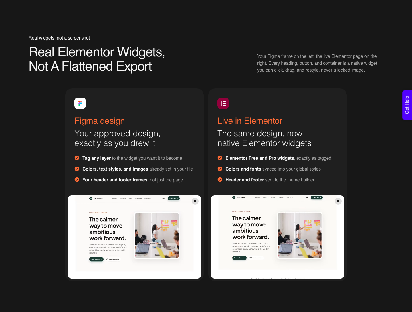
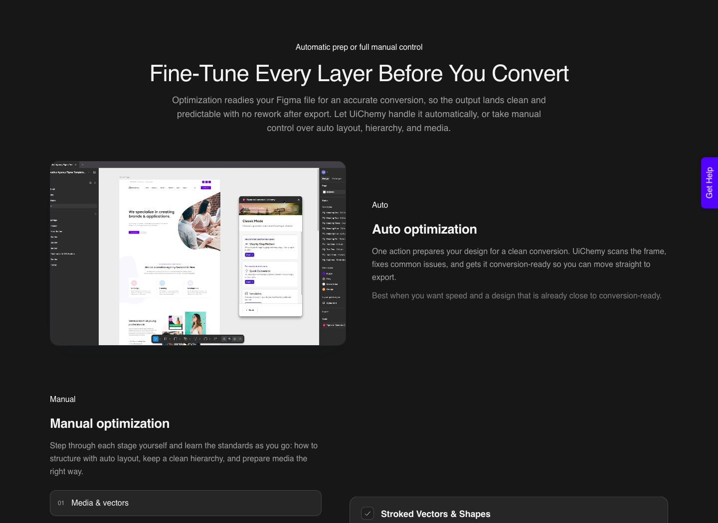
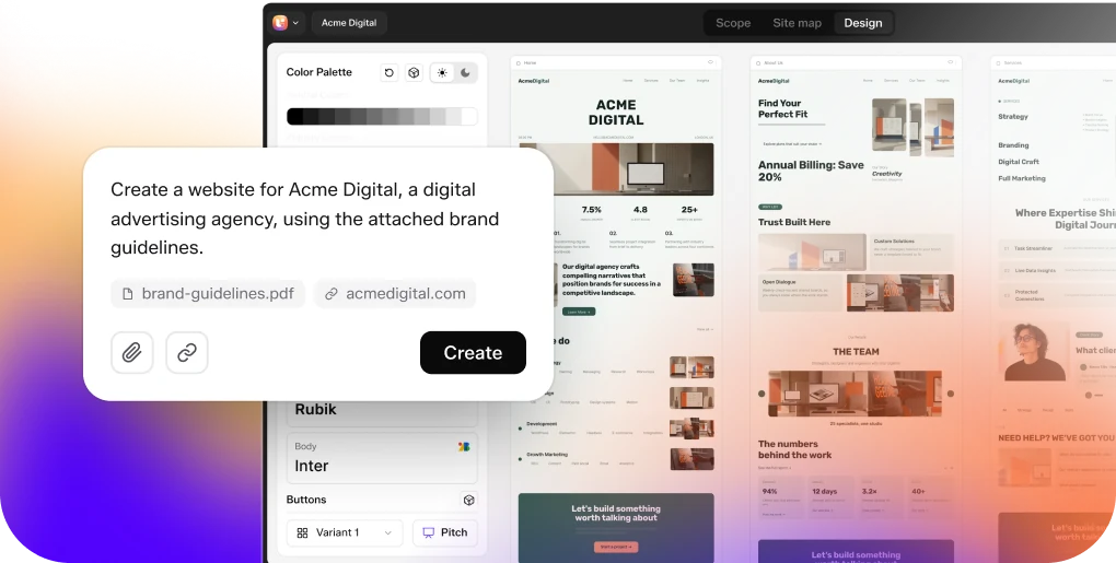
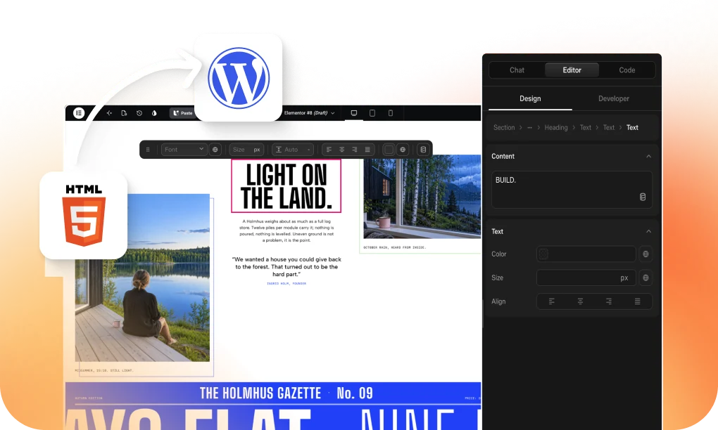
UiChemy is one engine with four ways in, and two of them start from the same sentence you were about to type into Make. AI Website Creator takes a prompt or a client brief and returns a sitemap, pages and a design you export to Elementor.
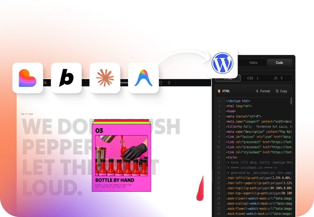
Composer takes a prompt inside the builder and writes real HTML, CSS and JavaScript as one widget on the page.
The other two ways in are for work that already exists: an approved Figma design through Figma to WordPress, or an existing Lovable, Claude, Bolt or v0 build through Composer.
The prompting habits in this post transfer across all of them, because the thing that makes a prompt cheap is the same everywhere. Say the scope, say the constraints, and put the rules that never change somewhere the model reads automatically.
The Honest Limits
A better prompt raises the floor, it does not remove the review. Figma notes that Make may incorporate third-party content such as fonts, code packages or images, and that you are responsible for having the rights to everything before publishing.
That check is yours regardless of how the prompt was written.
Prompting also cannot fix the handover. Layers copied from a Make preview into Figma Design are not tied to your design system and are not interactive, whatever the prompt said, so motion and component mapping are rebuilt later rather than carried across.
On the WordPress side the same honesty applies. A conversion handles roughly 70% of the design work in a verified reviewer’s words, leaving 30% to fine-tune in Elementor.
Responsiveness is handled automatically and then tuned in the responsive manager.
AI Express outputs to Elementor today, with Gutenberg and Bricks still on the roadmap, and AI Website Creator exports to Elementor with Gutenberg marked Soon on every plan.
Figma names one more limit that decides whether a prompt is worth writing at all.
Its own attachment guidance says to focus on desktop and full-screen friendly outcomes, because mobile output is still being improved. If the brief is a mobile-first app, that is worth knowing before the first 100 credits go out of the door.
Questions People Ask About Figma Make Prompts
How long should a first prompt be?
Long enough to enumerate what the result must do, and no longer. Figma’s own template warns that more context is not always better and can confuse the model.
Numbered requirements beat paragraphs of description.
Is it better to attach a design or describe it?
Attach a Figma frame where you can. Figma states that frames carry structured design data while images only give general direction, and that the model cannot reliably extract exact values such as colours from an image.
Why does the same prompt cost more later in a session?
Because prompt history accumulates. Figma explains that a longer history means more context to process on every prompt, even a simple one.
Starting a fresh file when the old context is no longer needed is the documented remedy.
Should I use plan mode for a landing page?
For a single page with a clear section list, a well-scoped prompt is usually enough. Plan mode earns its extra credits on complex builds where the approach itself is uncertain and a mid-build correction would be expensive.
Can a prompt make output convert cleanly to WordPress?
It can move the odds a long way. Asking for flexbox and grid, a single vertical stack of full-width sections, and a named spacing scale produces layers that reorganise easily.
It does not remove the restructuring step in Figma Design.
What to Take From This
Three habits carry most of the benefit. Scope the first prompt with numbered requirements, attach frames rather than screenshots, and state how the layout should be built rather than only what it should contain.
Figma documents all three, and the third is the one almost nobody writes.
After that, stop putting standing rules in the prompt box. Guidelines files and Make kits exist so the model already knows your system, and the credits you save on repetition are the ones you spend on the build that actually ships.