







The Figma Tutorial for People Building Websites
 Sagar Patel
Search for a Figma tutorial and you get someone building a mobile app screen. Rounded cards, a bottom tab bar, a profile page. It is a fine way to learn the toolbar, and it teaches you almost nothing about the decisions that matter when the thing you are making is a website that has to exist in a browser.
Websites have constraints app mockups do not. They reflow at arbitrary widths. They inherit type from a stylesheet. Somebody who is not you will edit them next Tuesday. This is the tutorial for that, and it assumes you are doing web design in Figma rather than app work.
Start With Frame Widths That Mean Something
The single most common mistake is designing one 1440 frame and calling it done. A website is not one width, it is a range, and the widths you pick in Figma should be the widths your build actually breaks at.
| Frame | Width | What it is really for |
|---|---|---|
| Desktop | 1440 | The presentation width. Not the widest real one |
| Laptop | 1280 | Where most business traffic actually sits |
| Tablet | 768 | The width where multi-column layouts collapse |
| Mobile | 390 | The one that decides whether the design works |
Design mobile early rather than last. A layout that survives 390 usually survives everything above it. A layout designed at 1440 and squeezed down afterwards rarely does.
Layout Guides Are Your Grid System
Frame widths tell you where the design breaks. A layout guide tells you what happens inside the width, and it is the feature most web work skips. Figma renamed layout grids to layout guides in May 2025, which is worth knowing because half the tutorials you find still use the old name.
There are three kinds, and only one of them behaves like a web grid. A uniform grid is a square mesh, useful for icon work. Columns run vertically down the frame and rows run horizontally across it, and those two are what responsive interface work uses.
The setting that decides whether the guide is any use is the type. Set a column guide to Stretch and the column widths adapt as the frame resizes, with margin controlling the space at the outer edges and gutter controlling the space between columns. Set it to left, right or center and it is fixed, beginning from that edge at a width you type in pixels.
| Guide type | What it does | Use it for |
|---|---|---|
| Uniform grid | Square mesh at a fixed pixel size | Icons, symbols, anything needing precision |
| Column, stretch | Columns resize with the frame, set by margin and gutter | The page grid on every responsive web frame |
| Column, fixed | Columns of a typed width anchored to one edge | Sidebars and rails that do not reflow |
| Row, stretch or fixed | Horizontal bands, same two behaviours | Vertical rhythm, header and footer bands |
Figma documents the 8 point grid in two flavours and the distinction is practical. A hard grid puts a uniform guide at size 8 on the frame and everything snaps to it. A soft grid just means every spacing value you type is divisible by 8, with a column or row guide carrying properties that follow the same rule.
Soft is the one to use for websites. Hard grids fight with the way content of unpredictable length behaves in a browser, and a client’s headline is always three words longer than the one in your mockup.
ShiftGtoggles every layout guide in the file at once.- Guides only apply to frames. If nothing appears, the selected layer is probably a group.
- A rotated frame will not show a guide. Set rotation back to zero first.
- Save a guide you like as a layout guide style and reuse it across frames.
Auto Layout Is Not An Advanced Feature
Most tutorials introduce auto layout around lesson six, as a convenience. For web work it is the foundation, and everything downstream depends on it.
A frame with auto layout describes relationships: this stack has 24 pixels between items, this container hugs its contents, this one fills available space. That is how CSS thinks. A frame without auto layout describes absolute positions, which is how nothing on the web thinks.
The practical consequence is that a hand-positioned design has to be interpreted at build time, and interpretation is where the disagreements start. An auto-layout design mostly translates.
- Every section is an auto layout frame, vertical, with real padding.
- Every row inside it is an auto layout frame, horizontal.
- Use fill and hug deliberately. Fixed width is the exception, not the default.
- Spacing values come from a scale. 4, 8, 12, 16, 24, 32, 48, 64. Not 23 because it looked right.
The Frame Structure That Survives A Build
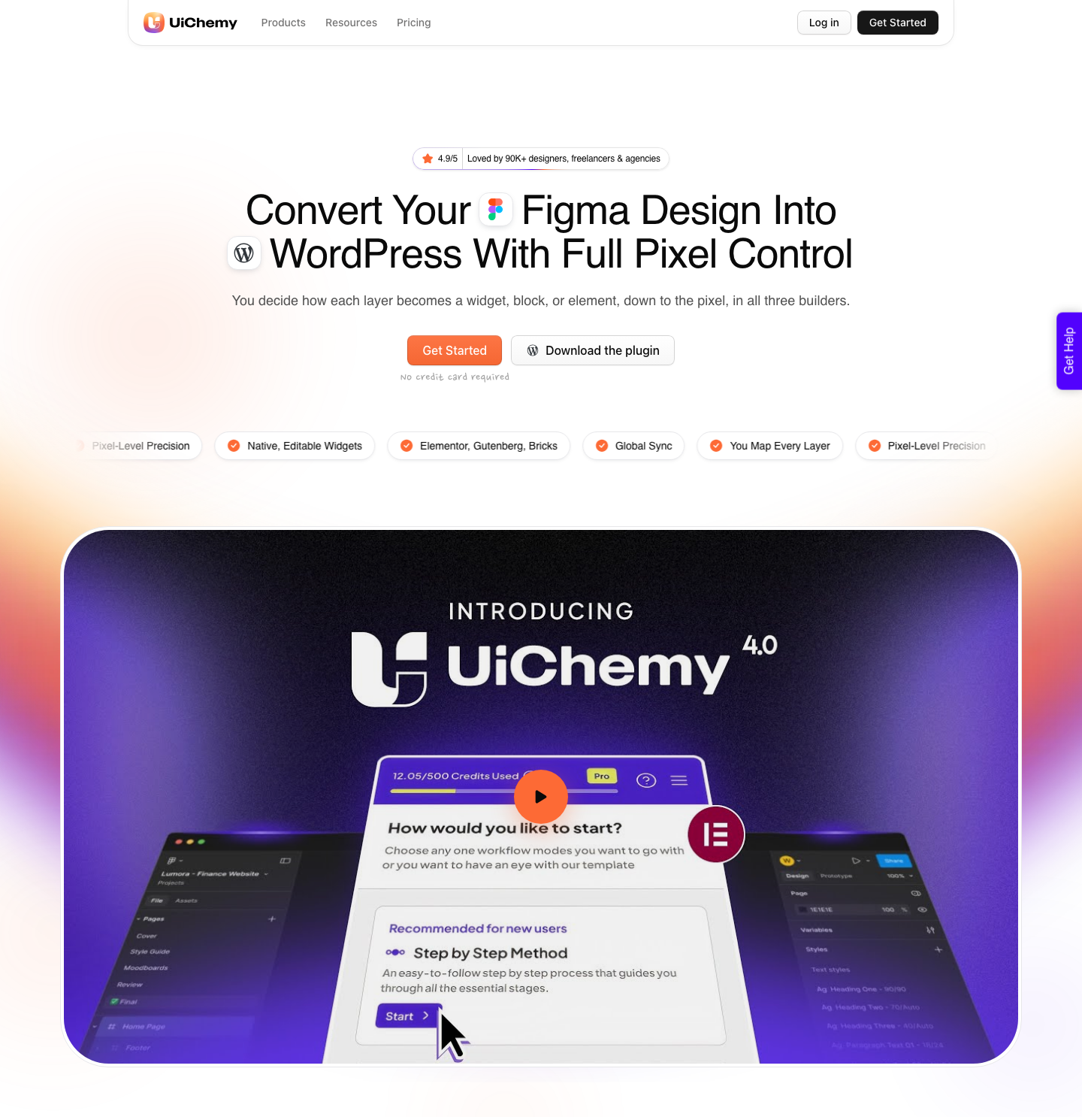
Auto layout on its own is not enough. The arrangement of frames inside frames is what a converter or a developer actually reads, and there is a specific shape that works. The UiChemy documentation sets it out precisely, and the rules hold whether a human or a tool does the rebuild.
Everything lives inside one top level frame. Sections sit inside that frame, stacked vertically, the way a web page stacks. Elements go inside a section and never anywhere else, because anything sitting outside a container is ignored at export time rather than misplaced.
| Setting | Top level frame | Section inside it |
|---|---|---|
| Auto layout | On, vertical | On |
| Alignment | Align top center | As the section needs |
| Horizontal and vertical padding | 0 | As the design needs |
| Gap between items | 0 | From your spacing scale |
| Width | Fixed, at your chosen value | Fill container |
| Height | Hug contents or fixed | Hug contents |
Two smaller rules from the same documentation save real time. Keep the number of nested frames down, because deep nesting is unpleasant to edit in any builder afterwards. And never use a negative gap in auto layout, because HTML has no negative flex gap and the overlap you designed simply will not exist.
Constraints, And Where They Stop Applying
Constraints tell Figma how a layer reacts when its parent frame resizes, and every layer starts life set to top and left. On the horizontal axis you can pin left, right, both, center, or choose scale, which holds the layer at a percentage of the frame width. Vertical works the same way with top and bottom.
Left and right together is the one that behaves like a fluid web element, because the layer grows and shrinks with the frame instead of drifting. Scale is the one to be careful with, since a layer at 70 percent of a 100 pixel frame becomes 140 pixels in a 200 pixel frame, type included.
Now the limit that matters. You cannot apply constraints to a layer inside an auto layout frame, and you cannot apply them to a group, because a group has no bounds of its own. Those two facts together explain most of the confusion about why a design will not resize the way it was drawn.
Hold Command on a Mac or Ctrl on Windows while dragging to ignore constraints temporarily. Use it to test, not to design. Figma’s own advice is to resize the frame and watch what happens before you hand anything over, and that habit catches more problems than any checklist.
Variables Instead Of Hex Codes
If your brand blue appears as a raw hex value in forty places, changing it is forty edits and you will miss four. Define it once as a variable and the change is one edit.
This matters more than it sounds, because colour variables and text styles are the part of a Figma file that maps cleanly onto a WordPress theme’s global settings. Colours defined loosely in Figma become colours defined loosely on the site, and then a client asks for a slightly different blue and you spend an afternoon on it.
Same logic for type. Build a scale, name the levels by role rather than size, and use it everywhere.
Components For Anything That Repeats Twice
Buttons, cards, form fields, nav items. The rule is simple: the second time you draw something, make it a component.
Use variants for states rather than separate components. One button component with variants for primary, secondary, hover and disabled beats four unrelated buttons that drift apart over a fortnight.
Name Layers As If A Machine Will Read Them
Layer naming used to be a courtesy to the next designer. It is now an input, because the tools that read your file to produce code or WordPress elements use those names to work out what a thing is meant to be. Figma’s own developer guidance says so directly.
The instruction is to replace default names like Frame1268 and Group5 with intent driven ones like CardContainer, ProductImage or CTA_Button. The reason given is that this helps the model understand what it is working with and what functionality the thing should have. A rectangle called Rectangle 47 carries no information at all.
- Name by role, not by appearance.
PricingCardbeatsWhiteBox. - Keep one convention across the file. Mixed casing reads as two people who never spoke.
- Use annotations for behaviour that the visual cannot show, like what a hover state does.
- Rename layers with Figma AI costs nothing, so there is no excuse left.
The same guidance names variables and components in one breath with naming. Apply variables for spacing, colour, radius and typography, make anything repeated a component, and give both a semantic name. That combination is what makes a file legible to a person, to a converter and to an agent, without doing the work three times.
The Mistakes That Cost Money At Build Time
These are the ones that look harmless in Figma and become hours later. The Elementor conversion guide documents the five that turn into support tickets.
- Text in images. A headline baked into a PNG cannot be edited, translated, selected or indexed. Keep text as text.
- Detached instances. The moment you detach, the component stops being a source of truth and you have created a maintenance problem nobody knows about.
- Groups instead of frames. Groups have no padding and no layout behaviour. They are a folder pretending to be structure.
- A container width that disagrees with the build. A design at 1280 and a site at 1120 will look wrong in a way nobody can name until someone measures it.
- Layers called Rectangle 47. Names are documentation. The next person opening this file is often you in three months.
The QA Pass To Run Before You Hand It Over
Designers run a visual review before handoff and almost nobody runs a structural one. Ten minutes with a checklist catches the problems that otherwise surface as a support ticket a week later. This one comes from the UiChemy design checklist, and most of it applies to any handoff, not only a conversion.
| Check | What goes wrong | The fix |
|---|---|---|
| Elements outside the container | They are ignored, so the section arrives incomplete | Move every layer inside a section frame |
| Negative gaps in auto layout | HTML has no negative flex gap, so the overlap vanishes | Rebuild the overlap with absolute positioning inside its own frame |
| Composite illustrations | Dozens of vectors land on the page and slow it down | Lock the group and export it as one image |
| Masked imagery | The mask is interpreted rather than reproduced | Lock the masking frame and import it as a single image |
| Rotated vectors | Rotation transforms arrive wrong | Flatten the vector in Figma before export |
| Content overflowing a frame | Either clipped when it should not be, or spilling when it should not | Set clip content deliberately on that frame |
| Fonts | A font Figma can see but the machine cannot substitutes silently | Install the font, or upload it to your Figma account |
Two of those repay the effort more than the rest. Locking a composite illustration and exporting it as a single image cuts the number of image and vector layers on the finished page, which is a page weight decision as much as a tidiness one. Fonts fail quietly, which is why they belong on a checklist rather than in your memory.

There is one post conversion adjustment worth knowing before you panic about it. If icons sit slightly off from their text label, the cause is usually the theme body line height rather than the design, and Elementor applies a default 20 pixel gap in site settings that may not match what you drew. Both are one setting each, not a rebuild.
What Happens To The File Afterwards
Here is the part most Figma tutorials stop before. The design is approved. Now it has to become a website, and how that happens determines whether all the structure above was worth building.
If the design gets rebuilt by hand in a page builder, the auto layout and variables saved the developer guesswork but nothing more. If it gets exported to code, you get a page your client cannot edit without calling you.
The third option is conversion into native builder elements. UiChemy reads the frame and produces real Elementor widgets, Gutenberg blocks or Bricks elements, which stay editable by anyone who can use the builder. That path rewards a clean file directly: auto layout becomes real containers, colour variables sync into the theme’s global colours, and text styles land as typography settings.
Worth knowing while you are still in Figma: a design file is one of four starting points now. AI Website Creator turns a client brief or a prompt into a sitemap and pages. Composer writes real HTML, CSS and JavaScript inside the builder for the section no widget covers. AI to WordPress brings a Lovable, Claude, Bolt or v0 build across.
None of that makes this tutorial less useful: a generated site still gets edited by somebody on a Tuesday, and the discipline above is what makes a design the fastest of the four routes.
Being straight about it: a messy file converts messily. Hand-positioned layers, detached instances and text baked into images produce a worse result whichever route you take. The design optimisation guide covers what a clean file looks like in detail, and it is worth reading before your first conversion rather than after.
Frequently Asked Questions
Should I use auto layout or constraints?
Auto layout for anything that stacks or flows, which on a website is nearly everything. Constraints are for children of a plain frame that need to hold a position as the frame resizes. You cannot use both on the same layer, because Figma does not allow constraints on a layer inside an auto layout frame.
Do layout guides carry through to the built site?
No. Layout guides are visual aids that live on the frame, and they are not exported as anything. What carries through is the padding, the gaps and the fill or hug behaviour you set with auto layout, so the guide is there to help you type consistent numbers rather than to be the numbers.
Why did part of my design not arrive on the page?
Nine times out of ten it was sitting outside the top level frame or outside a section inside it. Elements in that position are ignored rather than repositioned, so a decorative shape parked next to the artboard never makes the trip. Drag it inside a section and run the conversion again.
How many breakpoints do I actually have to design?
Four frames is enough for most marketing sites, and a fifth is worth it if a specific device dominates your analytics. A conversion carries your responsive intent across and hands you a breakpoint manager for the tuning, so the frames you design set the intent rather than settling every width.
How accurate is a Figma to WordPress conversion?
Nobody publishes a percentage, so be careful with any article that quotes one. The figure worth planning around comes from a verified reviewer on the plugin listing: about 70 percent of the design work handled, 30 percent fine tuned in Elementor, a fair trade for the time it saved. A clean file moves that split in your favour.
The Order That Works
- Set up colour variables and text styles before drawing anything.
- Build the mobile frame first at 390.
- Make every section an auto layout frame with padding from the spacing scale.
- Componentise on the second occurrence, use variants for states.
- Expand to 768, 1280 and 1440, fixing what breaks rather than redrawing.
- Name your layers as you go, not at the end, because at the end you will not.
None of this is about knowing more Figma features. It is about building a file that describes a website rather than a picture of one. The tool is not the hard part and never was.