
Figma Website Design That Survives the Build
 Sagar Patel
The design was approved on a Thursday. On Friday it lands in the builder as forty containers, half of them absolutely positioned, with the hero heading sitting on top of the paragraph beneath it.
Nothing went wrong in the conversion. The file was built in a way that only ever made sense on an infinite canvas.
Figma website design is two jobs wearing one toolbar. The first is making the page look right, which is the ground covered by the 2026 working method for Figma web design, and Figma is excellent at that.
The second is describing the page in a structure a layout engine can rebuild, and Figma will happily let you skip it.
This is the second job. Everything below was checked against Figma’s own documentation and our conversion docs on 7 September 2026, and every failure named here is one that shows up in real files rather than one invented to make a point.
What Figma Promises for Web Design
Figma’s own web design page is more measured than most product pages.
The claim is that auto layout, components and styles help you create designs that work well on any device, which is true and is also carefully worded. The tools help.
They do not enforce.
The same page carries figures from Figma’s State of the Designer 2026 report, based on a survey of 906 designers. Seventy-two percent now use generative AI somewhere in their web design workflow, and 98 percent say their usage went up in the last year.
Ninety percent say collaboration is central to producing good work.
What that adds up to in practice: more files are being started faster, by more people, and structural discipline is the thing generative tools are worst at supplying. A generated frame looks finished and is often a stack of loose layers with hard-coded positions.
Auto Layout Is The Load-Bearing Decision
Auto layout is available on all Figma plans, including the free Starter plan, to anyone with edit access. Shift and A applies it.
There are three flows: vertical, horizontal and grid. That is the entire cost of entry, and it is the single highest-leverage habit in web-bound Figma work.
The reason is structural rather than aesthetic. An auto layout frame describes a relationship between children, which is what a flex container is.
A freeform frame describes coordinates, which a browser has no direct equivalent for. Convert the first and you get a container with a gap.
Convert the second and you get absolute positioning, which is where responsive behaviour goes to die.
Figma ships a Suggest auto layout action for retrofitting older files. Control, Shift and A on a Mac, or Control, Alt and Shift and A on Windows.
Figma’s own guidance on it is worth taking literally: it handles moderately complex designs such as cards, navigation bars and mobile screens, and for something large like a full website you should run it in batches rather than on the whole page frame.
Two details save time afterwards. Nested auto layout frames created by the action are marked with a blue dot in the layers panel, so you can see what it did.
And auto layout cannot be removed from a component instance without detaching it, so fix the main component instead of fighting the instance.
The most common mistake is applying auto layout only to the page frame. The spacing that drifts is never the page, it is the button, the card, the list row and the nav item.
Each of those needs its own.
The Four Ways a Figma File Breaks on Export
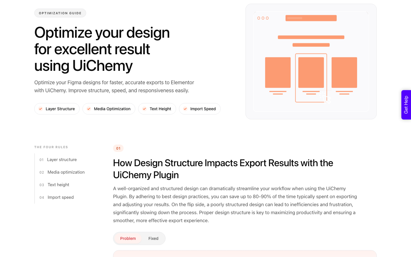
Our design optimisation guide groups the failures into four categories, and they hold regardless of which converter you use, because they are properties of the file rather than of the tool. A structured file can cut 80 to 90 percent of the time normally spent adjusting an export.
| Category | What you did in Figma | What arrives in the builder |
|---|---|---|
| Layer structure | Loose layers, no grouping, auto layout only on the page frame | Loose containers, spacing that has to be retyped by hand |
| Media | Masked groups and multi-layer vector compositions left unlocked | Nested groups explode into many separate containers and image elements |
| Text height | Fixed height on text layers to fake bottom spacing | Absolute positioning, because the text overlaps its neighbour |
| Import speed | Full resolution photography, a frame over 12,000 px tall | Timeouts, failed image uploads, or an import that does not complete |
Lock It or Leave It, and Why That Matters
The padlock in the Figma layers panel does something specific during conversion: a locked layer, group or frame arrives as one flat image. That is exactly what you want for a masked photograph or a decorative vector composition, and exactly what you do not want for an icon.
| Element | Lock it? | Why |
|---|---|---|
| Groups of images | Yes | Arrives as one image instead of a pile of nested containers |
| Anything carrying a mask | Yes | Masks do not survive as masks, so flatten them deliberately |
| Vector icons | No | A locked layer becomes an image, and an icon should stay a vector |
| Multi-path icons | Flatten first | Every separate path leaves as its own SVG otherwise |
| Paths drawn with a stroke | Outline Stroke first | Flatten works on fills, not on stroke colours |
| Anything with a blend mode | Replace with an image | Blend modes do not carry across, so the layer will not look the way you see it |
| Divider lines drawn as shapes | Use a frame border | A drawn line becomes its own element rather than a border |
The speed argument matters as much as the fidelity one. Unlocked masked groups take far longer to upload and sometimes fail outright, which shows up as missing images rather than as an error message.
Text Height Is The Single Most Common Failure
If you fix one thing before your next conversion, fix this. Fixed height on a text layer is a normal Figma habit, usually used to create bottom spacing under a heading.
It does not survive the trip, because Elementor’s Heading widget has no height control to reproduce it.
What happens instead is a chain. The text box is taller than the text, it overlaps the element below it, and overlapping layers arrive absolutely positioned.
Then every one of them has to be set back to relative by hand, one at a time, in the editor.
The fix is two habits. Set every text layer to auto height, and create the space underneath with the auto layout gap or the frame padding instead of by stretching the text box.
Then check that no two layers overlap anywhere in the frame, because the absolute positioning rule applies to any overlap and not only to text.
The 12,000 Pixel Ceiling and Other Hard Limits
Some limits are preferences and some are walls. A frame taller than 12,000 pixels will not upload at all, so a long landing page has to be split in half or sent section by section using the copy to clipboard method.
That is a number worth writing on the wall of any agency doing this weekly.
Oversized images are the other reliable cause of a failed import. Export at the size the image will actually display rather than at the size it happens to be, and pick the format deliberately, since WebP, AVIF, PNG and JPEG are all available with adjustable compression at export time.
A live import holds an open connection to your site until it finishes, so a patchy connection produces dropped images rather than a clean failure. Hotel wifi is a genuinely bad place to convert a homepage.
The Checklist To Run Before Any Build
Fifteen items, four groups, roughly twenty minutes on a page you designed yourself. Run it on every frame you plan to send.
- Group each block into its own frame. A card, a nav row, a testimonial: one frame each.
- Add auto layout to the small pieces, not only the page frame. Buttons, cards, list rows, nav items.
- Delete hidden layers, empty frames and stray rectangles. Everything inside the frame converts, including what you cannot see.
- Lock image groups and masked images so they arrive as one flat image.
- Leave vector icons unlocked so they stay vectors.
- Replace any layer using a blend mode with an exported image.
- Give vector paths a fill rather than a stroke, applying Outline Stroke where needed.
- Flatten multi-path icons into a single path.
- Turn divider lines into a border on the frame.
- Set every text layer to auto height.
- Create space with gaps and padding, never with text height.
- Check that no two layers overlap.
- Compress images to the size they will display at.
- Convert on a connection you trust.
- Keep the frame under 12,000 pixels tall, or split it.
Converting a design you have not cleaned up wastes more time than it saves. That is an opinion, and the evidence for it is that the same guide reports 80 to 90 percent of post-export adjustment time disappearing when the file is structured properly.
AI Express or Classic, and When Each One Wins
Once the file is clean, there are two routes into WordPress from a design and they suit different jobs. Both modes ship on every plan including the $0 Free tier, so this is a workflow choice rather than a purchase decision.
Worth saying while we are on choices: the design is one of four starting points.
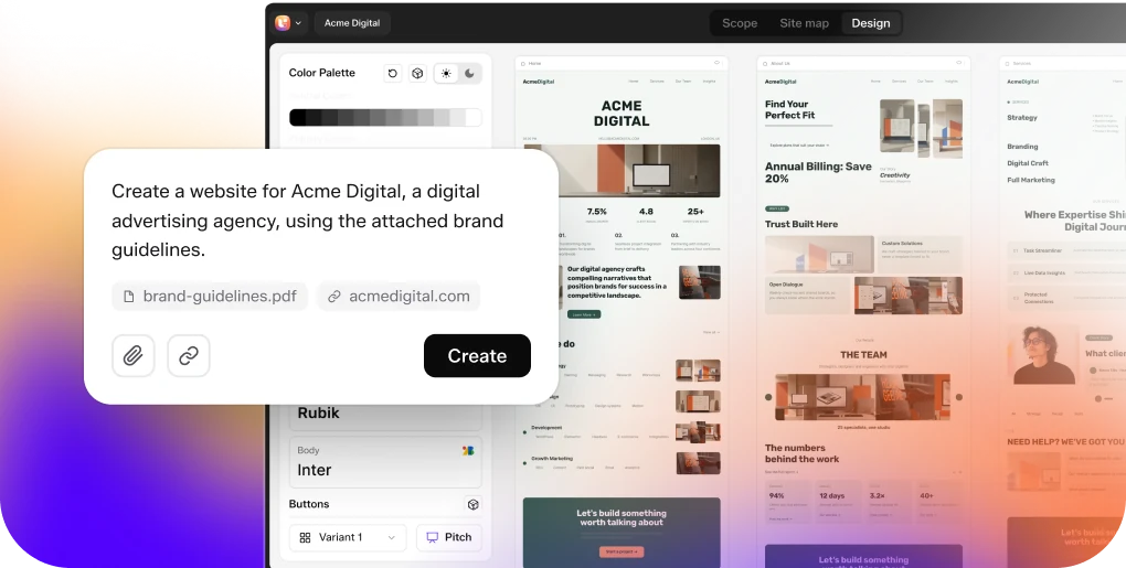
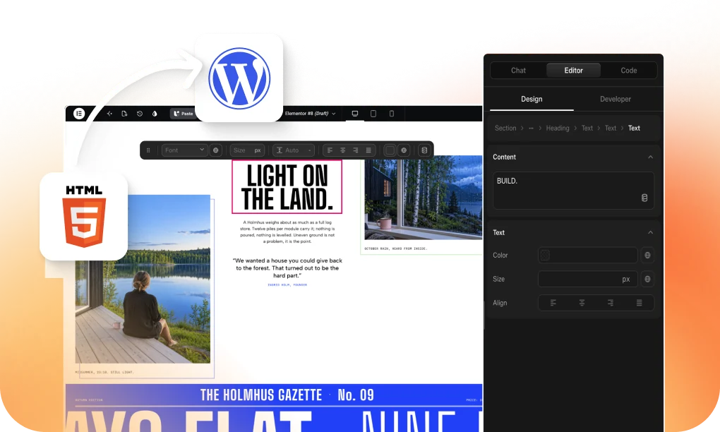
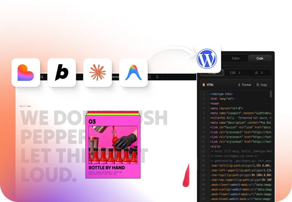
AI Website Creator builds a whole site from a written client brief, UiChemy Composer writes real HTML, CSS and JavaScript inside the builder for the section no widget covers, and AI to WordPress brings a Lovable, Claude, Bolt or v0 build across.
This article is about the design route because that is the one where the file quality decides the outcome.
| AI Express Mode | Classic Mode | |
|---|---|---|
| Layer tagging | Not required | Required |
| Layout styling | Automatic | Manual |
| Motion and effects | Built in, set to off, subtle or immersive | Added manually |
| Spacing and gaps | Optional automatic cleanup | Manual |
| Responsiveness | Automatic, tuned in the UiChemy Composer widget | Manual, via the responsive manager |
| Header and footer | Detected and sent to the Theme Builder | Manual or a separate export |
| Builders today | Elementor. Gutenberg and Bricks are not live yet | Elementor, Elementor v4 Atomic, Gutenberg, Bricks and more |
| Best for | Volume, and pages where close is good enough | Pages where every pixel has to be exact |
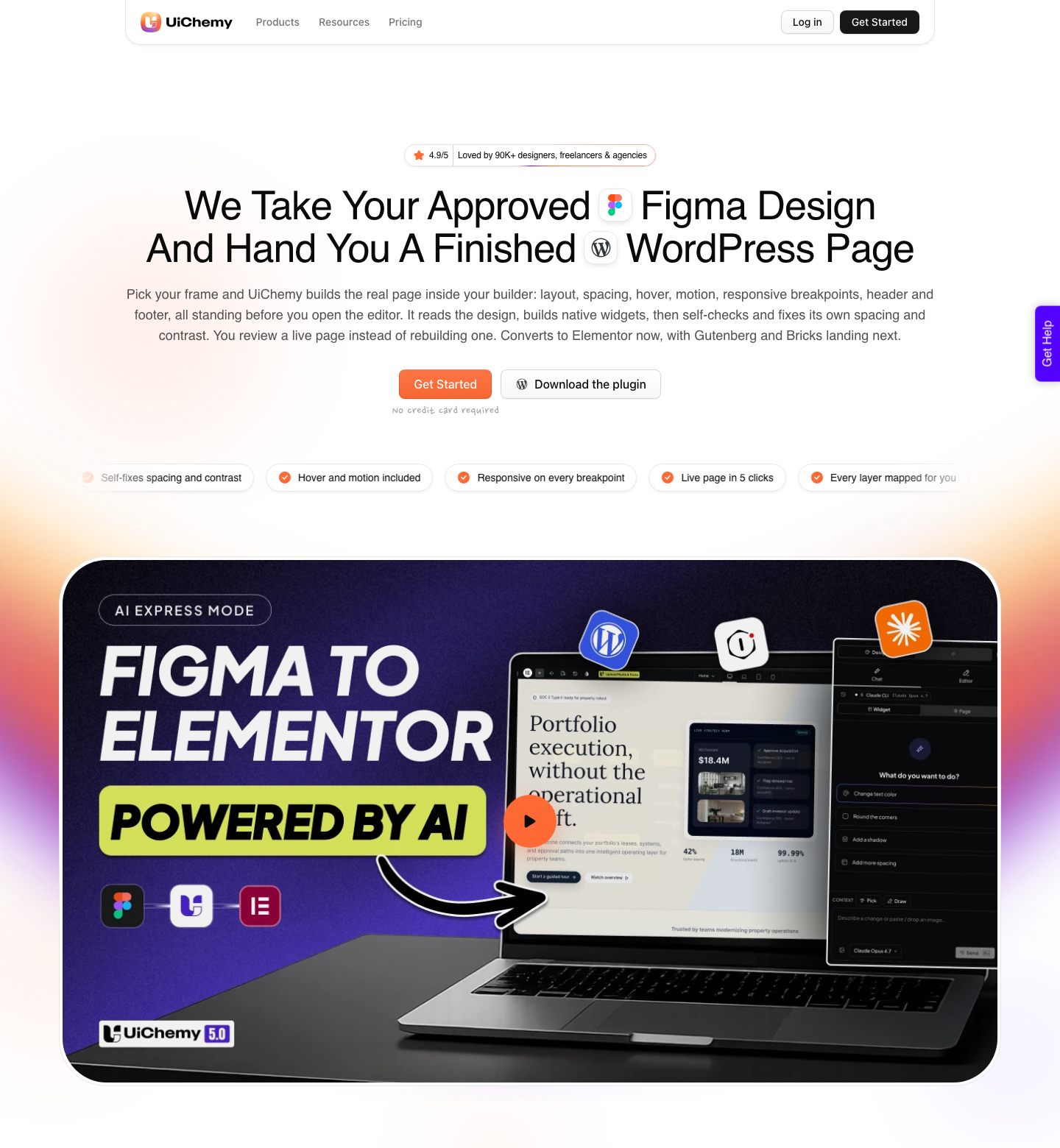
The estimate we publish for a full page is 30 to 60 hours of manual rebuilding against 4 to 7 hours with AI Express, which is roughly 75 to 85 percent less time. Read the second number carefully: it is 4 to 7 hours, not zero.
Two to four of those hours are touch-ups and review, and two to three are final quality assurance before publishing.
What The Conversion Will Not Do For You
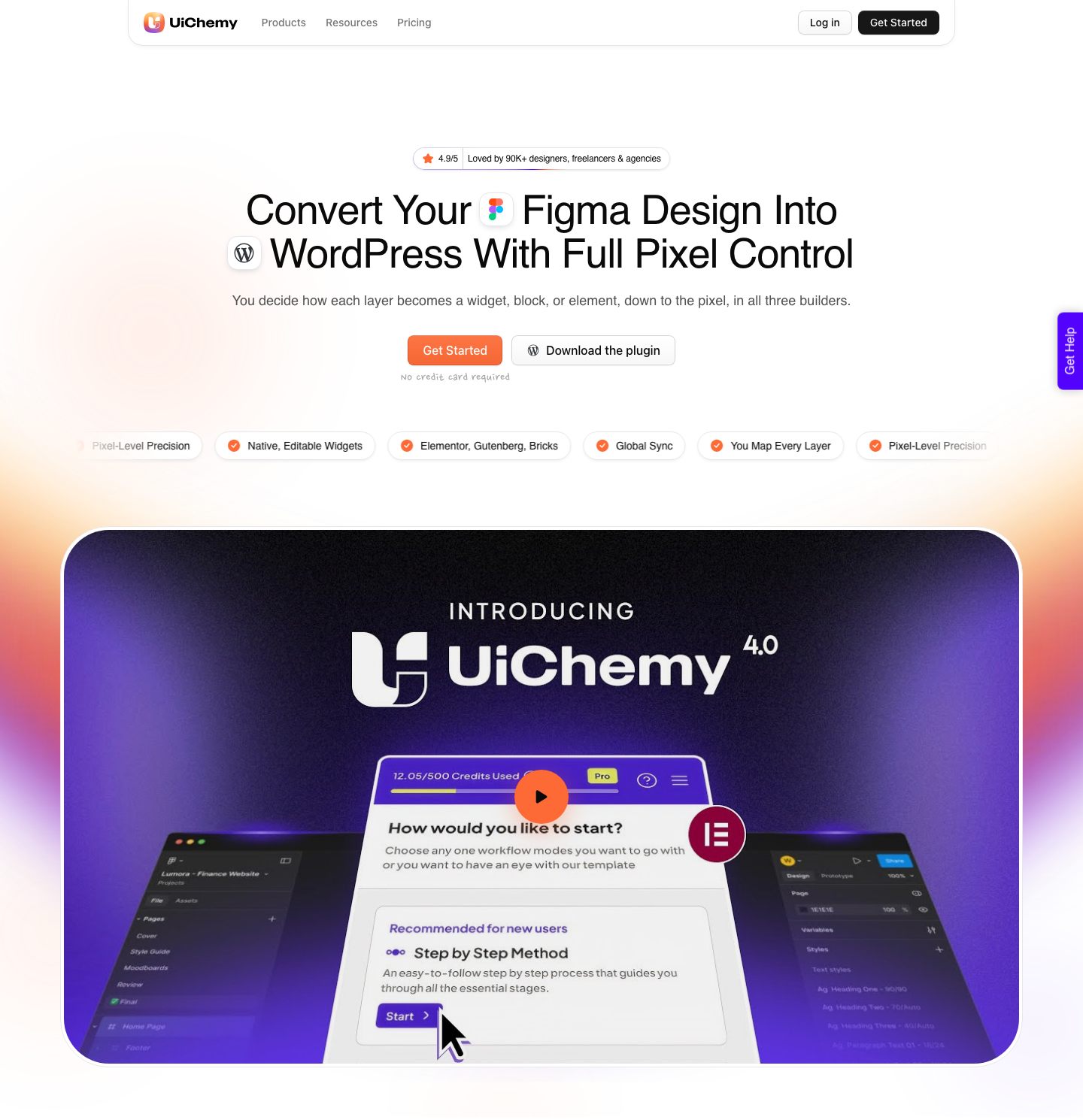
AI Express outputs to Elementor today. Gutenberg and Bricks are not live in AI Express yet, and both are on the roadmap.
Classic Mode already covers all three, along with Elementor v4 Atomic, Nexter Blocks, GenerateBlocks, Spectra and Kadence, so a Bricks site is not stranded, it just takes the tagged route, and the design system sync from Figma into Bricks now carries the global values with it.
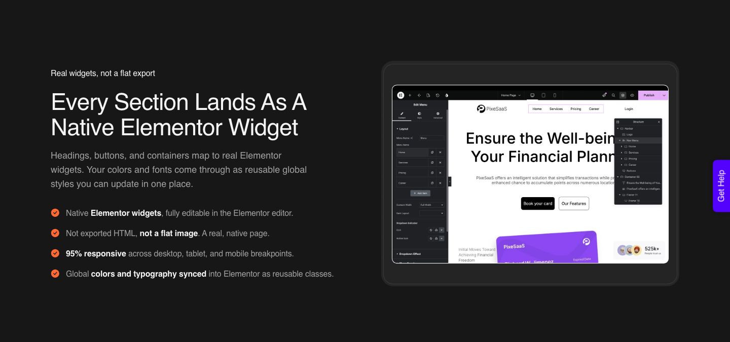
Conversions arrive responsive on Elementor’s desktop, tablet and mobile breakpoints, and no percentage is published for how close that lands.
Any breakpoint that needs work is tuned inside the UiChemy Composer widget, in the same panel you are already editing in, with no separate tool to learn.
A verified reviewer on WordPress.org described the split from the other side: about 70 percent of the design work handled, about 30 percent left to finish in Elementor, which they considered a fair trade.
Two more honest limits. If your design uses Elementor Pro widgets such as forms, menus or sliders, you need Elementor Pro for those specific widgets.
And the free tier is a plan rather than a plugin: the $0 Free plan carries 1,000 credits, one Figma seat, one AI Website Creator project of one page and one Composer site, which converts something real but not a client roster.
Advanced GSAP motion and MCP or API access both start on Studio at $29 a month, and the connector plugin on WordPress.org is what pairs the site on any plan.
None of this removes the design judgement. It removes the retyping.
Frequently Asked Questions
Is Figma good for website design?
Yes, with a caveat that has nothing to do with the drawing tools. Figma gives you auto layout, components, styles and variables, and 906 designers in its own 2026 survey are using it alongside generative AI.
The caveat is that none of those features are compulsory, so a file can look finished and still describe nothing a layout engine can rebuild.
Do I need auto layout on every frame?
On every frame that has more than one child laid out in a row or a column, yes. That means buttons, cards, list rows, nav items and section wrappers, not only the page frame.
Freeform frames are fine for decorative compositions you intend to flatten into an image anyway.
Why does my converted page use absolute positioning?
Because two layers overlap somewhere in the frame. The usual culprit is a text layer with a fixed height whose box is taller than its text, pushing it over the element below.
Set text to auto height, create spacing with gaps, and check the whole frame for overlaps before you convert again.
How tall can a Figma frame be before it fails to import?
Past 12,000 pixels the upload will not go through. Split the design in half, or lift a single section out and send that one on its own using copy to clipboard.
Long landing pages are the usual casualty, and splitting them is faster than diagnosing a silent failure.
Should I lock layers before converting?
Lock groups of images and anything carrying a mask, because a locked layer arrives as one flat image and that is what you want for those. Do not lock vector icons, because they would flatten too.
Locking also speeds up the upload noticeably on image-heavy pages.
Design For The Build, Not Around It
The difference between a Figma file that converts and one that does not is about twenty minutes of layer work, and almost none of it is design work. Grouping, auto layout on the small pieces, auto height on text, locks in the right places, images at the size they display, and a frame under 12,000 pixels.
Do that and the conversion is boring, which is the goal.
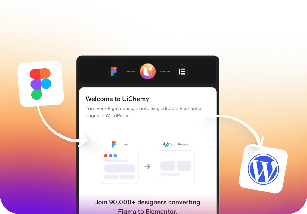
If you want the next layer of detail, the applied guide to Figma for UI and UX design covers the decisions upstream of this one, the Figma to WordPress page and the Figma to Elementor page show what the output looks like, and Classic Mode is the route to take when exactness matters more than speed.
Credit costs for either mode sit on the pricing page.