
Figma for UI and UX Design, Applied to Real Websites
 Sagar Patel
Almost every UX design course teaches you to design a product. A signup flow, a dashboard, a settings screen.
The craft transfers, but a large part of the specific advice does not, because a marketing website and a product interface are different problems wearing the same toolbar.
A product screen is used repeatedly by someone who has already committed. A website page is seen once by someone deciding whether to bother.
One rewards learnability and density. The other rewards clarity and speed, and it has to survive being edited by a marketing team six months from now.
This is Figma for UI and UX work where the output is a real website that real people will maintain. Everything below was checked against Figma’s own documentation and the UiChemy docs on 8 September 2026.
What Figma Actually Is Now
Worth establishing, because most tutorials describe a version of Figma from two years ago. It is no longer one canvas with plugins bolted on.
It is a set of products, and knowing which one you are supposed to be in saves a surprising amount of time.
| Product | What it is for | Status |
|---|---|---|
| Figma Design | The canvas. Design and prototype in one place | Generally available |
| Dev Mode | Translating designs into code, plus the MCP server | Generally available |
| Figma Make | Prompt to code. Working in your own local codebase and opening pull requests is a separate, Mac-only closed beta on a waitlist | Generally available, codebase mode closed beta |
| Figma Motion | Animating existing designs | New |
| Figma Weave | AI workflows for imagery, video and audio | Open beta |
| Figma Sites | Publishing responsive websites from Figma | Beta |
| Figma Buzz | On-brand assets at volume | Beta |
| FigJam, Slides, Draw | Whiteboarding, presentations, vector illustration | Generally available |
For website work you will live in Figma Design, visit Dev Mode at handoff, and mostly ignore the rest. Figma Sites is interesting and genuinely in beta, which is a different sentence from “ready for a client’s business”.
The UX Work That Happens Before Any Pixels
The most common failure in website UX is not ugly design. It is a page that looks professional and answers none of the questions a visitor actually arrived with.
Before opening a frame, write down three things. Who is arriving, what they are trying to find out, and what you want them to do next.
If those three sentences are vague, the design will be vague, and no amount of spacing discipline rescues it.
Then sketch the page as a sequence of questions and answers. A homepage is rarely a set of decorative sections.
It is usually: what is this, who is it for, why should I believe you, what does it cost, what do I do now. Sections that do not answer one of those are decoration, and decoration is what gets cut when the page is too long.
Wireframe in low fidelity for longer than feels comfortable. Grey boxes force conversations about hierarchy.
The moment real type and colour appear, feedback quietly shifts to whether people like the blue.
The File Structure That Decides Everything Downstream
Here is where website work diverges hardest from product work, and where most of the later pain is created.
A web page is a vertical stack of sections inside one container. That is how HTML works, how every page builder works, and it should be how the Figma file is built.
The UiChemy documentation is unusually blunt about this, and the rules that decide whether a design survives the build are worth following whether or not you ever convert the file.
- Everything lives inside one top level frame.
- Sections are frames inside that frame, stacked vertically, following the normal web layout structure.
- Elements go inside sections. Never loose on the canvas.
- Anything placed directly outside the container is ignored during export. Not shifted, not approximated. Ignored.
- On the top level frame: enable auto layout, set it to vertical, align top centre.
- Set horizontal padding, vertical padding and vertical gap between items to zero on that outer frame, so no phantom spacing is introduced around the page.
- Give the top level frame a fixed width.

Auto layout is doing something conceptual here, not cosmetic. A frame with auto layout describes relationships: this stack has 24 pixels between items, this container hugs its contents, this one fills the available space.
That is the same model CSS uses. A frame without auto layout describes absolute coordinates, which nothing on the web uses.
The practical consequence is that a hand-positioned design must be interpreted by whoever builds it. Interpretation is where disagreements, revisions and invoices come from.
Breakpoints, And Designing Them In The Right Order
One 1440 frame is not a website design. It is one photograph of a website.
| Frame | Width | What it is really testing |
|---|---|---|
| Mobile | 390 | Whether the content hierarchy actually works |
| Tablet | 768 | Where multi-column layouts have to collapse |
| Laptop | 1280 | The width most business visitors are on |
| Desktop | 1440 | The presentation width, and the least important one |
Designing mobile first is not a moral position, it is an efficiency one. Narrow forces you to decide what matters, and those decisions hold as the viewport widens.
Going the other way, you spend the mobile pass deleting things you already spent time perfecting.
Design Systems, Sized For A Website
Product teams build elaborate systems because dozens of people touch the interface for years. A marketing site usually needs something much smaller, and building the elaborate version is a real way to waste a fortnight.
What a website genuinely needs: colour variables, a type scale, a spacing scale, and components for anything appearing more than once.
Colour as variables, never raw hex. If the brand blue appears as a hex value in forty places, changing it is forty edits and you will miss four. This matters more on WordPress than people expect, because colour variables and text styles are precisely the part of a Figma file that maps onto a theme’s global settings.
Type as a scale named by role. Display, heading one through four, body, small, caption. Naming by role rather than size means changing the size later does not orphan the name.
Spacing from a fixed set. 4, 8, 12, 16, 24, 32, 48, 64. Not 23 because it looked right at the time.
Arbitrary spacing is invisible in Figma and glaring on a live page, because the eye detects rhythm even when it cannot name it.
Components on the second occurrence. Use variants for states rather than four unrelated buttons that drift apart over a fortnight.
Prototyping For Validation, Not For Applause
Website prototypes have a narrower job than product prototypes. Nobody needs to test a fourteen-step flow.
What is worth testing is whether someone can find the pricing, understand what you sell within about five seconds, and locate the action you want them to take.
Two or three linked frames usually answers that. Beyond that you are building a demo for the pitch rather than evidence for the design, and those are different artefacts with different audiences.
The same line applies to an AI generated prototype, which demos well and proves less than it appears to.
Handoff, And What Dev Mode Changed
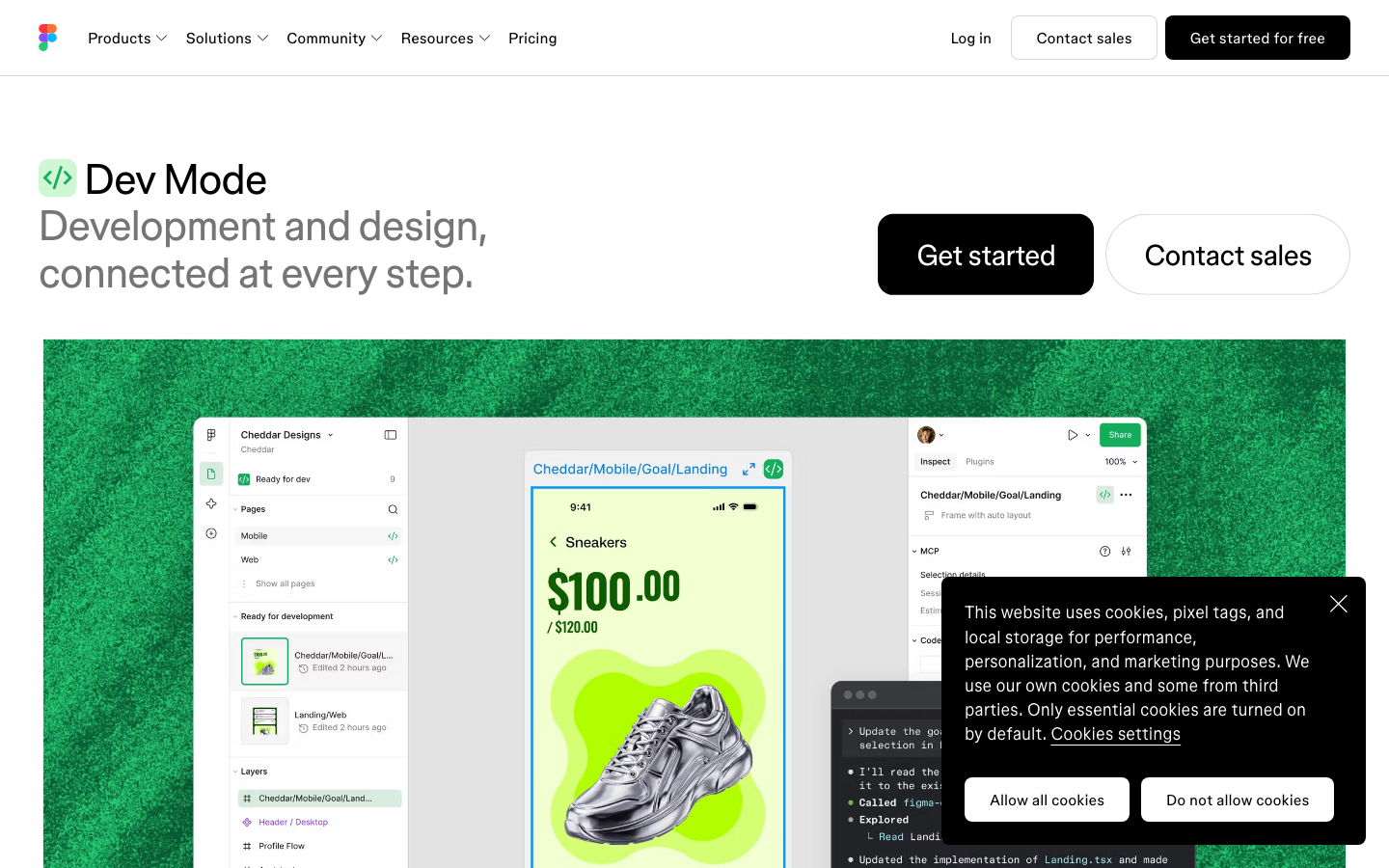
Figma’s Dev Mode gives developers measurements, spacing, a CSS box model view and a dedicated dev view. More significantly, Figma now runs an MCP server that pulls design system components directly into a codebase, so a design file can be read by tooling rather than only by a person.
This is excellent if your website is a codebase with engineers and a review process. A large number of websites are not.
They are WordPress sites where the person making next month’s copy change is a marketing manager, not a developer.
For those projects the handoff question is not “how does a developer read this file” but “what does this design become, and who can edit it afterwards”. That is the question the 15 point check before a design becomes a WordPress page exists to answer.
The Three Endings, Compared Honestly
| Route | What lands on the site | Who can edit it | What your clean file bought you |
|---|---|---|---|
| Manual rebuild in a page builder | Native, editable elements | Anyone | Less guesswork for the builder, nothing more |
| Export to code | Markup inside a page | A developer | Cleaner code, still a black box in the builder |
| Conversion to native elements | Native, editable elements | Anyone | Structure, variables and type carry across directly |
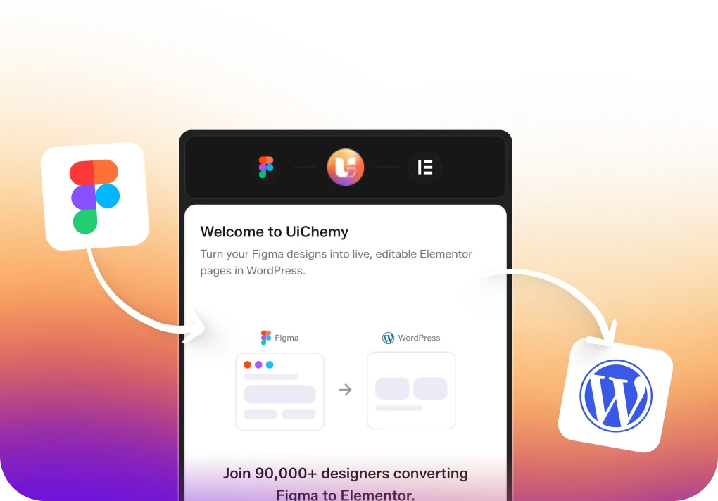
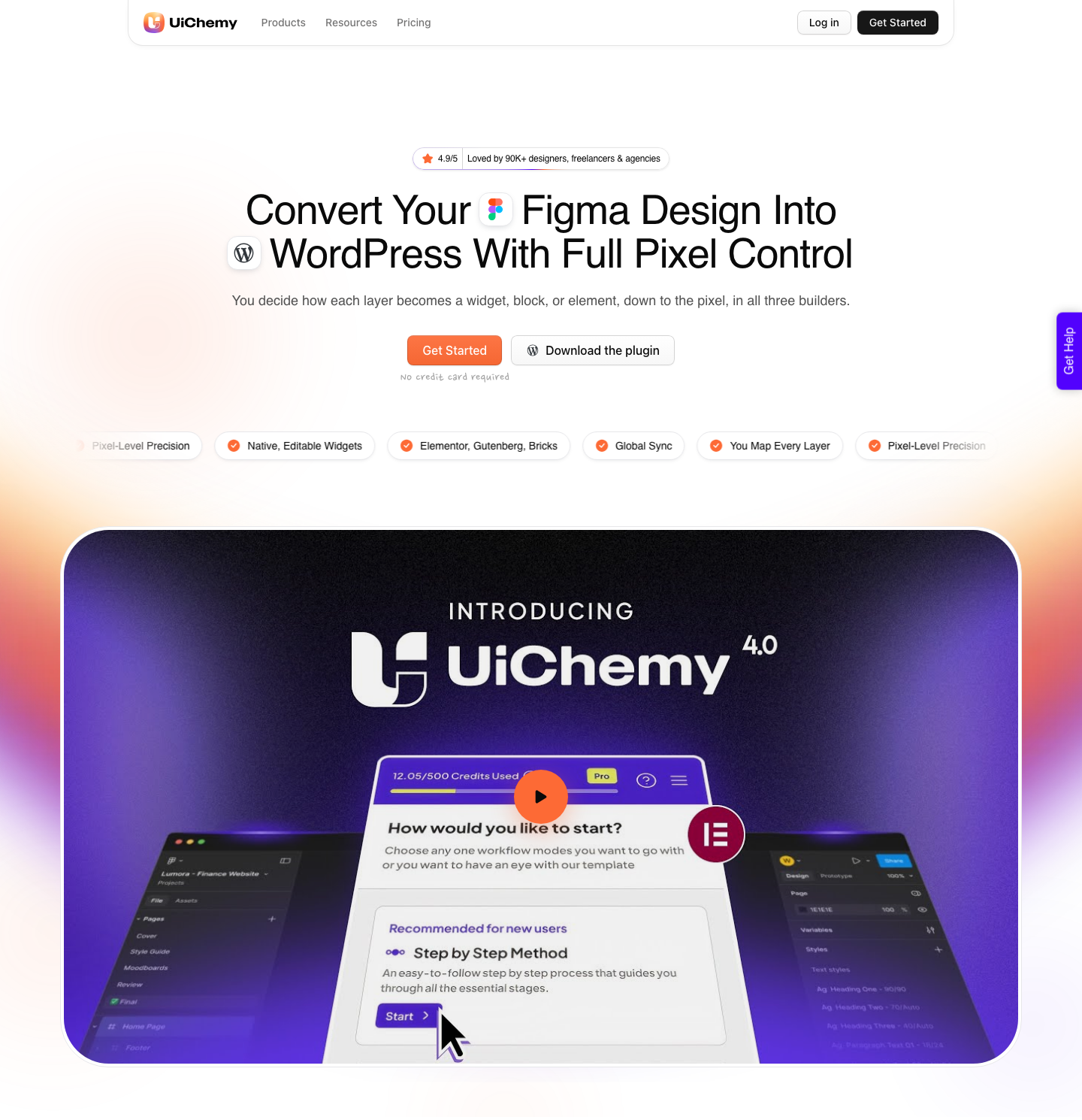
That third route is what UiChemy does. It reads the frame and produces real Elementor widgets, Gutenberg blocks or Bricks elements, so the page behaves like something built by hand in that builder.
Auto layout frames become real containers. Colour variables and text styles sync into the builder’s global settings instead of being flattened into one-off values.
The Figma frame is one of four starting points into the same engine, which is worth knowing on a project where the design does not exist yet.
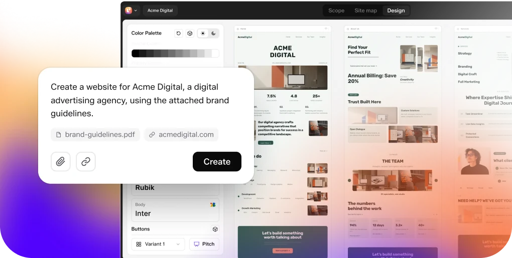
AI Website Creator takes a written brief or a prompt and produces a sitemap, then pages, then an export to Elementor.
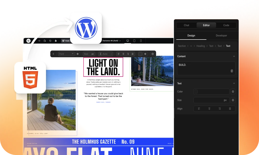
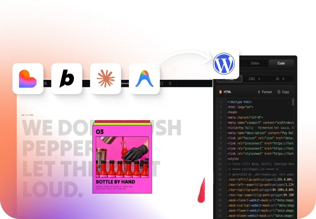
UiChemy Composer is one widget inside Elementor where AI writes real editable HTML, CSS and JavaScript for a section you could not draw comfortably. AI to WordPress brings a Lovable, Claude, Bolt or v0 build in through Composer.
For UX work specifically, that changes the order of operations more than it changes the craft. A discovery brief can become a clickable sitemap before anyone opens a frame, and the frame then does what it is good at, which is settling the parts a stakeholder will argue about.
There are two modes, both included on every plan. AI Express reads the layers and builds the page with no tagging.
Classic lets you tag elements yourself and decide exactly how each maps, which is what you want on a design with unusual structure.
The honest limits, because a post about craft should not go soft at the end. AI Express currently outputs to Elementor only, with Gutenberg and Bricks handled by Classic mode today.
A verified reviewer puts the realistic split at about 70 percent of the design work handled and the remaining 30 percent fine-tuned in Elementor, which matches what I see.
And a file built without auto layout, with detached instances and text baked into images, converts badly, because no tool can infer a structure that was never there.
A Working Sequence
- Write the three sentences: who arrives, what they want to know, what they should do.
- Map the page as questions and answers, then wireframe in grey.
- Define colour variables, the type scale and the spacing scale before drawing anything final.
- Build the 390 frame first, inside one top level auto layout frame set to vertical, aligned top centre, with zero outer padding and gap.
- Make every section its own auto layout frame. Put nothing loose on the canvas.
- Componentise on the second occurrence and use variants for states.
- Expand to 768, 1280 and 1440, fixing what breaks instead of redrawing.
- Name layers as you go. At the end you will not.
- Prototype only the two or three journeys worth validating.
- Decide the ending before handoff, because it determines whether the structure pays off.
Questions People Actually Ask
Is Figma good for UI and UX design of websites, or only apps? It is good for both, but the default advice online is written for product work. The differences that matter are file structure, breakpoint order and what happens at handoff.
Do I need a paid Figma plan? Not to design.
Every seat on every plan includes AI credits, from 500 a month on Starter to 4,250 on Enterprise, and those credits reset monthly without rolling over.
Paid plans matter more for team libraries and for API-heavy workflows than for drawing.
Should I use Figma Sites instead of WordPress? Only with your eyes open. Figma Sites is still labelled beta, and the site then lives inside Figma’s hosting and editing model.
If the client needs a CMS their team already knows, that is a real constraint rather than a preference.
How much design system do I need for a five-page site? Colour variables, a type scale, a spacing scale, and roughly six components. Anything more is usually procrastination dressed as rigour.
What is the single highest-value habit? Auto layout on everything, applied from the first frame rather than retrofitted. It is the difference between a design that describes a website and one that describes a picture of a website.
The Part Worth Remembering
UX for websites is mostly deciding what to leave out, then building the file so that decision survives contact with a builder, a developer, or a marketing manager in six months.
Figma has grown into a large suite, and most of it is irrelevant to that job. The canvas, auto layout, variables, components and a clear-headed view of where the file is going are the whole toolkit.
The rest is optional, and quite a lot of it is still in beta.