How to Export Figma Design in Fluid Responsive Layout using Responsive Manager in UiChemy?

Key Takeaways

  • UiChemy's Optimize mode exports designs with about 90% responsiveness on most devices by default.
  • CSS Clamp allows automatic font size adjustment between minimum and maximum viewport widths, enhancing fluidity in design.
  • The Responsive Manager feature enables customization of font size ranges and viewport sizes for responsive layouts.

Table of Contents

When you export your design using UiChemy’s Optimize mode, it will be about 90% responsive on most devices by default.

But if you want to manually customize the responsive values, there are two ways you can export your Figma design in a responsive layout with the Responsive Manager feature of UiChemy.

  1. Regular responsive layout.
  2. Fluid responsive layout using CSS Clamp for font size.
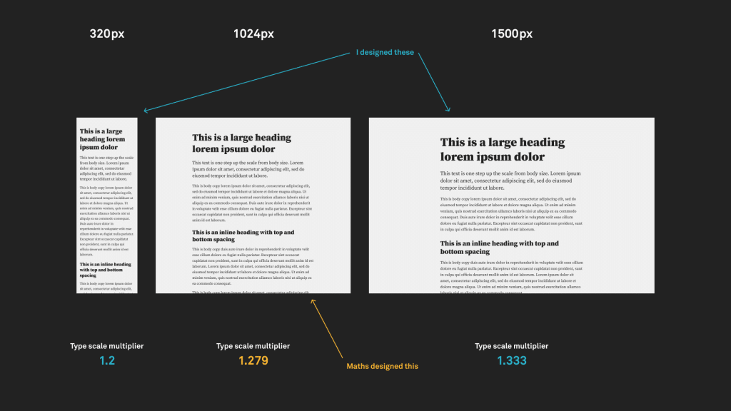
How CSS Clamp Works

To use the CSS clamp, you must set a minimum and maximum viewport width and a minimum and maximum font size. Now, the font size will automatically adjust for the in between viewport width.

For instance, if you set a font size of h1 to 32px and 50px for a minimum viewport width of 500px and a maximum viewport width of 1600px, respectively. Now, for in between viewport widths, the font size will be automatically adjusted.

So you just need to set font sizes for minimum and maximum viewport widths.

the result

Source utopia.fyi.

You can play with this online tool to better understand how the clamp works.  

Export as Fluid Responsive Layout

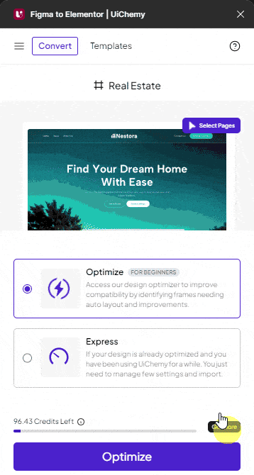
  1. To do this in Figma, open the UiChemy plugin and make sure you are logged in to your account. 
  2. Select the top level frame of your layout, and then select either the Optimize option and click the Optimize button.
  3. Then click the Responsive Manager tab.
  4. Now, the Responsive Manager will open.
  5. Select the Custom option. 
  6. In the Font Size tab, select Clamp. From here, you can make the font size fluid, so it automatically fits on different screen sizes. 
uichemy responsive manager font size clamp new ui

Range – Here, you can set the font size range. The values will be set in pixels. 

You have to set two values to create the range, like 20-30. This range will be calculated as per the font size set in Figma.

Min – Here, you can set the font size for the minimum viewport width. The value will be set in pixels.

Max – Here, you can set the font size for the maximum viewport width. The value will be set in pixels.

You can click on the + Add New to add new rows to add new responsive values.

You can also delete a row by clicking the cross button in the Range column.

In the Viewport section, you can set the minimum and maximum viewport size in pixels; based on this value, the font size will automatically adjust.

If you leave the Viewport values blank by default, the minimum and maximum viewport widths will be set at 500px and 1600px, respectively.

You can adjust line height and padding as done in the regular responsive layout.

Once the settings are done, close the Responsive Manager popup by clicking the cross button.

Now, if you export the design, the exported template will automatically adjust the font size as per the viewport size.

About the Author

Photo of Sagar Patel CEO of UiChemy
CEO · UiChemy · 11 years experience

Sagar is the Founder & CEO of POSIMYTH Innovations, with 10+ years building WordPress products trusted by 100,000+ websites globally. He has led the development of The Plus Addons for Elementor, Nexter, WDesignKit, and UiChemy, all built hands-on from concept to launch. His work focuses on making website building faster, more flexible, and accessible for creators and businesses worldwide.

WordPressFigmaUI DesignWeb DesignElementorBricksAutomationClaudeAI

Related Frequently Asked Questions


What should I do if my Figma design doesn't export correctly using UiChemy?

If your Figma design doesn't export correctly, ensure you are using the Optimize mode in the UiChemy Figma Plugin. This mode typically achieves about 90% responsiveness on most devices. If issues persist, double-check that you have selected the correct frame and settings in the Responsive Manager.

What are the best practices for setting font sizes when exporting with CSS Clamp?

When using CSS Clamp for font sizes, set a clear minimum and maximum viewport width along with corresponding font sizes. For example, you might set a font size of 32px for a minimum viewport of 500px and 50px for a maximum of 1600px. This ensures that your text scales fluidly across different devices, enhancing readability.

What happens if I leave the viewport values blank in the Responsive Manager?

If you leave the viewport values blank in the Responsive Manager, UiChemy will default to a minimum viewport width of 500px and a maximum of 1600px. This may not suit all designs, so it's advisable to customize these values to better fit your specific layout needs.

Are there any limitations when using UiChemy for responsive design?

One limitation of UiChemy is that it does not convert designs from any tool other than Figma. Additionally, it does not support page builders like Divi or WPBakery. Therefore, ensure your design is created in Figma and that you're using compatible builders like Elementor, Gutenberg, or Bricks.

How does the Responsive Manager in UiChemy differ from regular responsive layout options?

The Responsive Manager in UiChemy offers more customization than regular responsive layout options. It allows you to set fluid font sizes using CSS Clamp, which adjusts text based on the viewport size, providing a more dynamic and adaptable design compared to static font sizes in regular responsive layouts.

Last reviewed: April 14, 2026