How to Use Calculator in Responsive Manager?

Key Takeaways

  • UiChemy's Optimize mode exports designs with about 90% responsiveness on most devices by default.
  • The Calculator feature in UiChemy's Responsive Manager simplifies percentage calculations for Font Size, Line Height, Padding, and Flex Gap.
  • Users can calculate pixel values for mobile and tablet screens by entering Desktop and Percentage values in the Responsive Manager.

Table of Contents

When you export your design using UiChemy’s Optimize mode, it will be about 90% responsive on most devices by default.

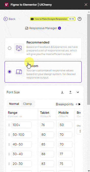
But you can customize the responsive values using the Custom option of Responsive Manager.

While exporting as a regular responsive layout you have to enter responsive values for different devices individually as a percentage of the desktop value.

To simplify the calculation process, you can use the Calculator feature of the UiChemy Responsive Manager.

Calculate the Percentage

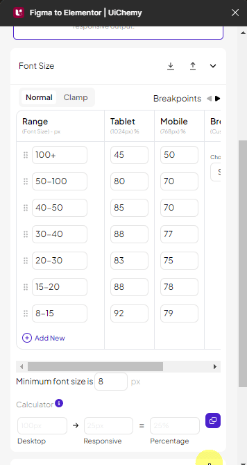
Once the Responsive Manager is open, select the Custom option, you’ll find the Calculator at the bottom of the popup for Font Size, Line Height, Padding, and Flex Gap.

Here you’ll find three fields – Desktop, Responsive, and Percentage.

In the Desktop field, you have to add the desktop value, and in the Responsive field, you have to add the value you want in the responsive screen. Then in the Percentage field, it will auto calculate the percentage that you need to enter in the respective device field of the responsive manager.

For instance, you have set a 100px font size for the desktop, and you want to set a 45px font size for the tablet. To calculate the percentage, enter 100 in the Desktop field and 45 in the Responsive field, and it will show the percentage in the Percentage field. Now you have to copy the number by clicking the copy button and then paste it in the appropriate Tablet field.

uichemy responsive manager calculator new ui

Calculate the Pixel Value

Similarly, you can calculate the mobile and tablet screen values for font size, line height, padding, and flex gap individually.

You can also find the responsive screen value in pixels by entering the Desktop value and Percentage value, then in the Responsive field, it will show the value in pixels.

For instance, you have set 80px font size for the desktop and have set 35 percent for the mobile. Now, to find the font size in pixels for the mobile, add 80 in the Desktop field and 35 in the Percentage field, then in the Responsive field, it will show the value in pixels.

uichemy responsive manager calculator pixel new ui

By using the calculator feature, you can add more accurate values for responsive devices.

About the Author

Photo of Sagar Patel CEO of UiChemy
CEO · UiChemy · 11 years experience

Sagar is the Founder & CEO of POSIMYTH Innovations, with 10+ years building WordPress products trusted by 100,000+ websites globally. He has led the development of The Plus Addons for Elementor, Nexter, WDesignKit, and UiChemy, all built hands-on from concept to launch. His work focuses on making website building faster, more flexible, and accessible for creators and businesses worldwide.

WordPressFigmaUI DesignWeb DesignElementorBricksAutomationClaudeAI

Related Frequently Asked Questions


What should I do if the Calculator in Responsive Manager isn't giving the correct percentage?

If the Calculator isn't providing the expected percentage, double-check the values entered in the Desktop and Responsive fields. Ensure that the Desktop value is set correctly, as the percentage is calculated based on this value. For example, if you input 100px for Desktop and 45px for Responsive, the percentage should reflect the ratio accurately. If discrepancies persist, consider restarting the UiChemy Figma Plugin to reset any potential glitches.

Can I use the Calculator feature for all responsive values in UiChemy?

The Calculator feature in UiChemy's Responsive Manager can be used for font size, line height, padding, and flex gap. This allows for precise adjustments across different devices. For instance, if you want to set a specific padding for mobile, you can calculate it easily by entering the desktop value and the desired percentage. This feature streamlines the process of ensuring your design looks good on all screen sizes.

What is the best practice for using the Calculator to set responsive values?

A best practice when using the Calculator is to always start with a clear desktop value, as this serves as the baseline for all calculations. For example, if your desktop font size is 100px and you want to set a tablet size, inputting the desktop value first ensures accurate percentage calculations. This method helps maintain consistency across devices and improves the overall responsiveness of your design.

How does the Calculator help in achieving responsive design in UiChemy?

The Calculator in UiChemy's Responsive Manager simplifies the process of achieving responsive design by automating percentage calculations. By entering the desktop value and the desired responsive value, it instantly calculates the percentage needed for various devices. This feature is particularly useful when working with multiple screen sizes, ensuring that your design maintains its integrity across platforms.

Last reviewed: April 14, 2026