





Figma for Web Design: The 2026 Working Method
 Sagar Patel
You have a 1440px homepage frame, signed off by the client on Friday, and a WordPress site waiting for it. The design is good.
The question is what happens in the next four hours, because that is where the craft either survives or quietly gets flattened during the rebuild.
Figma web design in 2026 is not the same job it was even six months ago. Between June and September the tool picked up new spacing controls, new text behaviour, motion on the canvas and an agent that can build its own plugins.
Some of that matters for the web. Some of it does not travel past the canvas at all.
This is the working method, written from Figma’s own product and help pages as they stood on 7 September 2026, plus the conversion rules UiChemy publishes for designs that have to become real WordPress pages.
What Changed in Figma Between August and September 2026
Four releases in the last four weeks touch web work directly. None of them were headline announcements, which is exactly why most designers have not turned them on yet.
| Date | Release | Why it matters for web output |
|---|---|---|
| 14 Aug 2026 | Text wrap: Balance and Pretty | Set on a layer, a text style or a single paragraph. Balance spreads lines evenly, Pretty stops one word being stranded on the last line. |
| 21 Aug 2026 | Auto layout spacing: Between, Around, Evenly | The old default is now called Between. Around and Evenly were added to match patterns CSS already supports. |
| 26 Aug 2026 | Agent chat panel in its own window | Desktop app only, macOS and Windows. Stays visible while you switch tabs. |
| 3 Sep 2026 | Opacity at scale for variables | Alias opacity while the colour stays linked to the library, instead of detaching to adjust it by hand. |
The spacing change is the one worth acting on this week. Figma explicitly renamed its default behaviour to match CSS terminology, which tells you where the product is heading.
If your spacing decisions already use the same three words your developer uses, one whole category of handoff argument disappears.
The Frame Setup That Survives a Handoff
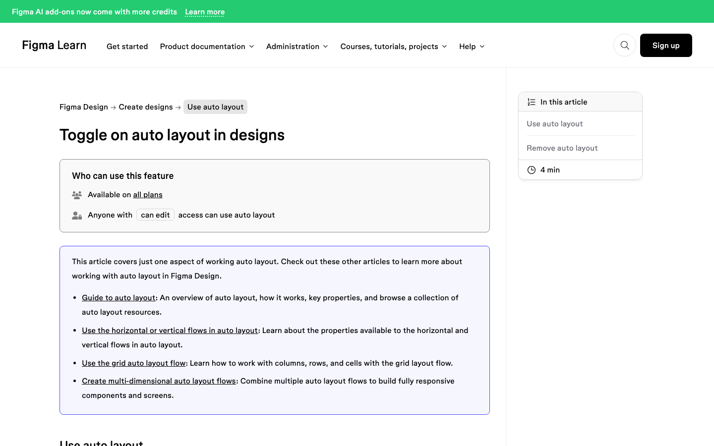
Auto layout is the load-bearing wall of Figma web design, and it works on frames only. Select loose layers and Figma wraps them in an auto layout frame for you, which is convenient and also the reason so many files end up with a container nobody meant to create.
Three flows are available on a frame or a main component: vertical, horizontal and grid. Shift A adds auto layout.
Option Shift A on Mac or Alt Shift A on Windows removes it, and right-clicking a frame gives you Remove all auto layout for the frame and everything nested inside it.
Suggest auto layout is the shortcut most people miss. Control Shift A on Mac, or Control Alt Shift A on Windows, and Figma adds as many auto layout frames as it thinks the design needs, marking each new nested frame with a blue dot in the layers panel.
Figma’s own guidance is that this handles moderately complex work such as cards, navigation bars and mobile screens, and that a full website should be done in batches. Take that literally.
Running it on an entire 6,000px homepage frame is how you end up with a horizontal flow where you wanted vertical, twelve levels deep.
Text That Behaves at Every Width
Fixed height on a text layer is the single most expensive habit in Figma web design. It looks fine on the canvas because you set the copy yourself, and it breaks the moment the copy changes.
UiChemy’s conversion documentation is blunt about why. A fixed-height text layer that overlaps its neighbour arrives in Elementor absolutely positioned, and every overlapping element then has to be set back to relative by hand.
Elementor’s Heading widget has no height control to rescue it either.
- Set every text layer to auto height, without exception.
- Create the space under a heading with the auto layout gap or the frame padding, never by stretching the text box.
- Use the new Balance text wrap on headlines and Pretty on body copy, so a two-word orphan does not survive into the build.
- Check that no two layers overlap. It is not only a text problem, and every overlap costs a manual fix later.
The Pre-Flight Check Before You Convert
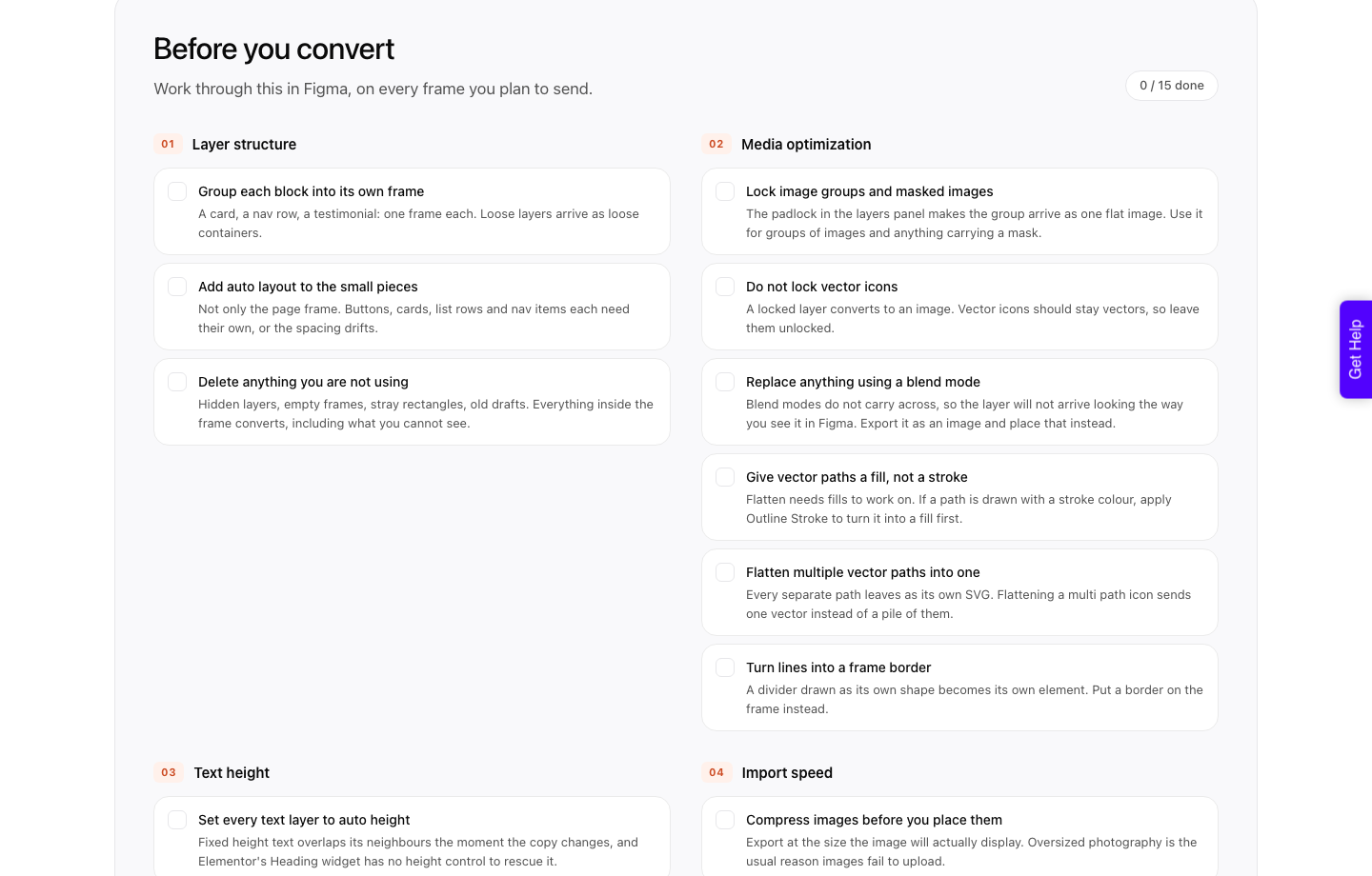
UiChemy publishes a fifteen-point checklist for designs that are about to become WordPress pages, and it overlaps almost entirely with what makes a Figma website design survive the build.
It is worth reading even if you never convert anything, because it is a list of the places a Figma file quietly stops describing a web page.
| Area | The rule | What goes wrong if you skip it |
|---|---|---|
| Layer structure | One frame per block. A card, a nav row, a testimonial each get their own. | Loose layers arrive as loose containers. |
| Layer structure | Delete hidden layers, empty frames and old drafts. | Everything inside the frame converts, including what you cannot see. |
| Media | Lock image groups and masked images. | Unlocked, a masked group arrives as a pile of separate containers instead of one flat image. |
| Media | Do not lock vector icons. | A locked layer converts to an image, so a crisp icon becomes a raster. |
| Media | Give vector paths a fill, not a stroke. Apply Outline Stroke first. | Flatten needs fills to work on, so stroke-drawn paths do not flatten. |
| Media | Replace any layer using a blend mode with a flat image. | Blend modes do not carry across at all. |
| Media | Turn a divider line into a frame border. | A line drawn as its own shape becomes its own element. |
| Text | Auto height everywhere, gaps for spacing. | Absolute positioning, fixed by hand. |
| Speed | Compress images to their display size before placing them. | Oversized photography is the usual reason images fail to upload. |
| Speed | Keep the design under 12,000px tall. | Past that height the upload does not go through at all. |
The 12,000px ceiling is the one that catches people out, because a long-scroll marketing homepage passes it easily. The fix is not clever: split the design in half, or lift one section out and send it separately.
UiChemy documents Copy to Clipboard as the method for exactly this, pasting into WordPress with the paste-from-other-site option.
Where the Design Becomes a WordPress Page
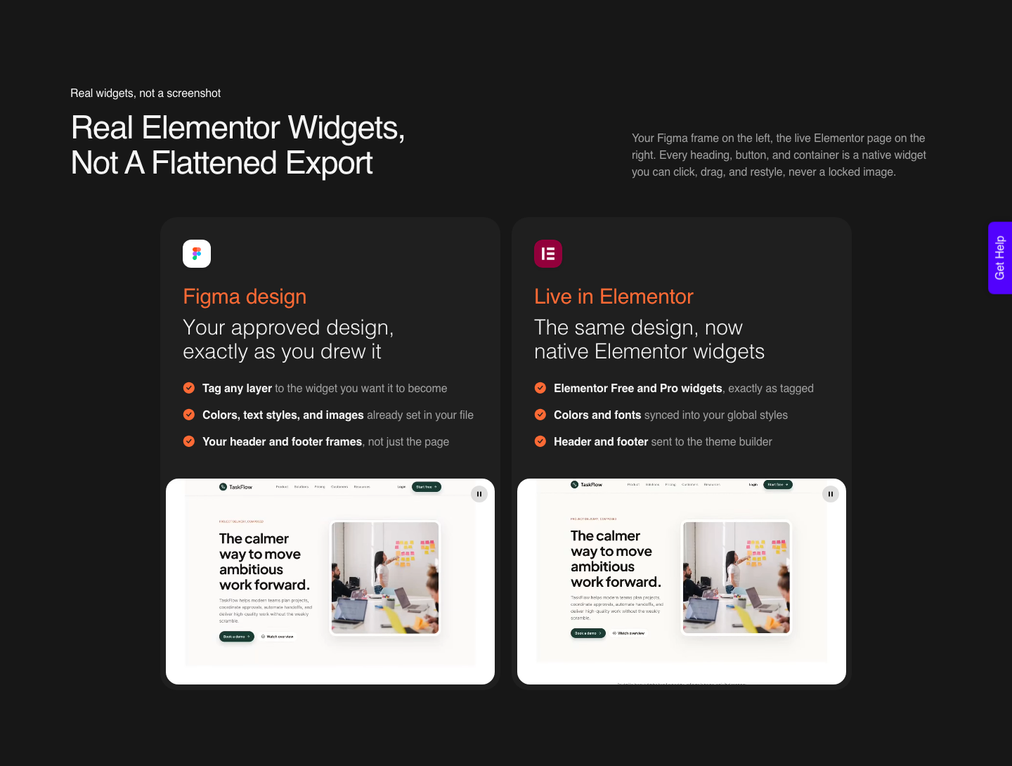
Figma stops at the canvas. Dev Mode gives your developer readable values, and Figma Sites is still marked Beta on Figma’s own product menu, so for a WordPress build something has to rebuild the frame as native widgets.
UiChemy does that in two modes, and both ship on every plan. The difference is how much you prepare and how much control you keep.
| AI Express Mode | Classic Mode | |
|---|---|---|
| Layer tagging | Not required | Required |
| Layout styling | Automatic | Manual |
| Motion and effects | Built in, three levels | Added by hand |
| Spacing and gaps | Auto-fix, optional | Manual |
| Header and footer | Sent to the theme builder automatically | Manual or multiple exports |
| Builders today | Elementor is live. Gutenberg and Bricks are not available yet. | Elementor, Elementor v4 Atomic, Gutenberg, Bricks, Nexter Blocks, GenerateBlocks, Spectra, Kadence |
| Best for | Speed on a design you trust | When every pixel has to be exact |
If you want the automatic route, AI Express Mode reads the layers without tagging and hands back native Elementor widgets. If the design has to land pixel-exact, Classic Mode covers every supported builder including Gutenberg and Bricks today.
A Working Sequence for a Homepage
Here is the order that wastes the least time on a single approved marketing homepage. It assumes the design is signed off, because converting a design still under review is how you pay for the same page twice.
It also assumes there is a design, which is worth saying out loud.
A Figma frame is one of four things UiChemy will take now: a design, a written client brief through AI Website Creator, a prompt inside the builder through UiChemy Composer, or an existing Lovable, Claude, Bolt or v0 build through AI to WordPress.
If what you are holding is a brief and a logo rather than a frame, none of the ten steps below apply and the brief is the faster road.
- Duplicate the approved frame. Work on the copy, keep the original as the reference the client signed.
- Delete every hidden layer and empty frame on the duplicate. This is also the cheapest memory saving in the file.
- Group each block into its own frame, then run Suggest auto layout section by section rather than on the whole page.
- Set every text layer to auto height and move the spacing into gaps and padding.
- Apply Balance to headlines and Pretty to body copy so line breaks stop being a surprise.
- Outline Stroke on any path drawn with a stroke, then flatten multi-path icons into one vector each.
- Lock masked groups and image groups. Leave vector icons unlocked.
- Re-export every placed photograph at the size it actually displays.
- Measure the frame height. Over 12,000px, split it before you try anything else.
- Convert, then review the live page in the builder rather than in a preview.
What This Method Does Not Fix
Nobody else writes this part, so here it is. A clean Figma file makes a conversion good.
It does not make it finished.
Nobody publishes a responsiveness percentage, and the honest number to plan around comes from a verified reviewer: roughly 70 percent of the design work handled, 30 percent left to fine-tune in Elementor, which they call a fair trade for the time saved.
That tuning happens on your own site, inside the UiChemy Composer widget in the same panel you already edit in, rather than back in Figma.
Blend modes do not carry across, full stop. If a hero relies on multiply over a photograph, that layer ships as an image or it does not ship as designed.
Same story with any effect that exists only as a canvas render.
And Figma’s own newer surfaces are not a WordPress answer yet.
Figma Sites carries a Beta label on Figma’s product menu as of 7 September 2026, and shader effects, launched at Config in June, still do not appear in Dev Mode at all. Figma says its product teams are actively exploring that.
Exploring is not shipping.
Questions Designers Actually Ask
Is Figma good enough on its own for web design?
For designing, yes. Figma’s own web design page names auto layout, components, styles and Dev Mode as the toolkit, and that is genuinely all you need to produce a responsive design.
It does not build the site. Dev Mode adds structure to handoff, which is a different job from producing the page.
Should I use fluid layouts or fixed breakpoints in Figma?
Design fluid inside auto layout, then check the breakpoints your builder actually uses. Elementor works in desktop, tablet and mobile, so a design that only exists at 1440px gives the conversion nothing to reason about at 768px.
Why does my converted page look different at tablet width?
Usually because the Figma file only described one width. Add the tablet and mobile variants in Figma before converting, or expect to tune those breakpoints by hand afterwards.
A conversion can only carry across intent the design actually expressed.
Do I need a paid Figma plan for this workflow?
Auto layout is available on all plans, and so is the memory management tooling. The newer AI features are where the plan matters.
Weave tools in Figma Design need Professional or above with a Full seat, and custom shader creation via the agent is paid-plan only.
What does a conversion actually cost?
There is a Free plan at 0 dollars a month with 1,000 Credits and one Figma seat, which is enough to put a real frame through before you decide anything. Paid plans run 9 dollars a month for 4,000 Credits and two Figma seats, 29 dollars for 12,000 and 49 dollars for 20,000.
The balance refreshes every month and you can top up between refreshes. Full detail is on the pricing page, including the 14-day money-back guarantee.
The Short Version
Figma web design in 2026 rewards preparation more than it rewards features. Auto layout on every small piece, auto height on every text layer, flat images where blend modes were, and a frame under 12,000px tall.
That list is boring and it is worth more than any new tool released this quarter.
The four hours after sign-off are the ones you can actually get back. Everything above is aimed at that window.
Primary sources used for this post, all fetched on 7 September 2026: Figma for web design, Figma release notes, and Figma’s auto layout documentation.