1. Want Your Figma Design to Convert Accurately in WordPress? UiChemy eliminates the hassle of manually recreating your Figma design in WordPress. By directly exporting your Figma layout into an Elementor or Gutenberg template, you save valuable time and effort, allowing you to focus on fine-tuning the visual details and enhancing the user experience.
However, you have to follow certain design guidelines while designing your layout in Figma for a pixel-perfect conversion with UiChemy. One of them is using Auto Layout in Figma.
What is Auto Layout in Figma?
Imagine you’re drawing a picture, and you want to make sure it looks good no matter how big or small the frame is. That’s what Auto Layout in Figma does for designers: it helps them create designs that automatically adjust and look great on different screen sizes.
Auto Layout is like a magic tool that helps designers arrange things in their designs so they can resize and rearrange them without the designer having to do it manually. It’s a bit like having objects that know how to behave and move around on their own!
Best Way to Use Auto Layout in Figma for UiChemy
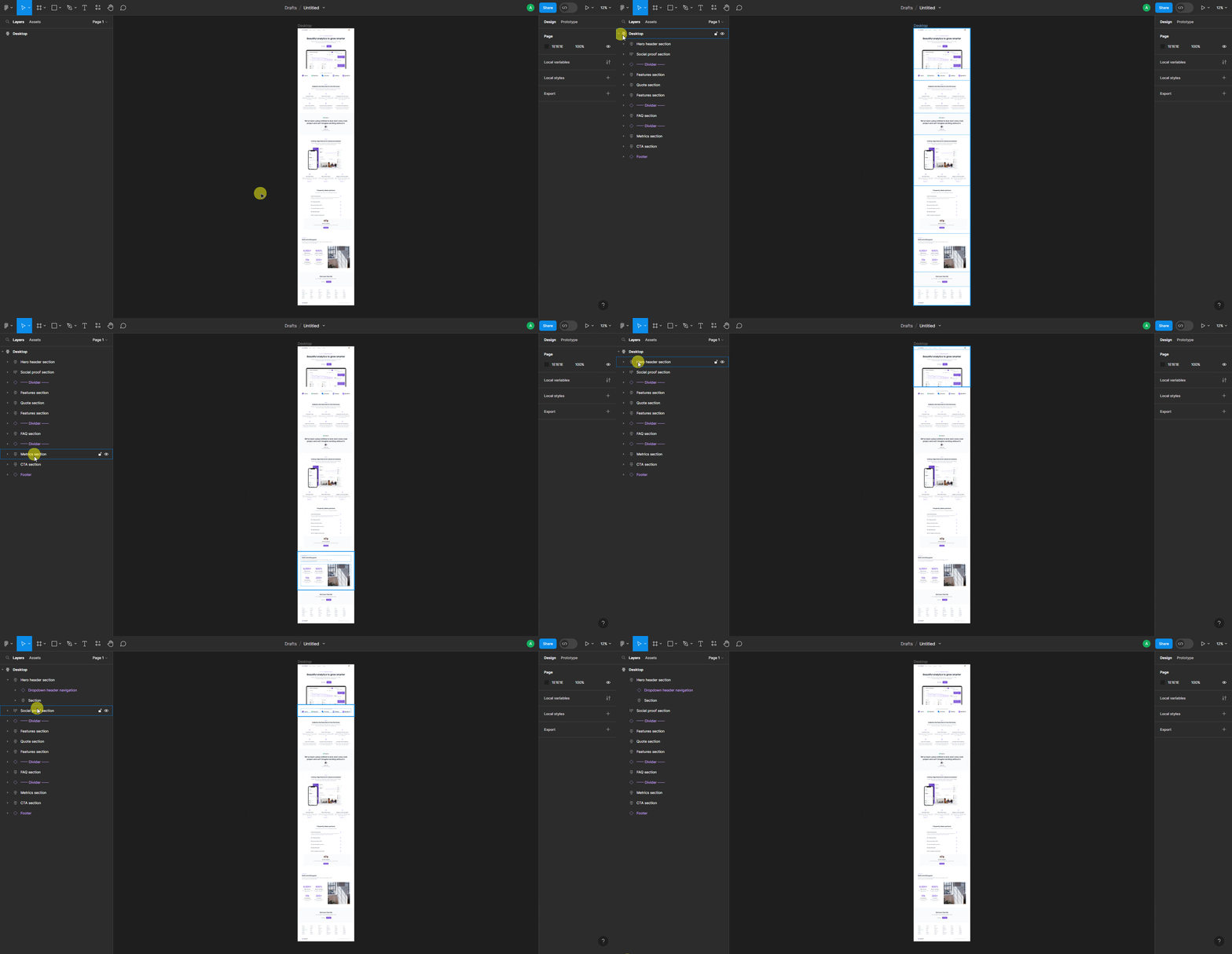
While designing a layout in Figma, you have to keep all the elements inside a main Frame, i.e., top level frame.
Then you have to add frames to create sections inside the main frame or top level frame, following the fundamental web layout structure where sections are placed vertically one after another inside the main container.
You can add elements inside the sections only then.

Don’t add any elements directly or outside the container, as those will be ignored while exporting the layout.
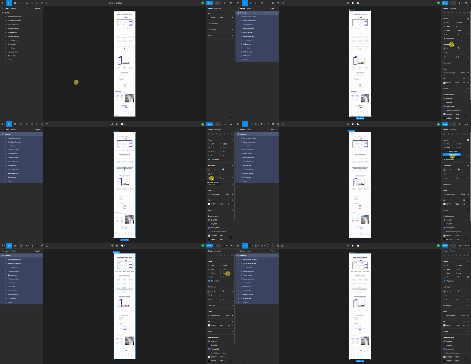
For the top level frame, you have to enable Auto layout, then set layout to Vertical layout and alignment to Align top center.
Make sure to set Horizontal padding, Vertical padding, and Vertical gap between items to 0, so there are no unnecessary spaces around.
Then you must set a fixed width of the top level frame; you can set your preferred value. For height, you can keep it in Hug contents or Fixed height, whichever you are comfortable with.

Note: You can also use a Page template of UiChemy to create the top level frame quickly with all the recommended settings.
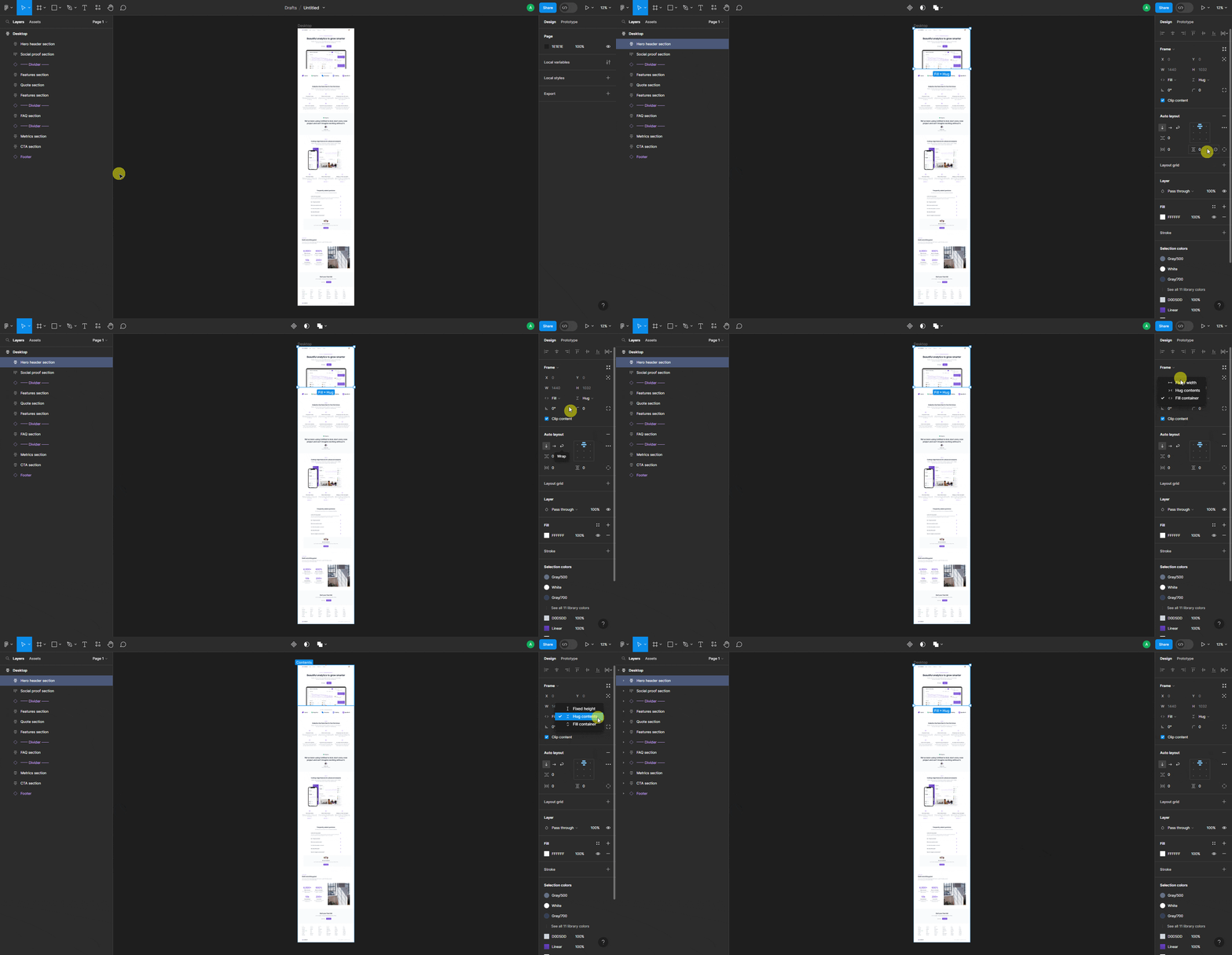
Then, for the sections inside the top level frame, you can enable Auto layout for a better responsive layout, and then you can set the layout and alignment according to your needs.
You can use the default Absolute objects as well, but it can cause issues in the responsive layout.
You can set the width to either Fill container or Fixed width.
We recommend using the Fill container for a better responsive layout.
For height, you can choose any height option. Ideally, you should keep it to Hug contents to keep the design flexible.

Follow the same structure for all the sections inside the top level frame.
Enabling auto layout provides the advantage of using the CSS Flexbox property on the page and for sections in the exported template.
While creating the layout in Figma, try to use less number of nested frames or containers to have a better editing experience in Elementor.
Note: You can use components and instances for creating sections and elements in your Figma layout.

