Information Architecture for AI-Generated Sites: Avoiding Thin and Duplicate Pages
 Sagar Patel

Information architecture for an AI-generated site means checking the page list the tool proposes before design: one purpose per page, no near-duplicates, clear navigation and a sensible depth. AI tends to over-propose pages, so merge or cut any page that cannot say something no other page says.
Structure decisions are cheapest at the sitemap stage. If you want the review habit first, read why a review step prevents rework, then come back here for the audit itself. For the tool category this sits in, see no-code AI website builders.
Why AI Over-Proposes Pages
A generator has no cost for adding a page. It does not have to write the copy, source the photos or keep the page current. When a prompt mentions a newsletter, a product list and testimonials, the easy move is to give each mention a page of its own. It looks complete, and it pads the page count.
A human planner works the other way. Each page is something you must maintain, so you add one only when a visitor needs it. The gap between those two habits is where thin and duplicate pages come from. The fix is to review the result with the planner’s mindset.
An Example From Our Own Test
On 2026-10-01 we ran one prompt in UiChemy: “A landing page for a boutique coffee roaster with hero, three product cards, testimonials and a newsletter signup”. The sitemap came back in about 13 seconds with six pages: Home, Products, Testimonials, About Us, Contact and Newsletter Signup.
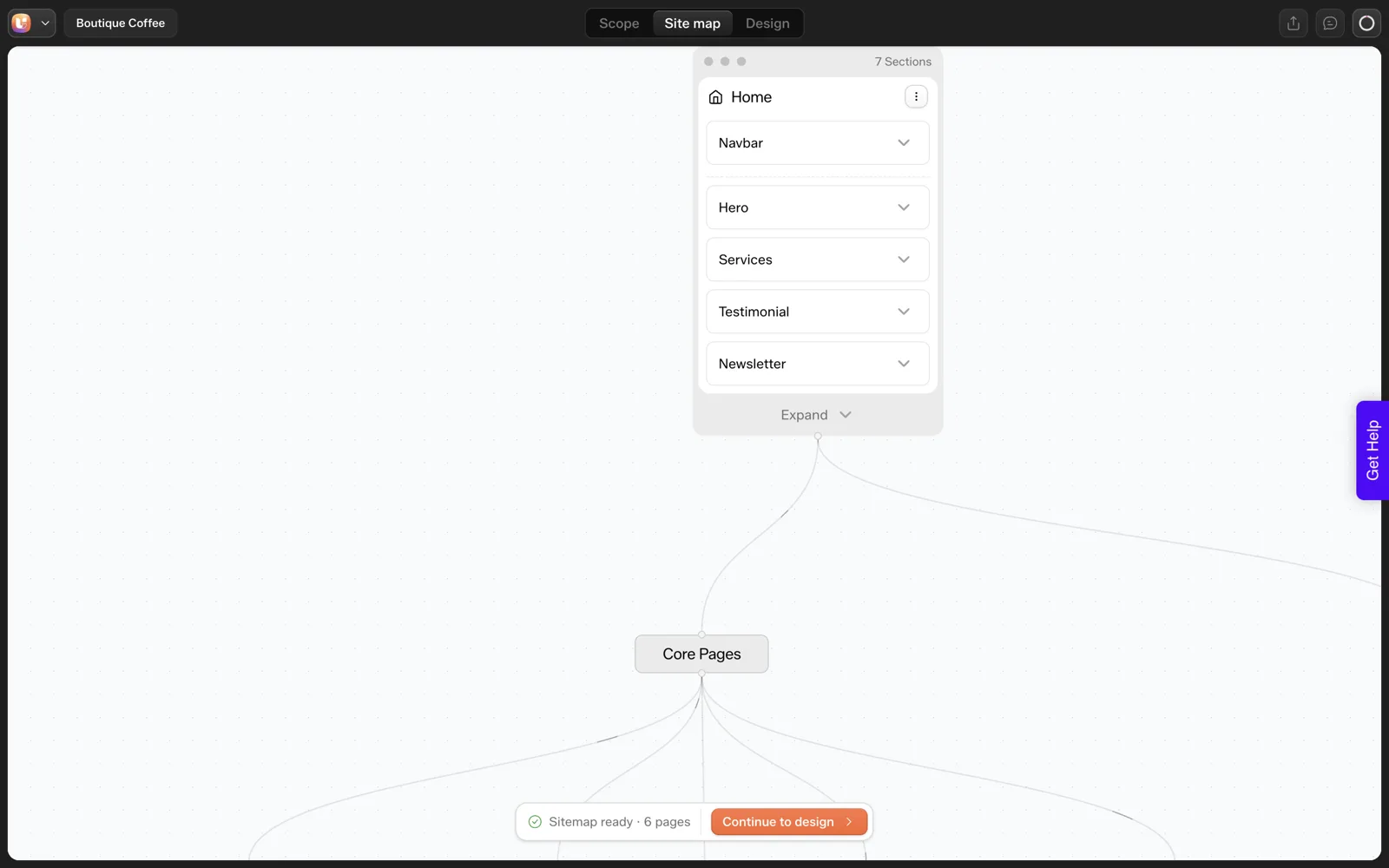
We asked for a landing page. The tool also produced a Products page and a Newsletter Signup page, and the Home page already contained product cards and a newsletter section. That is a structural overlap.
A visitor can reach the same product cards from two places, and a signup form sits on its own page that few people would ever visit directly. This is one run on one prompt, so it shows a pattern to check for and does not measure how often it happens.
The same page also drew five cards labelled “Service” when we asked for three product cards, which is a related problem covered in what AI gets wrong when it builds a website.
Thin Pages and Duplicate Pages, Defined
These two words get used loosely, so here are working definitions you can apply during review.
- Thin page. A page with so little that is specific to it that a visitor leaves with nothing new. A Newsletter Signup page holding one heading and one form is typical.
- Duplicate page. Two pages that answer the same visitor question, often with the same content in different words. Three city pages that swap only the city name are the classic case.
- Overlapping page. A page whose content is already a section of another page, such as a Products page and a Home section that list the same items.
Search engines can read these as low-value pages, and a human visitor reads them as clutter. Neither outcome helps you, and every extra page is more text to update when prices or opening hours change.
The Audit Table
Run each page of the proposed sitemap through the table. It turns a gut feeling into a decision you can explain to a client.
| Symptom | What it usually means | Action |
|---|---|---|
| Page has one section and one form | Thin page | Make it a section on Home or Contact |
| Two pages share the same promise | Duplicate pages | Merge into one, keep the stronger name |
| A Home section lists what another page lists | Overlap | Keep a short summary on Home and detail on the page |
| Page title is generic (“Services”, “Solutions”) | No clear visitor question | Rename in the visitor’s words or cut |
| Page exists for a feature you do not offer | AI guess | Delete |
| Navigation has more than seven items | Too many choices | Group, or move extras to the footer |
| Legal or utility pages sit in main navigation | Wrong placement | Move to the footer |
If you are unsure how many pages the site should end up with, our guide to how many pages a small business website needs has a framework by business type.
Navigation and Depth
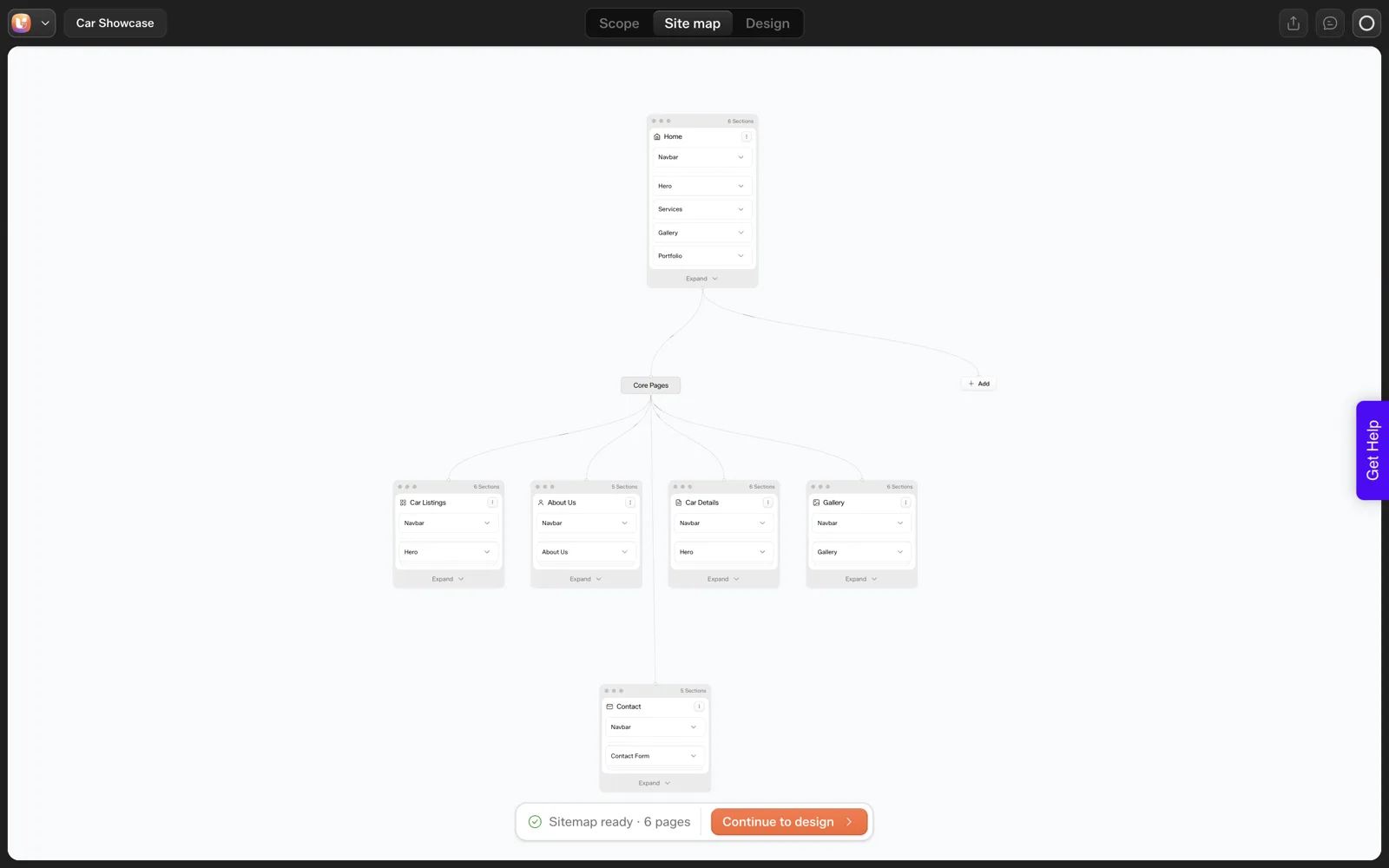
Structure is more than a page list. It is also how a visitor moves between pages, and AI sitemaps can get that wrong too.
Keep the main menu short
Five to seven top-level items is a comfortable range for most small sites. If the sitemap proposes more, check whether some belong in a group or in the footer.
Keep depth shallow
A visitor should reach any important page in two clicks from Home. Deeper structures make sense for large catalogues and rarely for a small business site.
Name pages in the visitor’s words
“About Us” is fine. “Our Journey” or “Solutions” hides what the page holds. If you are not sure, ask a few customers what they would call it.
Check the repeated parts
Header and footer repeat on every page, so they should be defined once. The Sitemap Editor documentation describes Global Sections for exactly this, letting a repeated element update everywhere from one place.
The 7-Point IA Check to Copy
IA CHECK FOR AN AI-GENERATED SITEMAP

Project: ____________________   Pages proposed: ____

1. PURPOSE   Each page answers one visitor question.   [ ]
             List any page that needs "and": ________
2. OVERLAP   No section on one page duplicates another.   [ ]
             Pairs to merge: ________
3. THIN      Every page can carry 150 words nobody else says.   [ ]
             Pages to fold into sections: ________
4. REQUEST   Every page maps to something the client asked for.   [ ]
             Pages the AI added that we did not ask for: ________
5. NAMES     Page names use the client's words.   [ ]
6. MENU      Main menu has 7 items or fewer; legal pages in footer.   [ ]
7. DEPTH     Every key page is within 2 clicks of Home.   [ ]

Pages after the check: ____ (was ____)
Client has seen the final list: [ ] yes
How to Fix What You Find
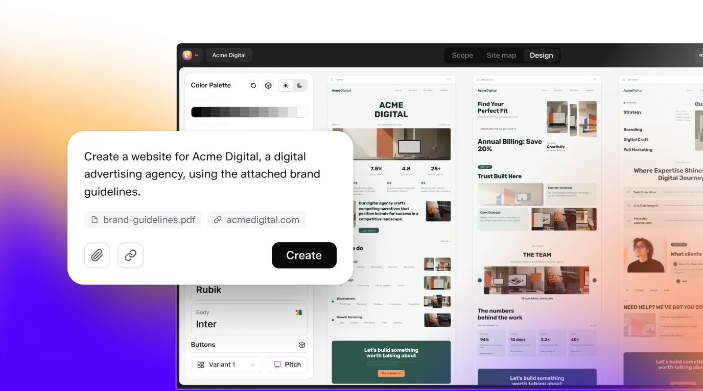
In UiChemy the fixes happen in the Site map tab before you continue to design. You can rename pages, move them between groups, add or delete pages and sections, and set repeated elements as Global Sections. Our screen by screen tour of the sitemap review shows where each control sits.
When you merge two pages, move the stronger content into one and delete the other, so you are left with a single page that has a clear job. If you work with a client, tell them what you cut and why. The scope sign-off then records the final list, so a deleted page does not come back as a surprise.
Prompt wording affects the result as well. A prompt that names the pages you want gets a closer match than one that describes the feel of the site, which the post on prompts that get the sitemap you want goes through in detail. For a view on how structure survives into a build when you start from design instead, see Figma wireframe to finished website.
Coming from a Figma Make draft instead? Finishing a Figma Make project in WordPress covers that route.
A Worked Audit: From Six Pages to a Shorter List
Here is the audit table applied to the coffee roaster sitemap. The brief asked for a landing page, so I treat the page count as something to defend. This is one reasonable outcome, and a different client could justify a different one.
- Newsletter Signup. This is a thin page by our definition. A signup form is a section, so fold it into Home, where the brief already asked for it.
- Products. This overlaps with the product cards on Home. For a landing page, keep the cards on Home and delete the page. If the roaster later sells many items, a Products page earns its place again.
- Testimonials. The Home page already carries a testimonial section, so a separate page repeats it. Fold it in.
- About Us and Contact. Each answers a question a visitor asks, who you are and how to reach you. Keep both unless the brief says a single page is the goal.
That leaves a Home page with the hero, product cards, testimonials and signup, plus About Us and Contact if wanted. Each remaining page has a job no other page does. It also gives you a page count to quote, instead of a number the tool happened to produce.
Merge, Cut or Keep: A Decision Table
Cutting is not always right. A business with several distinct services may need a page per service, because each answers a different visitor question. Use this table to decide.
| Situation | Decision | Reason |
|---|---|---|
| Page holds one heading and one form | Merge into another page as a section | Too little to justify its own URL |
| Two pages promise the same thing | Merge, keep the better name | One page per visitor question |
| Page lists what Home already lists | Cut the page or shrink the Home section | Avoid maintaining the same content twice |
| Each service has its own audience and details | Keep a page per service | Each page answers a different question |
| Page covers something the client does not offer | Cut | It is a guess, so it should not ship |
| Client asked for the page by name | Keep, then discuss | Remove it only with the client’s agreement |
The last row matters in practice. If the client named a page, explain your concern and let them decide. A client questionnaire filled in beforehand makes that conversation easier, since the page list traces back to their own answers.
Mistakes When Cleaning Up a Sitemap
Over-correcting causes as many problems as under-reviewing. These are the ones to watch.
- Cutting too far. Collapsing every service into one page can leave visitors with a long page that answers nothing in depth. Keep pages that have their own question and their own details.
- Merging by deleting the stronger content. When you combine two pages, move the better copy and structure across before you delete anything.
- Renaming a page and forgetting the menu. After renaming, check that the navigation reads the same way as the page titles.
- Cleaning up without telling the client. A list that shrank from six pages to three needs a short explanation, or it looks like missing work.
- Treating one run as the rule. Our test was one prompt. Your generator may over-propose less or more, so audit every list on its own merits.
A tidy list also keeps your own estimate honest. The post on how to quote AI-built websites for clients uses the page count as a basis for the price, so a padded sitemap quietly changes what you are selling.
FAQ
What is information architecture for a website?
Information architecture is how a site’s pages, sections and navigation are organised so visitors can find things. It covers the page list, the order and grouping of pages, the names used for them and how pages link to each other. Good structure makes content easy to find and easy to maintain.
Why does AI add pages I did not ask for?
A generator pays no cost for an extra page, so it tends to give each mentioned idea a page of its own. In our test, a landing page prompt returned six pages, including a separate Products page and a Newsletter Signup page. Review the list and cut anything the visitor does not need.
What is a thin page?
A thin page offers very little that is specific to it, such as a page holding only a heading and a signup form. Visitors gain nothing from it and it is one more page to maintain. Fold it into a section of a stronger page.
How many items should the main menu have?
Five to seven is a comfortable range for most small business sites. More than that usually means some items can be grouped or moved to the footer. Legal and utility pages belong in the footer, which keeps the main menu focused on what visitors want.
Can I change the structure after design starts?
Yes. The UiChemy documentation says you can add, remove, reorder and rename pages and sections before and after moving to the design editor. It takes more effort once pages are designed, so the sitemap review is the cheapest time to fix structure.
To run the IA check on a real draft, you can Get Started and generate a sitemap from your own prompt.
Every feature named in this post is listed by product: all UiChemy features, UiChemy Composer features.