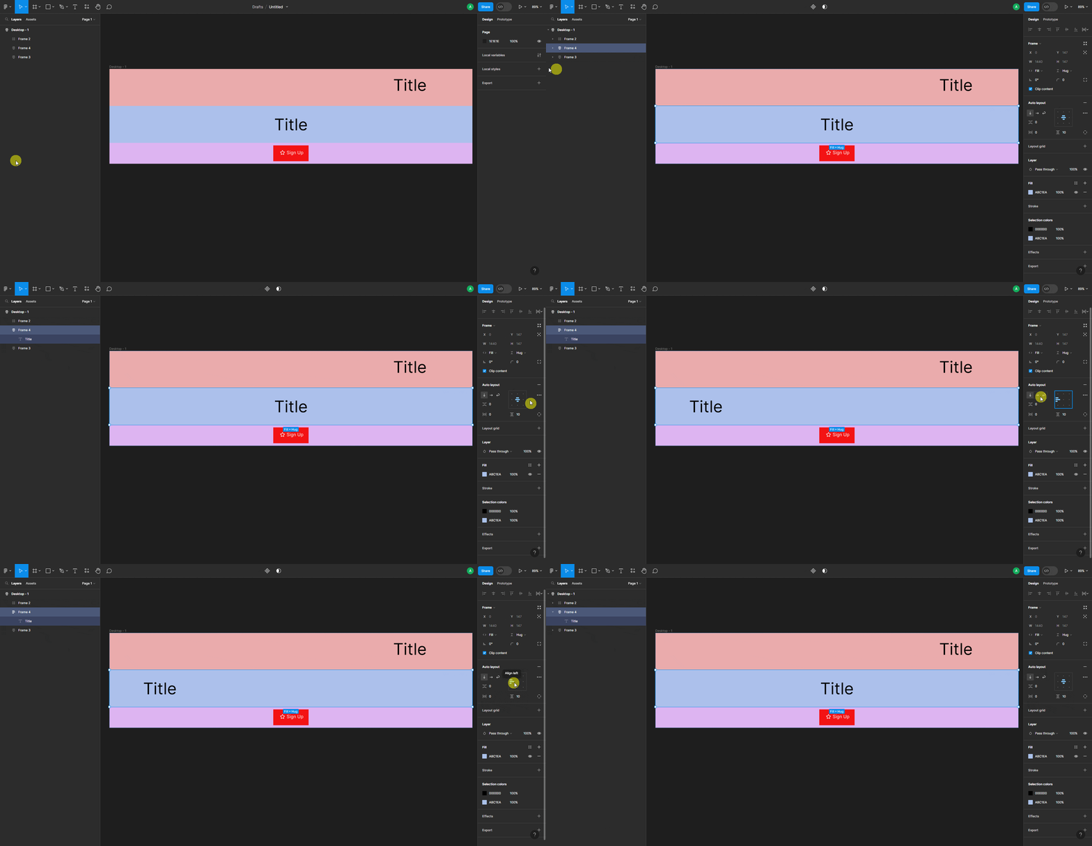
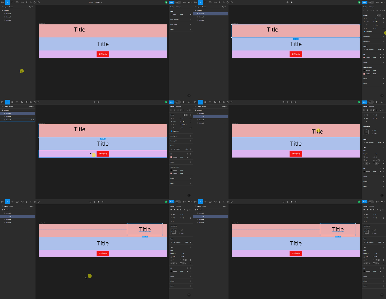
When you make the design in Figma, you’ll find two types of layout one is the default one, which can be called the Absolute Objects, and the other one is the Auto Layout.
The decision between Auto Layout and absolute objects depends on the specific design requirements and desired outcomes. Auto Layout excels in creating responsive designs that adapt to different screen sizes and content variations, making it ideal for designing components that need to be flexible and scalable. On the other hand, absolute objects offer pixel-perfect control over element placement, which can be used for precise alignments and fixed layouts.
What is Auto Layout in Figma?
Imagine you’re building a puzzle, but this puzzle is special because the pieces can change their size and position all by themselves! That’s what Auto Layout does in Figma—it helps designers create designs that automatically adjust and look great on different devices.
For example, let’s say you have a design with a bunch of buttons. With Auto Layout, you can tell the buttons to line up neatly and evenly, no matter how many buttons there are. And if you decide to add or remove buttons later, Auto Layout will automatically adjust everything so it still looks nice and organized.
In Figma, Auto Layout can be applied to the Frame object only, but the effect will apply to all the elements placed inside the Frame.
Auto Layout in Figma is like using the CSS Flexbox property, you can set different layout positions and alignments to place the child elements.

What is Absolute Objects in Figma?
In Figma, absolute objects are like your toys that you can place exactly where you want them on a piece of paper. They stay in that spot no matter what happens around them. It’s like having full control over where your toys go and how they look.
Let’s imagine you’re drawing a picture. With absolute objects in Figma, you can decide exactly where each thing goes, like a house, a tree, or a person. You can say, “I want the house to be in the middle, the tree on the left, and the person on the right.” And guess what? They will stay exactly where you put them, just like you want.
In Figma, by default, objects are positioned as Absolute Objects you don’t need to set them specifically.

Choosing Absolute Objects and Auto Layout for Conversion
You need to keep the layout in mind especially when you are creating your layout for exporting it through UiChemy.
For UiChemy, we recommend using auto layout, but we do support absolute layout as well.
When you export your layout containing Absolute Objects using UiChemy those will use CSS absolute position and they will remain in the exact position as your layout.
But the downside of using Absolute Objects is that they are not responsive, you have to manually set their position for different devices.
When you export your layout containing Auto Layout, it will use the CSS Flexbox property on those sections.
Using Auto Layout will make your layout responsive by default.
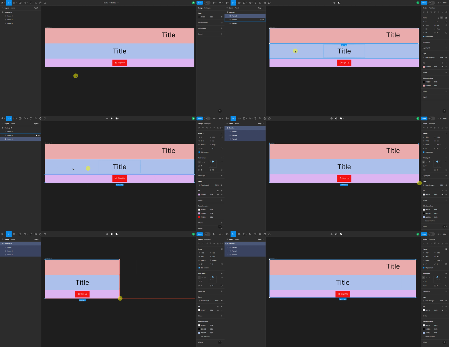
You can check the section responsiveness in Figma as well, for example, we have three frames, one with Absolute Objects and the other two with Auto Layout.

Now when we resize the top level frame, the object in the top frame will remain in its position, while in the other frames, the objects will automatically position themselves according to the layout size.
You’ll get the same behavior when you export the template.
Resources
Learn how to use auto layout in Figma.
https://help.figma.com/hc/en-us/articles/360040451373-Explore-auto-layout-properties