Brand Kit in an AI Website Build: Carrying Colors, Fonts and Voice
 Sagar Patel
To carry a brand into an AI-built website, supply four things before generation: hex colors to use and to avoid, a font preference, a logo file, and a voice described with a tone and a list of banned words. UiChemy’s Scope Editor takes all four, and the Design Panel applies colors and fonts globally afterwards.
I looked for a saved “brand kit” object in UiChemy’s AI Website Creator that stores all this once and reuses it across projects.
I did not find one in the docs or in our captures, so this post describes only what is documented: brand inputs in the scope step and global style controls in the Design Editor. If you build several sites, our agency playbook shows how to keep brand inputs consistent by process.
What Should You Supply Before You Generate?
An AI tool cannot see a brand guideline you keep in your head. The first design pass reflects what you typed, so brand input is the cheapest quality lever you have. The docs say tone, brand style and color preferences flow into the first design pass, which means thin input shows up as generic output you then restyle by hand.
Gather these before you open the tool:
- Colors: hex values for the colors to use, and any to avoid.
- Typefaces: a heading and body font if the brand has them, or the name of a typeface family you like.
- Logo: an SVG, PNG, JPG or WebP file. If the brand has a dark-background version, have that too.
- Voice: two or three tone words, one thing to avoid, and a list of words that must never appear.
- References: links to sites you like and dislike, with one reason each.
If the client has no brand yet, say so and pick a direction on purpose, rather than letting a default pick for you.
Where Does the Scope Step Take Brand Inputs?
Two of the six scope steps carry most of the brand. This table is taken from the Scope Editor docs.
| Scope step | Brand input it asks for |
|---|---|
| Business and Audience | Tone (Premium, Friendly, Bold, Minimal, Playful, Corporate), tones to avoid, up to 15 words never to use, price display |
| Brand Look and Feel | Design styles (Minimal, Premium, Playful, Bold, Corporate, Elegant, Techy, Organic, more than one allowed), a font preference, a logo upload, brand colors as hex values, colors to avoid as hex values |
| Design Inspiration | Sites you like and dislike; each URL is crawled for colors, fonts, navigation structure and content tone |
| Project Basics | An existing site as a reference link, or a brief document up to 25MB, for rebrand and redesign work |
The Design Inspiration step is the one most people skip. A pasted reference URL is crawled for style data, so you do not need to describe a competitor’s look by hand.
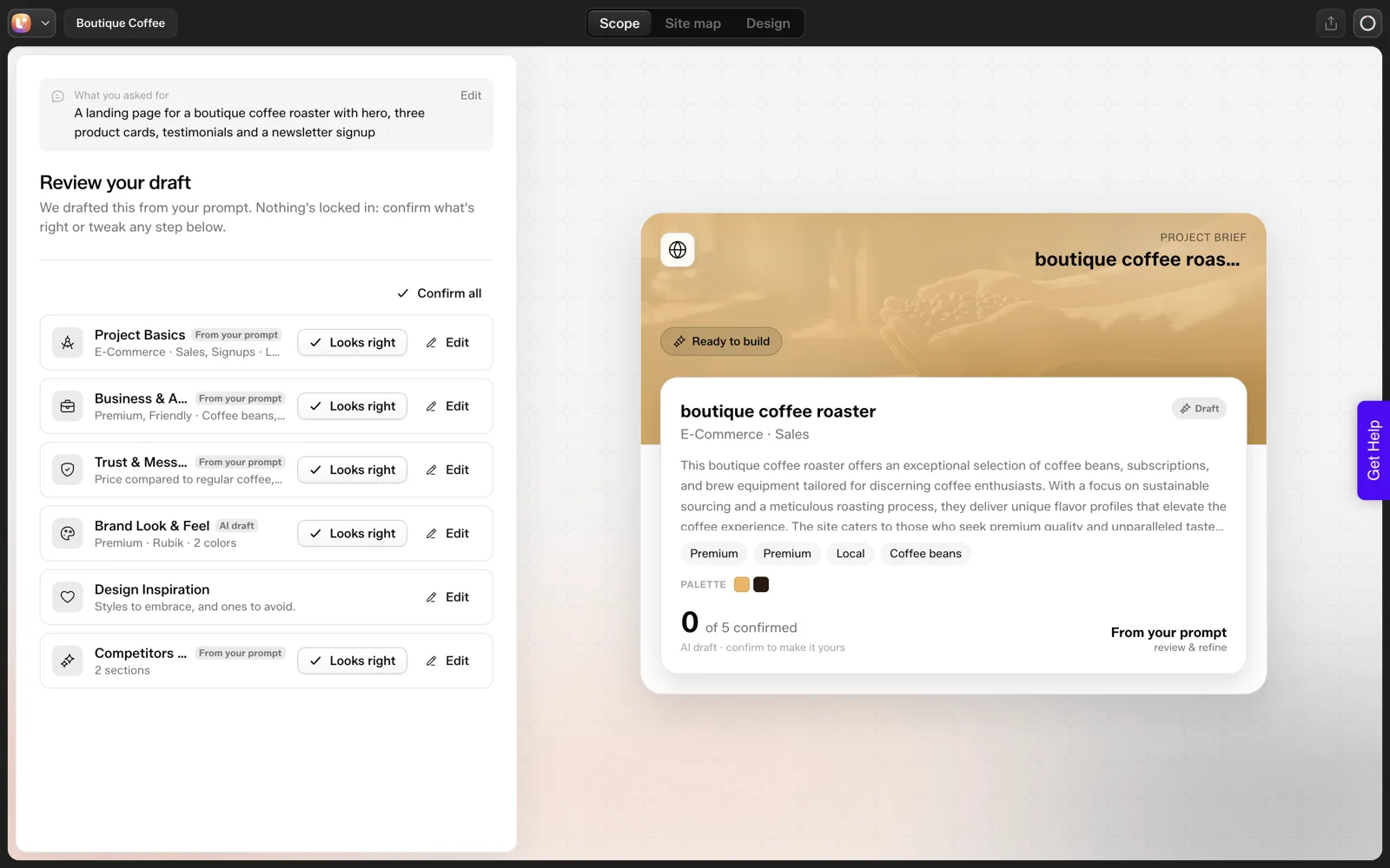
The docs say that when you create a project from a prompt, the tool drafts all six areas for you on a “Review your draft” screen. Read the cards, then correct them. We show that screen in our coffee roaster test.
How Does the Design Panel Apply Colors and Fonts?
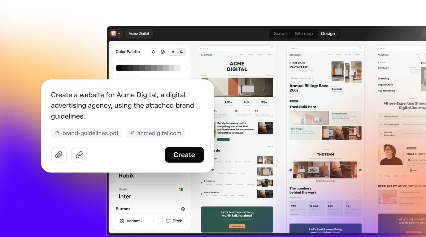
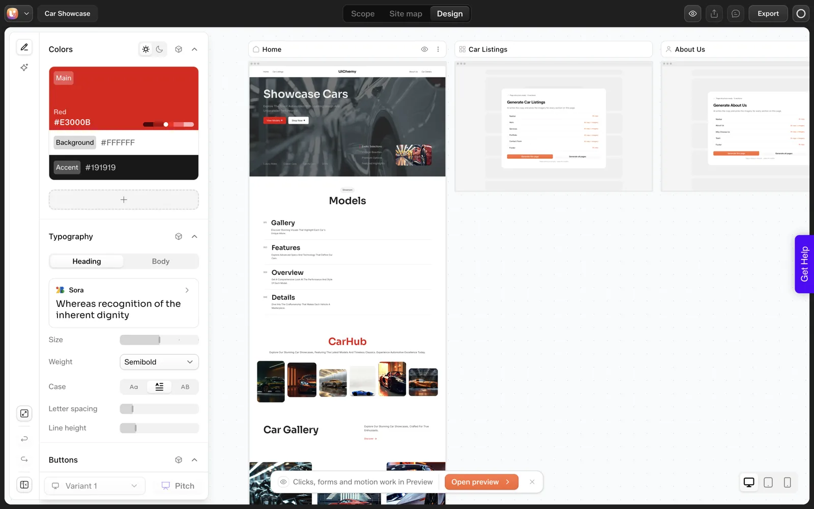
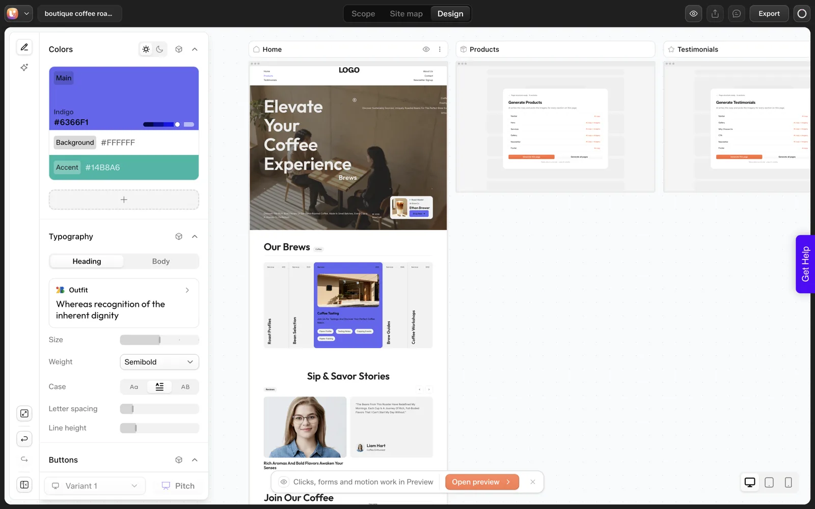
After generation, the left Design Panel (see the Design Editor docs) controls global style: Colors, Typography, Buttons, Badges, Cards, Section Style and Spacing. The docs say changes there apply across every page and section, and that Badges is marked “Coming Soon”. For brand work the first two matter most.
Colors
- Palettes are grouped by industry, and a custom palette can be created from hex values.
- Swatches are Main, Background and Accent, with optional Extra colors. Each opens a picker with a hex field.
- A global saturation slider makes everything more vivid or more muted.
- Light and dark mode toggles let you check both themes.
- CSS Tokens shows the derived set: Brand, Text, Backgrounds, Shades and Utility groups, all generated from your Main, Background and Accent.
Pick your three base hex values carefully, because everything else derives from them. Then use the dark toggle and check text contrast in both modes.
Typography
The docs list 1,000+ Google Fonts, with Heading and Body tabs for separate font, size, weight, case, letter spacing and line height. Font changes apply globally. If the brand font is not on Google Fonts, you will not find it in the picker. In that case, plan to set it in WordPress after export, and check the docs for how your builder handles custom fonts.
Both Randomize buttons exist, but they are for exploring directions. Once you have a brand palette and a font pair, leave them alone, or you will replace the brand with a random one.
How Do Logos and Images Stay on Brand?
Per the docs, logos are uploaded from the Logo group of the Section Content Panel on Navbar and Footer sections. You choose Light or Dark for the theme you are uploading for, drop an SVG, PNG, JPG or WebP file and adjust a size slider. Upload both versions if you plan to ship a dark mode.
For images, the docs describe a Generate tab with a “Match this site’s brand” checkbox that keeps results on-palette. We have not tested the output, so judge it on your own project.
Anything photographic of a real product, a real person or a real place should be a real photograph. A generated image of a roast level you do not sell is a false claim, not decoration.
How Do You Keep the Voice Consistent?
Voice is the part of a brand that drifts fastest, because AI copy trends toward the generic middle. Three habits help.
- Set the banned list early. The scope step takes up to 15 words never to use. Fill it with the clichés the client hates.
- Pair a tone with an avoid. “Friendly, not salesy” gives the tool a direction and a boundary.
- Edit copy against real facts. The docs list text quick actions on a page: Rewrite, Shorten and Expand. Use them on drafts, then replace generic claims with specifics only the client knows.
Our guide to prompts that get the sitemap you want includes a tone-and-avoid line you can reuse, and the list of common AI website misses covers generic copy and wrong labels.
For where brand design meets a handoff, see our Figma to WordPress guide, which starts from a finished brand design rather than a prompt. If you are still choosing a builder, the AI website builder for WordPress overview sets out what to compare.
The Brand Handover Checklist
Copy this and attach it to the project. Fill every line before generation, and mark the ones you cannot fill as decisions still open.
BRAND HANDOVER CHECKLIST

Client / project:
Date:

COLORS
Main (hex):
Background (hex):
Accent (hex):
Extra colors (hex):
Colors to avoid (hex):
Dark mode needed? yes / no

TYPE
Heading font:
Body font:
Is it on Google Fonts? yes / no (if no: set after export)

LOGO
Light-background file (SVG/PNG/JPG/WebP):
Dark-background file:

VOICE
Tone words (max 3):
Tones to avoid:
Banned words (max 15):
Price display: show / hide / from-price

REFERENCES
Liked sites + reason (3):
Disliked sites + reason:
Existing site URL (for rebrand):

REAL FACTS the AI must not invent
Prices:
Hours / address:
Testimonials (real, with permission):
Product names and counts:

CHECK AFTER GENERATION
[ ] Colors match hex values, in light and dark
[ ] Fonts applied to headings and body
[ ] Logo in navbar and footer, correct theme version
[ ] No banned words on any page
[ ] No invented claims
What Does a Brief Look Like When the Client Has No Brand Yet?
Many small clients arrive with a logo and nothing else. The temptation is to let the tool pick a style. Pick one on purpose instead, using the inputs the scope step already asks for.
- Choose one or two design styles. The Brand Look and Feel step allows more than one, such as Premium and Organic for a coffee roaster.
- Choose three tone words and one to avoid. For example, warm, direct and local, avoiding salesy.
- Give two liked sites and one disliked site. Write one reason for each. The tool reads colors, fonts and tone from the URLs you paste.
- Pick the three base colors. Main, Background and Accent. Everything else derives from them, so spend ten minutes here.
- Write the banned word list. Add the clichés the owner dislikes, up to the limit of 15.
That is a brand brief in under an hour with no designer. It is also a draft: a client who later gets a real brand identity should replace these choices in one pass in the Design Panel, since global changes apply across every page.
Which Brand Mistakes Show Up Most?
These patterns come from how the inputs described above work. Each one has a quick fix.
| Mistake | What you see | Fix |
|---|---|---|
| Only one color supplied | The derived set looks flat or clashing | Supply Main, Background and Accent as hex values |
| Brand font is not on Google Fonts | It is missing from the picker | Pick the closest family now and set the real font after export |
| Only a light logo uploaded | It disappears on a dark section | Upload both the Light and Dark versions |
| Pressing Randomize after setting the brand | The brand colors are replaced | Use Randomize only while exploring |
| No banned words | Generic phrases appear in headings | Fill the list before you generate |
| Skipping the dark mode check | Low contrast text in one theme | Use the light and dark toggles and read every section |
If the problem is wording instead of visuals, the sitemap prompt framework has a tone-and-avoid line you can reuse.
How Do You Audit the Draft Against the Brand?
After generation, a ten-minute pass catches most drift. Open the draft next to the handover checklist above and tick each line.
- The three base colors match the hex values on the checklist.
- Headings and body text use the chosen font pair.
- The logo is the right file on both light and dark sections.
- Not one banned word appears. Search every page for each.
- Every price, hour and address matches what the owner supplied.
- Product and service names are real, and the counts match the brief.
- Button labels use one consistent wording across pages.
- Photographs of products, people and places are real.
- Both light and dark modes are readable, if both ship.
- The tone reads like the three tone words, with the avoided one absent.
Anything that fails goes into one list, and you fix it in one sitting. Changing colors and fonts in the Design Panel applies everywhere, so those fixes are quick. Copy fixes are slower, and our 30-minute review routine shows how to batch them.
FAQ
Does UiChemy save a brand kit I can reuse across projects?
We could not find a saved brand kit object in the AI Website Creator docs or in our captures. What exists is brand input in the Scope Editor and global styles in the Design Panel. Keep your own handover checklist and paste the same values into each new project.
Can I use my own brand colors?
Yes. The scope step takes preferred brand colors and colors to avoid as hex values, and the Design Panel lets you create a custom palette from hex input and edit each swatch’s hex code. Colors and fonts apply globally across all pages.
What if my brand font is not a Google Font?
The font picker covers 1,000+ Google Fonts, so a custom font will not appear there. Choose the closest Google Font for the draft, and set the brand font in WordPress after export. We did not test custom font handling after import, so check it on a throwaway site.
How do I stop the AI from using words my client hates?
Add them to the banned words field in the Business and Audience step, which takes up to 15, and pair a tone with a tone to avoid. Then read every page. A banned list reduces misses but does not replace a review.
If you want to try your own brand inputs on a real project, you can Get Started and see how the first design pass responds.
Every feature named in this post is listed by product: all UiChemy features, UiChemy Composer features.